



Kraft Boxes Keep Printing Blotchy Dark Colors — Should Design Switch Paper, or Should the Printer Rebalance Ink and Pressure?
Dark colors printing blotchy on uncoated natural kraft is usually not simply poor paper or the wrong ink — it is paper surface absorption, ink layer thickness, printing pressure and drying conditions that are not aligned. Based on 2026 packaging and brochure delivery experience, first work out whether it is overall grey haze, local patches, or color cracking at folds, then run a step-by-step check with a proof on the same batch of kraft. Before that proof exists, we do not recommend simply increasing ink volume or switching to lamination.
First, Sort Dark-Color Blotchiness Into Three Symptoms
Natural kraft is an uncoated paper: coarser fiber, lower surface energy, higher ink absorption. Dark graphics carry a thick ink layer, and the binder in the ink tends to soak into the paper, so the print often looks greyish, solids are not solid, edges turn fuzzy, or one area is dark and another light. Its imaging logic differs from coated art paper and white card, so a proof made on coated paper cannot be applied directly to kraft.
In delivery, splitting blotchiness into three types makes the judgment much clearer: insufficient overall density is mostly about ink volume, paper absorption and ink viscosity; local patches look more like uneven plate pressure, contamination on the paper surface, or the wrong grain direction; whitening at folded corners and glue flap edges is usually scoring and fiber breakage, not insufficient print depth. Identify the type before changing anything and you save a round of rework.
- Overall grey haze: check the paper batch and ink viscosity first; do not start by changing the spot color.
- Local mottling: check surface contamination, plate pressure and the blanket; common on small dark solids.
- Color cracking at folds: check score line position, grain direction and glue flap allowance; if needed, score before printing.
Four Layers to Check: Paper, Ink, Printing, Finishing
Dividing the variables into four layers avoids changing paper, ink and pressure all at once and then not knowing which one worked. The goal is to pin down the main cause with one proof; the deliverables are the proof, the paper sample and the ink color record; the acceptance criteria are: under the same light source, no obvious streaks in the dark solid, readable letter edges, and no white showing at folded corners. Change only one variable per layer, record the result, then move on.
- Paper layer: confirm grammage, grain direction and batch. Kraft packaging and brochure covers commonly fall in the 120–200 gsm range; the exact choice depends on box style and binding method. Start with a proof on the same batch of paper.
- Ink layer: distinguish water-based ink, UV ink and spot color. For large dark areas, try a white underprint first or a moderate increase in ink volume, but guard against show-through and incomplete drying.
- Printing layer: check plate pressure, anilox roller and registration. Local mottling often comes from uneven pressure, not from the paper itself.
- Finishing: check varnishing, lamination, scoring and gluing item by item. Keep score lines away from the edges of dark solids where possible; a 3–5 mm safety zone on the glue flap is more reliable.
Among the four layers, paper and ink set the base color; printing and finishing determine evenness and durability. If the budget only allows one change first, check the match between printing pressure and ink volume before considering a white underprint; jumping straight to lamination often pushes cost up without necessarily fixing overall grey haze.
On the Delivery Floor: Which Three Things to Lock First for a Short Test Run
Short-run test packaging often comes with these constraints: the brand supplies only a vector logo, one phone photo of the product and one reference color number; the quantity is a few hundred; the budget is managed as short-run printing; and only 7–12 working days remain including proofing. The usual approach is to lock three things first: a proof on the same batch of kraft, whether dark solids get a white underprint, and how much allowance the glue flap and score lines get.
Skip the proof and go straight to press, and the common cost is a whole batch of greyish dark color, or cracking at the spine score of a brochure cover; one rework round is commonly 7–10 days, and 2–4 revision rounds is also a typical range. Signing off and filing the proof and paper sample before discussing the bulk run is more effective than arguing about paper or ink afterwards.
- Lock the paper sample first: within one project, use kraft from the same batch and the same grain direction wherever possible.
- Then lock the ink color: make an underprint proof for large dark areas first; light text on a dark ground needs a separate check of the knockout effect.
- Then lock the structure: fold the box glue flap and the brochure cover spine score once on a white dummy first.
Comparing Uncoated, Varnished, Laminated, and White Underprint Plus Spot Color
In 2026 the common practice is not to laminate everything, but to tier the choice by use case. For projects that want a natural feel, short test sales or cost sensitivity, uncoated plus a water-based varnish may be enough; only when rub resistance, long-term display or large dark areas are required does lamination or white underprint plus spot color come into play. Below is an experience-range comparison by appearance, durability, cost and lead time.
- Uncoated: natural feel, better recyclability; dark-color evenness depends on paper and ink; low cost, short lead time, suited to test sales and short-term materials.
- Water-based varnish: slightly better rub resistance than uncoated while keeping the paper feel; dark solids may shift slightly, so a proof is needed; the cost increase is limited.
- Lamination: more even dark color and better rub resistance, but the feel becomes plastic-like, and barcodes and light fine text must be re-tested after laminating; cost commonly rises by a few yuan to a dozen-plus yuan per square meter (typical range).
- White underprint plus spot color: darker, more solid color and more stable brand color, suited to large solids; it adds one printing pass and plate cost, and the short-run press setup fee commonly falls in the several-hundred to one-to-two-thousand yuan range.
Do not compare unit price alone: the rework lamination saves may not offset the loss of feel; the extra cost of a white underprint should be spent where dark areas are large and brand color is critical. If a brochure cover uses uncoated kraft, the spine score for sewn perfect binding needs its grain direction confirmed earlier than a packaging box does.
Acceptance Criteria and Where It Applies
Acceptance cannot rely on a screen or an office printout. Put the bulk run under the same light source and check whether dark solids show streaks, whether letter edges are clear, whether folded corners show white, and whether glue flaps are securely bonded; barcode grade should be checked against the customer's acceptance checklist or platform specification, not judged by eye. Meeting these points is the baseline for passing.
- Common pitfall 1: proofing on coated art paper instead of kraft; color and ink absorption differ greatly, and the bulk run easily comes out greyish.
- Common pitfall 2: a dark solid sits right on the score line and cracks after one fold; move the score line to a light area or keep a safe distance.
- Common pitfall 3: increasing ink volume without adjusting pressure turns local mottling into overall muddiness, and letter edges blur first.
- Common pitfall 4: the barcode will not scan after lamination, so the barcode size gets changed afterwards, which adds revision rounds.
Uncoated kraft printing in dark colors suits natural, understated brand tonality, small-batch test packaging, short-term promotional materials, and projects where both budget and lead time are tight. Its value is real paper feel, controllable cost and simple finishing; but the boundaries should be stated clearly — it is not a universal answer for all packaging.
- Suited to: small dark areas, mostly text and single-color marks, short service life, recyclability requirements.
- Not suited to: high-precision color images, large dark areas requiring batch-to-batch consistency, long-term shelf display needing rub resistance, or direct food contact where ink migration must be assessed.
- Brochure covers: for sewn perfect binding or saddle stitching, fold a white dummy first; grain running along the spine is more stable. Without lamination, spine and fold-edge wear increases with handling.
Common Questions
On an uncoated kraft box, do dark solids always need a white underprint first?
Not necessarily. For large dark areas, or light text on a dark ground, a white underprint is more reliable; for small dark areas, compare proofs on the same batch of paper first, then decide whether to add the pass.
The same kraft paper printed darker this time than last batch — what should I check first?
Check the paper batch, grain direction and ink viscosity first, then plate wear and pressure. Keep paper samples and ink color records so the printer can adjust ink to the same batch of paper; do not just chase color against last batch's printed sheet.
Can you hot-foil stamp directly on uncoated kraft?
You can try, but the surface is coarse and the fiber is loose, so foil edges tend to fray. The common approach is a small-area proof first, or a thin primer coat before foiling; confirm adhesion and edge quality before the bulk run.
For a small test run, should I print on white card or kraft first?
It depends on the test goal and channel. For a natural feel and short-term promotion, kraft is an option; for high-precision color images, rub resistance and batch stability, white card is more reliable, and cost and lead time differ as well.
Will an uncoated kraft brochure cover crack at the spine fold?
Binding method and grain direction matter a lot. For sewn perfect binding, leave enough allowance at the spine score, and grain running along the spine is more stable; folding a white dummy once is more reliable than looking at a flat layout.
In practice: make one dark-color proof on the same batch of kraft, record the paper sample, ink color and score positions, then decide between uncoated, varnished or white underprint. It suits small-batch test sales and natural-feel packaging; for high-precision color images, long-term rub-resistant display or direct food contact, check against the acceptance checklist first and, if necessary, switch to coated paper or add finishing steps.
-
 Booth Poster Design for Professional Monitor Product Suppliers
The standard exhibition booth poster projec ...
-
 Design of Standard Exhibition Booth Posters for Beauty Instruments
Carefully designed a standard exhibition bo ...
-
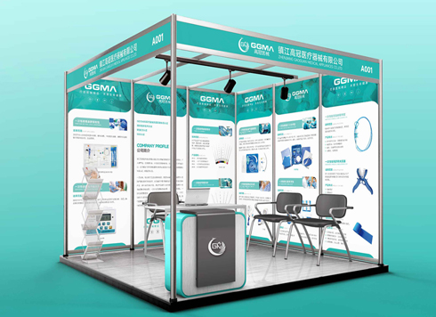 Design of Exhibition Posters for Medical Device Standards
XiYue is designing an exhibition booth post ...
-
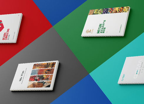 Collection of Brochure Design Cases in 2024 (Cover Series 02)
Our brochure design projects focus on diver ...
-
Same 32mo trim and 10.5 pt type, nearly 200 fewer characters per page than comparable books—adjust the type area or tighten leading first?
Date: Nov 22, 2026 Read: 4
-
Storefront is installed and packaging is printed—will newly added supporting graphics still match the earlier materials?
Date: Nov 21, 2026 Read: 8
-
Why does a logo look gray when reversed out on dark paper boxes—and what should change in the mono version the maker asks for?
Date: Nov 20, 2026 Read: 10
-
Hardcover Cover Logo Foil Stamping: If Fine Strokes Smudge in the Proof, Should You Change Line Width or Switch Paper First?
Date: Nov 19, 2026 Read: 13
-
When only a palm-sized area is left on the back of the pack and the barcode, net content, and ingredient list are all crammed together, what should be protected first?
Date: Nov 18, 2026 Read: 18