


Why does a logo look gray when reversed out on dark paper boxes—and what should change in the mono version the maker asks for?
When a logo on a dark paper box or black storefront sign is to be reversed out, taking the light-background standard version and reversing it with one click is often enough on screen and for small-area digital printing. Once it goes into dark-paper printing, screen printing, hot foil stamping, embroidery, and illuminated letters, direct reversal often causes thin strokes to fill in, edges to bleed, and contrast to be insufficient from a distance. A more stable approach is usually to make a separate dark-background or mono version, adjusting line weight, inner white space, minimum size, and contrast treatment item by item, rather than only replacing the color with white.
Why direct reversal on a dark background easily goes wrong
Reversed-out white on screen is additive light: the brighter the light color, the clearer it looks. Printing a reversal is ink coverage: printing a light color on a dark background depends on opacity and ink film thickness. The two logics are almost opposite, so a reversed-out artwork that looks crisp on screen often appears gray and fuzzy when printed on dark paper, with edges less clean than on screen.
Dark backgrounds also change the visual weight of strokes. Light colors have strong contrast on dark grounds, making thin strokes look even thinner; edges are more easily consumed by paper texture and ink spread. Mono processes such as screen printing, hot foil stamping, and embroidery have no grayscale transition, so thin lines and small sharp corners are more easily lost. Based on common experience in 2026 packaging and storefront delivery, judgment should not rely only on enlarging the electronic artwork; the substrate, process, and final viewing distance should be considered together.
- Uncoated dark paper: ink penetrates the fibers, and edge spread commonly runs 0.1–0.3 mm (experience range).
- Screen printing: affected by mesh and squeegee; thin lines below a typical 0.2–0.3 mm easily break.
- Hot foil stamping: temperature and pressure fluctuate, so sharp corners and small text easily fill in.
- Embroidery: limited by stitch spacing; details are consumed by stitches.
- Illuminated letters: limited by letter-shell width and LED layout; structures that are too thin cannot be made.
Separate the three dark-background scenarios first—don’t use one reversed-out artwork for everything
Treating "dark background" as one single thing is the starting point for rework. According to 2026 project delivery habits, dark-background scenarios should be divided into at least three types: multi-color or four-color printing on dark substrates; mono processes (screen printing, hot foil stamping, laser, embroidery); and illuminated or backlit applications. The three have different requirements for the logo, and few cases can be covered by one set of artwork.
- Multi-color printing on dark paper: some layering can be retained, but insufficient opacity and show-through must be handled; light colors often need a white underlay or a different process.
- Mono processes: usually only solid color or pure white is retained; gradients and shadows basically fail, so a separate mono artwork is needed.
- Illuminated or backlit: what matters is the overall silhouette and halo; thin lines and small text are the first to fail.
After classification, decide whether to "revise the existing artwork" or "make a separate version": if it falls into only one category, revision is usually enough; if it must be used across all three, a separate version often has to be built. Getting this judgment clear can save time in repeated proofing and multi-party communication later.
What to change in a dark-background logo: line weight, inner white space, minimum size, and contrast treatment
What to change in a dark-background version can be viewed in four steps, usually line weight first, then inner white space, then minimum size, and finally contrast treatment. Reversing the order easily leads to wasted changes: adjusting contrast first can mask line-weight problems, and after line weight is fixed, the work has to be redone.
- Change line weight: uniformly thicken thin lines in the light-background version that fall below the process lower limit, commonly to 1.2–1.5 times the original line weight (experience range), while preserving the original thick-thin rhythm to avoid making the whole mark uniformly thick.
- Change inner white space: negative space on a dark background is easily invaded by ink, so letter counters and cut-out areas in graphics should be appropriately enlarged to avoid filling into a solid block after reduction.
- Change minimum size: for the same logo, the minimum usable size of a dark-background version is commonly 10%–30% larger than the light-background version (experience range). Work backward from the minimum use scenario first, rather than judging from a large image.
- Change contrast treatment: for mono processes, deliver a solid-color or pure-white mono artwork directly; for dark-paper printing, an extremely fine outline or white edge can be added, but the outline width must be printable—adding it too thin is the same as not adding it.
Each step must land on "what counts as acceptable": after thickening line weight, print a small sample at the minimum use size; if strokes do not break and counters do not fill in, that item passes; otherwise, go back and adjust again.
What is the difference in cost and lead time between direct reversal and a separate dark-background version?
Not every project is worth building a separate version. Two options can be roughly compared, then decide based on material quantity and the number of makers:
- Option A: directly reverse the existing artwork. Fewer design changes, commonly deliverable within half a day; but the probability of proofing rework is higher. When storefront panels or packaging are redone, the schedule commonly extends by 1–2 weeks (experience range), with the cost mostly falling on the production side.
- Option B: make a separate dark-background mono version. Design and drawing commonly increase by 0.5–2 working days, and proofing commonly takes 1–2 rounds; more time is spent upfront, but when the artwork is reused across multiple materials and multiple makers later, the version is clearer and rework risk is lower.
The difference between the light-background standard version and the dark-background dedicated version can also be compared by several dimensions: in line weight, the standard version follows the design artwork, while the dark-background version is commonly thickened to 1.2–1.5 times; in minimum size, the dark-background version is commonly 10%–30% larger; in color, the dark-background version is mostly mono or pure white; in applicable processes, the standard version corresponds to light-background printing, while the dark-background version corresponds to screen printing, hot foil stamping, embroidery, and illuminated letters. In production cost, the dark-background version requires one more drawing version, commonly adding a small amount of design time, depending on quantity (experience range).
At delivery: what goes wrong when only a PNG is given with “reverse it out”?
A common situation in projects is that the client provides only a screen-use PNG and says "reverse it out." The storefront factory makes it as illuminated letters, but thin strokes and sharp corners cannot be produced; only after the lightbox face is installed is it found to be unclear from a distance, and finally the artwork is revised and the panel redone, adding one to two weeks to the schedule (experience range). At the time, the constraints were a fixed budget, a tight schedule, and no original vector artwork yet. The approach was to first get back the vector source file, redraw the line weights according to the lower limits of the illuminated-letter process, and issue a mono artwork for the maker to proof and confirm. The cost was two to three extra days of artwork revision upfront, but it avoided redoing the entire panel. This kind of on-site experience shows that a dark-background version is not just one more drawing; it writes the maker's process lower limits into the file in advance.
How should this dark-background logo version be accepted?
Acceptance cannot rely only on enlarging the artwork on screen. The criteria for a dark-background version are three views: "reduced, from a distance, and in mono." Reduce to the minimum use size and see whether strokes are still present; step back to the actual viewing distance and see whether the silhouette is clear; convert to mono and see whether recognition still holds.
- Print at the minimum size and check that strokes are continuous and counters do not fill in.
- Check the silhouette at the real viewing distance (e.g., 3–10 m for a storefront), not only up close.
- After converting to grayscale or mono, the mark can still be recognized.
- Have the maker proof according to the actual process, rather than confirming only the electronic artwork.
- Counterexample: signing off after viewing the reversed-out artwork only on a large screen is a high-frequency starting point for rework of dark-background materials.
Where it applies—and where it does not
A dedicated dark-background version suits these situations: the brand needs to go onto dark packaging, black storefront signs, or mono-process materials, or it needs to be handed to multiple makers for separate production. Conversely, if it is used only online on light backgrounds, or if there are almost no dark-background and mono materials within a year, there is no need to build a dedicated dark-background version; use the light-background standard version instead. Making one unnecessarily can easily cause confusion with the standard version.
- Suitable: dark packaging, storefronts and illuminated letters, screen printing/hot foil stamping/embroidery, multi-maker collaboration.
- Not necessary: online-only use, light-color printing only, very few materials and no mono processes.
- Boundary: a dark-background version is part of version management, not "one more drawing"; first define where it will be used and who will make it, then decide whether to create it. If it is only one-off small-area digital printing, directly reversing the existing artwork may also be enough, but the proofing confirmation step must be accepted.
Common questions
Why does a logo still look gray after being changed directly to pure white on a dark background?
Changing the color alone is not enough. Dark paper absorbs ink, mono processes have no grayscale, and thin lines and counters are still consumed; pure white also needs to be combined with thickening, enlarged inner white space, and proofing confirmation.
Can gradients and shadows in a logo be retained when storefront illuminated letters are used?
Illuminated letters and most mono processes cannot produce fine gradients. Usually the silhouette and main shapes are retained, and simplifying gradients to one or two colors is more stable; thin lines must also be thickened according to the letter-shell lower limit.
What is the smallest size a dark-background logo can be made?
There is no universal number; it depends on the process and viewing distance. For the same logo, the dark-background version is commonly 10%–30% larger than the light-background version, and the final criterion is that it can be seen clearly in the maker's proof.
When a partner asks for logo files, should the reversed-out version be provided as well?
If the partner will use it on dark or mono materials, it is advisable to provide it together with usage instructions, stating the minimum size and applicable processes, to reduce errors from the partner reversing it on their own.
If dark packaging, storefronts, or mono-process materials are to be implemented in the near future, first confirm the process lower limits with the maker, then decide how far the dark-background version should be adjusted; if it is only for online or light-color printing, use the standard version and there is no need to build a separate version for reversal.
-
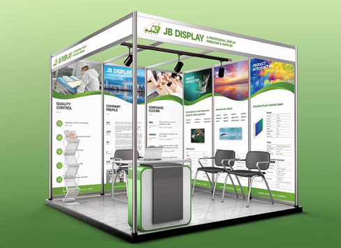 Booth Poster Design for Professional Monitor Product Suppliers
The standard exhibition booth poster projec ...
-
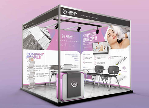 Design of Standard Exhibition Booth Posters for Beauty Instruments
Carefully designed a standard exhibition bo ...
-
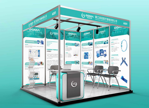 Design of Exhibition Posters for Medical Device Standards
XiYue is designing an exhibition booth post ...
-
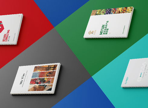 Collection of Brochure Design Cases in 2024 (Cover Series 02)
Our brochure design projects focus on diver ...
-
Same 32mo trim and 10.5 pt type, nearly 200 fewer characters per page than comparable books—adjust the type area or tighten leading first?
Date: Nov 22, 2026 Read: 4
-
Storefront is installed and packaging is printed—will newly added supporting graphics still match the earlier materials?
Date: Nov 21, 2026 Read: 7
-
Hardcover Cover Logo Foil Stamping: If Fine Strokes Smudge in the Proof, Should You Change Line Width or Switch Paper First?
Date: Nov 19, 2026 Read: 13
-
When only a palm-sized area is left on the back of the pack and the barcode, net content, and ingredient list are all crammed together, what should be protected first?
Date: Nov 18, 2026 Read: 18
-
The event poster already went out in the group chat once, and now it suddenly needs to be printed as A1 for the door—can we just use the original file to print?
Date: Nov 17, 2026 Read: 21