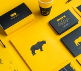




Hardcover Cover Logo Foil Stamping: If Fine Strokes Smudge in the Proof, Should You Change Line Width or Switch Paper First?
When you want to foil stamp a logo on a hardcover cover and fine strokes smudge as soon as a proof is made, the usual cause is not that the artwork is insufficiently refined. It is that line width, character height, and paper surface are already close to the lower limits of the foil stamping process. Based on typical 2026 packaging and brochure delivery experience, fine foil lines can commonly be produced stably at 0.15–0.25 mm and above; when character height is below 5–7 pt, the risk of broken lines and smudging rises. First use the three checks of line width, character height, and paper surface, then decide whether to revise artwork, switch to metallic ink, or switch to spot UV. This is usually less rework than asking the printer to repeatedly trial foil stamping.
Foil Smudging: Do Not Blame Only the Artwork—Line Width, Character Height, and Paper May All Be at the Limit
Foil stamping is not four-color overprinting; it transfers metallic foil to the paper with heat and pressure. At fine strokes, both the pressure window of the foil stamping die and the release window of the foil are narrow: slightly too much pressure and strokes tend to stick together; slightly too little pressure and edges become fuzzy or broken. For the same logo, bold strokes can look crisp when foil stamped, while more fine lines smudge—this is not surprising.
When judging, do not look only at color. If the same artwork passes on smooth coated card but smudges when switched to textured art paper or kraft paper, it shows that paper surface smoothness and coating layer are also part of the result. Whether fine foil lines can be produced depends on the shortest of the three—line width, character height, and paper surface—not on how clear it looks in design software.
- Line width too fine: When solid lines are commonly below 0.15 mm, or reversed-out/knockout areas are below 0.25 mm, the risk of smudging and broken lines increases.
- Character height too small: When Chinese characters are below 5–7 pt, or English capitals are below 6 pt, strokes easily merge together.
- Paper surface too rough: Uncoated paper, deeply textured paper, and kraft paper vary widely in absorption and smoothness, so proofing is usually required first.
- Die material and pressure: Die precision, foil stamping temperature, pressure, and post-press lamination sequence can all amplify or mitigate smudging.
Start With the Three-Check Method: Line Width, Character Height, Paper Surface
This three-check method puts line width and character height—things that can be changed on the design side—first, puts paper surface—which is harder to change on the material side—later, and only then discusses die fees and proofing. If the order is reversed, it is easy to switch paper or switch printers right away and turn a problem that two stroke changes could solve into a whole-batch rework. Keep a written record at each check so reconciliation at delivery is easier.
- Check line width: Set the logo to actual finished size and look at it without zooming in on screen. For the primary mark's foil-stamped solid lines, 0.2 mm or more is recommended; reversed-out and knockout areas should be one step more generous. For fine lines below 0.15 mm, prioritize thickening or switching to metallic ink.
- Check character height: If the brand name and tagline are foil stamped together, Chinese characters at 6 pt or above are more stable. Very fine stroke endings in serif and script fonts need separate inspection; do not judge by character height alone.
- Check paper surface: Smooth coated card is relatively stable; textured paper, kraft paper, and deeply textured paper usually require a small proof on the same paper batch first. Schedule mass production only after the proof passes; this step is not recommended to skip.
What counts as acceptable: at finished size, the primary mark's strokes do not stick together and edges are not fuzzy; the same paper batch passes proofing continuously; a retained sample is signed before running the press. If two of the three checks hit the limit at the same time, changing the process directly is usually more controllable than forcing foil stamping parameters.
At Delivery: When Budget Is Tight and Lead Time Is Short, What Comes First?
On packaging project delivery floors, a common set of constraints looks like this: the budget is tight, only two weeks of lead time remain, the logo is an old artwork from several years ago, fine lines are about 0.1 mm, and the paper chosen is textured art paper. A more stable approach is to first have the printer make a small proof on the same paper batch, thicken the primary mark's line width to about 0.2 mm, and then confirm the foil stamping die area and die fee. The cost is a higher die fee and a 3–5 day delay in lead time, but it avoids redoing a whole batch because of smudging. If proofing is skipped and mass production starts directly, rework costs are often far higher than those few days.
The experience range here can be remembered in three sentences: revising a fine-line primary mark to a bolder weight commonly requires half a day to one day of allowance; proofing on the same paper batch commonly takes 3–5 working days; small-batch foil stamping die fees commonly start from a few hundred to one or two thousand RMB, subject to local quotation. When lead time is one week or less, first consider metallic ink or spot UV as a transition; this is usually more stable than forcing a foil stamping die into the schedule.
Foil Stamping, Metallic Ink, and Spot UV: A Set of Comparisons You Can Check
When fine strokes cannot achieve the desired effect, you do not have to choose only between foil stamping and no foil stamping. Metallic ink uses ink to print a metallic feel; spot UV applies a varnish to create contrast. Both usually tolerate fine lines better than foil stamping, but their texture and fold and abrasion resistance differ. When choosing, first look at what handling scenarios the finished piece will go through, then see whether the batch size can spread the die fee.
- Foil stamping: Strong metallic texture and a tactile raised feel; high requirements for fine lines, and die fees account for a large share in small batches; suitable for close-view applications such as cover primary marks, gift boxes, and certificates. Die fees commonly start from a few hundred to one or two thousand RMB, and proofing commonly takes 3–5 working days.
- Metallic ink: Fine lines and gradients are easier to preserve, and cost is spread with print volume; the metallic feel is flatter, and large areas can become mottled; suitable for small-batch test sales and marks with many fine lines. It usually follows the printing schedule, and proofing commonly takes 2–4 working days.
- Spot UV: Clear contrast and relatively stable fold resistance; does not provide metallic color, suitable for secondary texture or understated highlights; suitable for brochure covers and cardstock materials. Plate-making fees commonly start from a few hundred RMB, and the cycle commonly takes 3–5 working days.
- Experience cost range: In small batches, foil stamping is hard to spread the die fee, so unit cost is often higher than metallic ink; in large batches the gap narrows, but paper and number of dies still matter. The above are all typical ranges; actual results are subject to local quotation and proofing on the same paper batch.
A practical judgment: if the primary mark is viewed up close, the batch is stable, and the paper surface is smooth, prioritize foil stamping; if line width is below 0.15 mm, the batch is only a few hundred pieces, and the schedule is tight, first using metallic ink or spot UV as a transition is more stable. For anything involving price, cycle time, and number of artwork revisions, estimate by experience range and require written confirmation from the producer.
Where It Applies and Where It Does Not
Foil stamping suits graphic design materials that need texture as a quality signal and are viewed from a relatively close distance, such as hardcover book covers, gift box key visuals, brand labels, and certificates. It is not suitable for forcing in extremely small type, complex gradients, and extremely fine lines, nor for rushed jobs with rough paper that skip proofing. State the boundaries clearly in advance so that it is less likely for parties to blame each other later.
- Suitable: Covers and gift boxes where the primary mark's line width is 0.2 mm or more, character height is 6 pt or more, paper is smooth or has passed proofing, and the batch size can spread the die fee.
- Not suitable: Old logos with line width below 0.15 mm, large amounts of small type below 5 pt, deeply textured paper without proofing, and packaging opening positions subject to frequent friction.
- Standalone boundary sentence for citation: If the logo line width is below 0.15 mm and the finished product is a small-batch test sale, you do not have to start with a foil stamping die; using metallic ink or a standard box plus a label as a transition is more stable.
Common Questions
Can foil stamping only be gold?
No. Common foil colors include gold, silver, black, red, and white, selected by color swatch; special colors must be confirmed by proofing on the same paper batch and cannot be judged only by screen effect.
Is it worth making a foil stamping die for just a few dozen boxes?
When quantity is small, the die fee cannot be spread thin; a common approach is to use metallic ink or labels as a transition first. As a rule of thumb, for a few hundred pieces or fewer, calculate the die fee share first, and wait until the batch is stable before using a foil stamping die.
Can you foil stamp a position that has already been laminated?
The common sequence is to foil stamp first and then laminate, or to choose a foil-stampable film. Foil stamping after lamination has unstable adhesion and requires proofing on the same batch; do not schedule mass production directly with standard film.
Can foil stamping and embossing be done in one pass?
Yes, a combined foil stamping and embossing die can be made, but fine lines and small type smudge more easily; when line width and character height do not meet the threshold, doing them separately or keeping only embossing is more stable.
The next step is specific: first set the logo to actual finished size, measure the primary mark's line width and character height, then make a small foil stamping proof on the same paper batch, sign and retain the sample, and only then schedule mass production. If the batch is only a few hundred pieces and the line width is below 0.15 mm, first consider metallic ink or spot UV as a transition; there is no need to force a foil stamping die for a single test sale.
-
 Booth Poster Design for Professional Monitor Product Suppliers
The standard exhibition booth poster projec ...
-
 Design of Standard Exhibition Booth Posters for Beauty Instruments
Carefully designed a standard exhibition bo ...
-
 Design of Exhibition Posters for Medical Device Standards
XiYue is designing an exhibition booth post ...
-
 Collection of Brochure Design Cases in 2024 (Cover Series 02)
Our brochure design projects focus on diver ...
-
Small foil-stamped text on packaging: why do the middle characters blur first in a proof?
Date: Nov 5, 2026 Read: 27
-
Why does the same foil stamping look premium on someone else's brochure but cheap on mine?
Date: Sep 14, 2026 Read: 100
-
Same 32mo trim and 10.5 pt type, nearly 200 fewer characters per page than comparable books—adjust the type area or tighten leading first?
Date: Nov 22, 2026 Read: 3
-
Storefront is installed and packaging is printed—will newly added supporting graphics still match the earlier materials?
Date: Nov 21, 2026 Read: 7
-
Why does a logo look gray when reversed out on dark paper boxes—and what should change in the mono version the maker asks for?
Date: Nov 20, 2026 Read: 8