


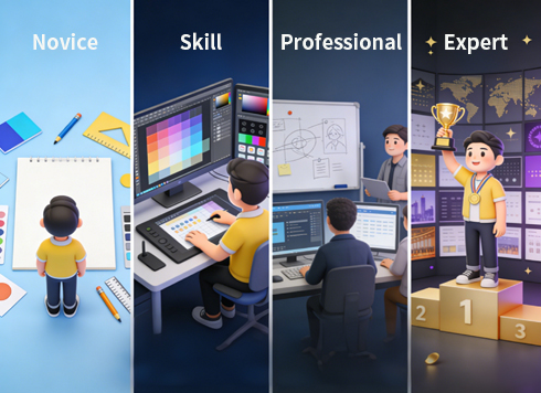
From Novice to Expert: A Complete Step-by-Step Solution for Advancing Graphic Design Skills
In the current era dominated by visual communication, graphic design has become the core bridge connecting brands and users. However, many designers often face predicaments such as "disconnection between theory and practice", "no clear direction for skill improvement", and "lack of commercial value in works". Combining core theories of the graphic design industry, practical cases and viewpoints from authoritative materials, this paper constructs a full-process solution from solidifying fundamentals to shaping competitiveness, providing actionable growth paths for designers at different stages.
I. Breaking the Fundamental Dilemma: Resolving the Lack of Design Logic – Building the Three Pillars of Design Thinking
The common problems of novice designers, such as "self-indulgent creation" and "vague information transmission", stem from the lack of design thinking. By building the three pillars of "audience insight - visual language - layout logic", we can fundamentally solve the core pain point of aimless design.
1. Audience-Centric: Solving the "Mismatch Between Design and Needs" Issue
The essence of design is to serve needs, and creations divorced from the target group will inevitably lose value. The core solution at this stage is to establish a closed-loop thinking of "user persona - demand matching - visual implementation".
First, clarify the core attributes of the target group through data research or user interviews: age determines visual complexity (e.g., avoid fine-grained elements for children), cultural background influences symbol selection (e.g., traditional patterns for Chinese-style design, minimalist symbols for international brands), and usage scenarios determine presentation forms (high contrast for outdoor posters, compressed visual hierarchy for mobile design). Second, anchor the brand tone based on user personas to form a "crowd - tone - vision" correspondence – for example, children's education design uses high-saturation colors + rounded graphics to convey affability, while business consulting design uses cool tones + sans-serif fonts to strengthen professionalism. In a revision case of an education APP, the design team found through user personas that the core users were parents of 3-6-year-old children. Thus, they simplified the originally complex interface, adopted warm yellow as the main color and cartoon icons, making it more efficient for parents to guide their children to use it. After the revision, the user retention rate increased by 23%.
2. Precision of Visual Language: Solving the "Chaotic Use of Colors and Fonts" Issue
Colors and fonts are the basic communication tools of design, and their abuse will lead to the failure of information transmission. The solution needs to rely on psychological theories to establish a corresponding mechanism of "emotional needs - visual selection".
In color application, while following the color composition theory, focus on emotional transmission: complementary colors (e.g., red and green) are used in scenarios requiring strong contrast (e.g., promotional posters), and analogous colors (e.g., blue and cyan) are used to create a harmonious atmosphere (e.g., tech product brochures). From the perspective of emotional matching, blue is suitable for fields that need to convey trust such as finance and medical care, while red is applicable to scenarios that need to stimulate action such as e-commerce promotions and public welfare calls. In the interface design of a bank APP, blue is used as the main color with light gray as the auxiliary color, which increased users' perception of fund security by 37% – this is the practical value of color psychology.
Font selection should balance style and readability: rounded fonts (e.g., Source Han Rounded) are suitable for brands that need affability such as parent-child and catering, serif fonts (e.g., Source Han Serif) are suitable for traditional fields such as culture and publishing, and sans-serif fonts (e.g., Source Han Sans) are the first choice for modern brands such as technology and Internet. It should be noted that no more than 3 fonts should be used in the same screen, and the font hierarchy between titles and body text should be clearly distinguished to solve the problem of "reading confusion caused by font stacking".
3. Layout Composition Logic: Solving the "Cluttered and Unfocused Screen" Issue
Layout is the skeleton of information, and a chaotic layout will directly block information transmission. The core solution is to use the three principles of "hierarchy construction - alignment norms - balance control" to create an orderly and focused screen.
Hierarchy shaping can be achieved through "size contrast + white space guidance": enlarge core information (e.g., poster main title, product core selling points), reduce and weaken secondary information, and use white space to separate different information modules to avoid element crowding. S-shaped or Z-shaped visual guide lines can naturally guide users' sight to ensure the orderliness of information transmission. Alignment is the key to improving screen neatness – whether left-aligned, center-aligned or right-aligned, the alignment benchmark of elements at the same level must be consistent to avoid "visual drift". Although symmetrical composition can strengthen a sense of balance, it is necessary to break the rigidity of mechanical symmetry through changes in local elements (e.g., color differences, detail decorations). In the design of a corporate brochure, the left side adopts a combination of corporate LOGO and text, and the right side echoes with abstract graphics of the same size, which not only maintains symmetrical balance but also adds a sense of design.
II. Skill Advancement: Resolving "Difficulty in Applying Theories" – Four Paths to Transform Knowledge into Practice
After solidifying the fundamentals, designers often face the dilemma of "understanding theories but failing to create good works". Through the advanced path of "aesthetic accumulation - tool proficiency - theory internalization - practical feedback", deep integration of theory and practice can be achieved to break through capacity bottlenecks.
1. Aesthetic Cultivation: Solving the "Creative Exhaustion" Issue
Aesthetics is the core competitiveness of design, and low aesthetics will lead to works lacking attractiveness. The solution is to establish an aesthetic improvement system of "active input - classified precipitation - inspiration transformation".
Spend 30 minutes every day browsing professional platforms such as Dribbble and Behance – not only appreciate works but also conduct structured analysis: record the color scheme, composition logic, and information hierarchy processing methods of works, and think about "how the design solves user needs". At the same time, classify and collect design materials in life (e.g., street billboards, product packaging, book covers) to build a "color palette", "composition library", and "font library". Record inspiration with hand-drawn sketches in a timely manner to avoid creative loss. This "continuous input + immediate precipitation" method can quickly improve aesthetic judgment.
2. Tool Proficiency: Solving the "Low Efficiency and Poor Effect" Issue
Software tools are the implementation carriers of design, and unfamiliarity will restrict creative expression. The solution is "in-depth cultivation of core tools + empowerment of auxiliary tools" to achieve efficient creation.
First, master the positioning and application scenarios of the three core tools: Photoshop focuses on image processing (e.g., photo retouching, texture making), Illustrator is good at vector graphics (e.g., LOGO design, icon making), and InDesign specializes in typesetting (e.g., brochure, magazine design). Improve operation efficiency by memorizing shortcuts (e.g., Ctrl+J to duplicate layers in Photoshop, Ctrl+2 to lock objects in Illustrator), and practice practical cases in a targeted manner (e.g., design a brand LOGO with Illustrator, typeset a corporate brochure with InDesign) to avoid the problem of "only knowing tool functions but not practical application".
Second, rationally use AI-assisted tools to improve creative efficiency, such as generating initial concept sketches with MidJourney and quickly generating color schemes with Figma plugins. However, it is necessary to clarify the auxiliary positioning of AI – core creativity and detail optimization still need manual control to avoid becoming a "technology porter".
3. Theory Internalization: Solving the "Disconnection Between Theory and Practice" Issue
Design theories are the guidance for practice, and rote memorization cannot exert their value. The solution is "systematic learning + case dismantling + active application" to realize the landing of theories.
Systematically learn the three basic courses of plane composition, color composition, and three-dimensional composition, understand the combination rules of points, lines and surfaces, the principles of color contrast and harmony, and the expression methods of spatial texture. Read authoritative books such as "Grid Systems in Graphic Design" and "The Non-Designer's Design Book", focus on the practical cases in the books, and analyze the application methods of theories in the cases. For example, after learning the grid system, try to typeset a product brochure with grid tools, directly transform theories into practice, and deepen theoretical cognition through the closed loop of "learning - dismantling - application".
4. Practical Feedback: Solving the "Self-Cognitive Bias" Issue
Working behind closed doors will lead designers to fall into a subjective perspective and fail to find problems in their works. The solution is to "participate in real projects + obtain diversified feedback" and iterate and grow in practice.
Take the initiative to participate in real projects (e.g., corporate brochure design, event poster production, public welfare advertisement creation), face practical problems such as customer demand changes and time node pressure, and exercise comprehensive abilities of "demand interpretation - creative landing - revision and optimization". After completing the work, obtain opinions through multiple channels such as peer review, professional community feedback, and customer evaluation, focusing on core issues such as "whether information transmission is clear", "whether it meets the needs of the target group", and "whether commercial value is up to standard" to avoid falling into the misunderstanding of "self-satisfaction". A novice designer optimized the color matching and information hierarchy based on feedback by participating in a community public welfare poster project, and the work was widely recognized by community residents – this is the value of practical feedback.
III. Pitfall Avoidance Guide: Resolving "High-Frequency Issues for Novices" – Targeted Solutions for Three Core Pain Points
Novices often fall into misunderstandings due to lack of experience in the design process. This section provides directly operable solutions for the three high-frequency issues of "element stacking", "uncontrolled color matching", and "oversight of details".
1. Element Stacking and Visual Chaos: Adopt "Subtractive Design"
Core Problem: Excessively pursuing "richness", using too many decorative graphics and font styles, resulting in core information being obscured.
Solution: Follow the principle of "first complex, then simple". After completing the first draft, conduct "element screening" – retain core information (e.g., title, core selling points, brand logo) and delete decorative elements irrelevant to the theme. Strengthen the focus through "contrast" by using differences in size, color, and virtuality/reality to highlight core content. For example, present the main title in large bold font and auxiliary information in small light-colored font to make the screen hierarchy clear. The first draft of a promotional poster had "unprominent promotional information" due to too many decorative patterns; during revision, redundant elements were deleted, leaving only product images, promotional slogans, and purchase buttons, resulting in a 40% increase in click-through rate.
2. Uncontrolled Color Matching and Style Fragmentation: Establish a "Color System"
Core Problem: Abusing high-purity contrast colors, or integrating multiple styles (e.g., cartoon and business) in the same screen, leading to visual incoordination.
Solution: First, determine the main color (accounting for 60%-70% of the screen), then select auxiliary colors (20%-30%) and accent colors (within 10%) based on the main color. Monochromatic gradient (e.g., dark blue - light blue, dark green - light green) is a harmonious color matching method easy for novices to master. If using contrast colors, neutral colors (black, white, gray) should be used to reconcile conflicts. In terms of style unification, after clarifying the design theme, all elements (fonts, graphics, colors) must revolve around the theme. For example, in business-style design, avoid using cartoon icons and rounded fonts to ensure style consistency.
3. Neglecting Details and Lack of Professionalism: Establish a "Detail Checklist"
Core Problem: Detail issues such as uneven font spacing, misaligned image edges, and low resolution reduce the professionalism of works.
Solution: Use grid tools to assist alignment during typesetting to ensure uniform element spacing; check letter spacing and line spacing in font design to avoid "crowding" or "looseness". Before output, confirm item by item against the checklist: whether the resolution of printed materials reaches 300dpi and that of screen-displayed works is 72dpi; whether images have rough edges and blend naturally with the background; whether there are typos in text and whether key information such as contact details is accurate. Establishing a habit of "detail checking" can greatly improve the professionalism of works.
IV. Future Layout: Resolving "Insufficient Competitiveness" – Building Core Advantages Through Three Trends
The graphic design industry is facing changes of dynamization, cross-domain integration, and AI-driven development. Mastering only basic skills is difficult to gain a foothold. By laying out three trends, long-term competitiveness can be built.
1. Integration of Dynamic Design: Enhancing the "Attractiveness" of Works
Static design can no longer meet users' demands for visual experience, and dynamization has become a new trend. The solution is to learn dynamic design tools such as After Effects and master basic micro-animation production – such as text fade-in, icon scaling, dynamic background gradient, etc., transforming static posters into dynamic promotional videos, or designing loading animations for APP interfaces. In the design of a brand LOGO, the designer made a micro-animation of "LOGO gradient expansion" based on the static LOGO, which increased the brand's communication effect on short-video platforms by 50%.
2. Cross-Domain Knowledge Integration: Enhancing the "Commercial Value" of Works
The ultimate goal of design is to realize commercial value, and the lack of cross-domain knowledge will lead to works being "good-looking but impractical". The solution is to supplement marketing and UX design knowledge: learn the AIDA model (Attention-Interest-Desire-Action) to enable design to guide user behavior; understand UX design principles (e.g., usability, consistency) to ensure that information transmission in posters, brochures and other designs conforms to users' reading habits. In the design of an e-commerce product detail page, the designer combined marketing knowledge to place the product's core selling points at the visual focus, paired with action-guiding elements such as "limited-time discounts", resulting in a 35% increase in conversion rate, reflecting the commercial value of design.
3. AI Collaboration and Ethical Boundaries: Balancing "Efficiency and Originality"
The popularization of AI generation tools has improved efficiency but also triggered disputes over originality. The solution is to clarify the principle of "AI assists creativity, humans dominate the core": use AI to generate multiple concept sketches, and conduct manual optimization and creative deepening based on the sketches; use AI to complete basic work such as image matting and color matching, and focus energy on core creativity and user demand interpretation. At the same time, ensure the originality of the core creativity and copyright ownership of works, avoid directly using complete works generated by AI, and adhere to the bottom line of design ethics.
Conclusion: Design is a Practice of "Solving Problems"
Graphic design is not pure artistic creation, but a "problem-solving method with vision as the carrier". From building basic thinking to improving practical skills, from avoiding pitfalls and correcting mistakes to laying out future trends, each link requires "theoretical guidance + practical polishing + continuous reflection". Kenya Hara, a Japanese designer, once said: "Design is not a skill, but a sensory ability to capture the essence of things." Designers need to maintain insight into life – capture needs from user behavior and find directions from industry trends; maintain curiosity about technology – take the initiative to learn new tools and theories. Only in this way can they achieve the transformation from novice to expert in the ever-changing industry and create excellent works with both aesthetic and commercial value.