



When a packaging crease runs through the net content line, should design move the text or should the printer make the crease shallower?
Conclusion first: when a packaging crease runs directly through a line of text, the more reliable fix is usually to move the artwork, not to ask the printer to make the crease shallower. A crease line is a stress concentration area during forming. Paper fibers are crushed there, and when the ink layer bends across the line it can chip, whiten, or crack. Making the crease shallower may reduce damage to the image, but the cost is often a box that does not form crisply and glue flaps that do not bond securely. Based on common 2026 packaging delivery experience, leaving a 2–3 mm experience range between important text and the crease line is more reliable. The exact choice depends on paper thickness, whether the box is laminated, and font weight; thin strokes and information such as net content and barcodes should generally get more clearance.
When a crease line runs through text, do not blame print registration alone
Printers usually impose artwork according to the dieline, and crease positions are determined by the box structure; this is not the same issue as press registration. When a design is laid out only on a flat die-cut drawing, the crease often appears on screen as a light reference line, and text is set in normal reading order, so the problem is easy to miss during artwork review.
The problem often shows up in proofing, gluing, and forming: at a crease, white text breaks where fibers are crushed and the paper core shows through; laminated boxes whiten on both sides of the fold; dark solid areas develop light cracks across the line. By the time these issues appear, printing plates are often already made, so rework is no longer just changing one line of text.
- Broken strokes: thin strokes break at the bend after crossing the line and look like missing characters from a distance.
- Color cracking: dark backgrounds or large solid spot-color areas crack at the crease and expose the white paper.
- Whitening: laminated boxes turn white on both sides of the crease, and it becomes more obvious with repeated folding.
- No break but dull: the character is still intact, but the reflection changes at the folded corner and it looks like a dirty patch when read.
Three checks: structural lines, artwork tiers, and process overlap
Crease problems often result from the combination of structural lines, artwork content, and finishing processes; looking only at the design file or asking only the printer can easily miss the cause. Based on 2026 packaging project delivery practice, this order should not be reversed: first clarify the structural lines, then decide which content must remain intact, and finally check whether finishing processes amplify the risk.
- Check structural lines: obtain the dieline from the client or structural designer, color-code cut lines, crease lines, glue flaps, wrap edges, and bleed by layer, and confirm which lines will fold during forming.
- Check artwork tiers: divide the layout content into three categories: must remain intact, can be folded, and can be trimmed. Only the first category needs strict clearance.
- Check process overlap: check whether lamination, UV coating, foil stamping, or embossing crosses the crease line. At crossing areas, the probability of cracking or delamination after folding increases.
If you move positions before assigning tiers, you may also move decorative patterns that could have stayed, and the layout becomes crowded; if you decide positions before checking processes, you may waste a full artwork revision on a line that will not actually fold.
Structural lines: each line has a different keep-out zone
The crease line is not the only line to avoid. Glue flaps and wrap areas are covered after forming, so artwork placed there is effectively wasted; cut lines need bleed outside them, and content set too close to the edge will be trimmed off. In experience, paper box crease width commonly falls in the 0.5–1.5 mm range. The thicker and heavier the paper, the wider the crease, and the larger the clearance area needed.
Artwork tiers: which text should not break at all
Not all content crossing a line needs to be changed. Information that must be read completely, such as the brand name, main selling point, net content, and barcode, belongs to tier one; large background textures, solid color blocks, and decorative patterns belong to tier two, where crossing the line is usually acceptable; tier three is auxiliary graphics that can be trimmed or covered.
- Tier one: leave a 2–3 mm experience range from the crease line; use a little more clearance for thin-stroke fonts.
- Tier two: may cross the line, but accept that the color at the bend may be slightly darker or lighter.
- Tier three: glue flaps, wrap edges, and bleed areas; as a rule, do not place content that needs to be read there.
Process overlap: be careful when lamination or foil stamping crosses a crease
In laminated boxes, the film and paper have different stretch behavior. When the crease is folded, the film is stretched and white edges easily appear. When foil stamping or embossing crosses a crease line, the metal layer has weaker adhesion at the bend. In such cases, even if the text itself does not cross the line, it is advisable to keep process areas at least 2 mm away from the crease line.
At delivery: an old dieline, a five-day schedule, and last version's PDF
A common set of constraints looks like this: the budget is limited, the schedule is compressed to about five days, the structure still uses the previous version's old dieline, and the client-supplied assets are still the previous version's PDF. The approach is to first obtain the dieline, mark the three vertical crease lines separately, and then move the main headline and net content into the safe zone. The front panel becomes tighter, so one selling point has to move to the side. The result is half a day of extra artwork revision, but it avoids remaking printing plates and redoing proofs after forming; based on experience range, this often saves 3–7 days of rework. This judgment is still common in short-cycle 2026 packaging projects, provided the dieline data can be confirmed rather than setting text from a chat screenshot alone.
Moving artwork, making the crease shallower, or changing the structure: how do the three options compare?
The three approaches differ considerably in cost and risk. The main basis for judgment is which tier the crossing content belongs to and whether the layout still has room. The figures below are experience ranges and will vary with box style, paper, and printer equipment.
- Path A: move artwork and keep a safe zone. Artwork revision commonly takes 0.5–1 day and adds almost no production cost; suitable when the layout has room and the crossing content is movable text.
- Path B: ask the printer to make the crease shallower. It adds almost no artwork revision cost, but increases the risk that the box does not form crisply and the glue flaps do not bond securely; only suitable when graphics cross the line slightly and the box structure does not rely on that crease for strength.
- Path C: change the structure or box style. This includes dieline, proofing, and plate remake; the lead time commonly falls in the 1–3 week range and the cost is clearly higher; suitable when the crease runs through information that must remain intact and the layout has no remaining room.
In terms of order, try A first; if A does not work, evaluate C; use B only as a temporary transition. Treating B as a long-term solution often trades forming quality for image completeness, and the cost shows up in gluing and transport.
For approval, check the sheet that has actually been folded, and watch for commonly missed issues
The acceptance criterion is not complicated: make a white sample or digital proof, fold it in the actual box style, and check at normal reading distance whether tier-one information on both sides of the crease remains intact. Zooming to 300% on screen cannot determine color cracking; only folding makes it count.
- Looking only at a flat PDF and not the dieline layer; the crease line does not exist in the artwork at all.
- Judging character integrity from a 3D mockup; a rendering will not show crease-related broken characters.
- Skipping the white sample and going straight to mass production, then discovering the problem only at gluing.
- Setting text in the glue flap area, where it is completely covered after forming.
- Lamination or foil stamping crossing the crease, which increases the risk of delamination and white edges.
Where this applies and where it does not
Situations suitable for this check order: folding versions of cartons, corrugated boxes, hardcover covers, hang tags, and stickers, especially when the brand name, net content, or barcode is close to a crease. Situations where it should not be applied directly: single-curved flexible packaging, round can labels, tin boxes, and other carriers without crease lines; their problems usually relate to curved-surface artwork layout and label misalignment. For internal transfer boxes that only print identification information and where a break at the crease does not affect use, there is no need to add artwork revision cost for this issue.
Frequently asked questions
How far should text be from a packaging crease line to be safe?
The typical range is 2–3 mm. The thicker the paper and the thinner the type, the more clearance should be left; for thin strokes and information such as net content, at least 3 mm is recommended.
If a laminated box turns white at the crease, is the film the wrong choice?
In most cases it is not just the film. The crease passes through a solid color area or laminated area, and the film is stretched during folding; first offset the artwork from the crease line and then verify.
Can asking the printer to make the crease shallower work as a temporary fix?
It can serve as a temporary transition, but a crease that is too shallow can make the box form poorly and increase the risk of glue failure; it is not recommended as a long-term solution.
If the client insists on text crossing the crease for a visual effect, what is a good compromise?
Change the crossing part into a decorative element and place key information such as the brand name and net content on the side or back panel to preserve readability.
Can the crease line in a design file be used as a dashed reference frame?
Not recommended. Crease width and position are determined by the dieline. During layout, treat it as a keep-out zone rather than an ordinary reference line, or it can easily mislead production.
Next time a crease line runs through text, first obtain the dieline, assign artwork tiers, and then check whether processes cross the line. Most cases can be solved at the layout stage and do not need to wait for proofing rework. If the crease runs exactly through information that must remain intact and the layout has no remaining room, then consider changing the structure. The ranges above are based on common paper box delivery experience; the printer's white sample and structural confirmation should still be the final reference.
-
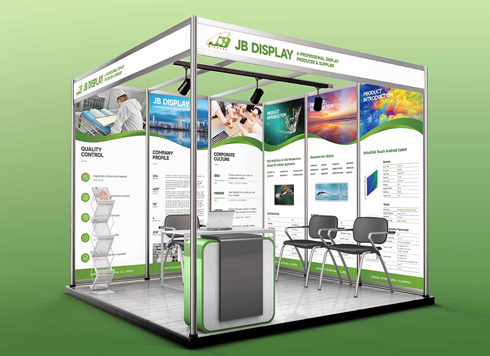 Booth Poster Design for Professional Monitor Product Suppliers
The standard exhibition booth poster projec ...
-
 Design of Standard Exhibition Booth Posters for Beauty Instruments
Carefully designed a standard exhibition bo ...
-
 Design of Exhibition Posters for Medical Device Standards
XiYue is designing an exhibition booth post ...
-
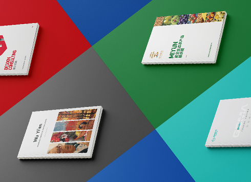 Collection of Brochure Design Cases in 2024 (Cover Series 02)
Our brochure design projects focus on diver ...
-
Same 32mo trim and 10.5 pt type, nearly 200 fewer characters per page than comparable books—adjust the type area or tighten leading first?
Date: Nov 22, 2026 Read: 4
-
Storefront is installed and packaging is printed—will newly added supporting graphics still match the earlier materials?
Date: Nov 21, 2026 Read: 8
-
Why does a logo look gray when reversed out on dark paper boxes—and what should change in the mono version the maker asks for?
Date: Nov 20, 2026 Read: 10
-
Hardcover Cover Logo Foil Stamping: If Fine Strokes Smudge in the Proof, Should You Change Line Width or Switch Paper First?
Date: Nov 19, 2026 Read: 13
-
When only a palm-sized area is left on the back of the pack and the barcode, net content, and ingredient list are all crammed together, what should be protected first?
Date: Nov 18, 2026 Read: 18