



The client asked for linen paper's feel, but the full-bleed dark cover prints unevenly—what can we do besides switching paper?
When a brochure cover is switched to textured art paper such as linen or watercolor, patchy dark solids and broken fine lines are usually neither because the paper is too rough nor because too much ink has been laid down. The paper's relief makes ink transfer and impression pressure uneven: the high points of the texture take more ink and the low points take less. On light colors this is invisible; on dark solids it shows as patches of density difference, and fine lines simply break at the low points of the texture. The suggested order is first to check whether texture depth matches the detail precision of the artwork, then decide whether to change paper, revise the artwork, or adjust the process, rather than just adding ink—textured paper problems are mostly not seen, but printed.
More than one cause for patchy dark solids on textured paper
Textured art paper has a pressed relief surface, not a flat coated surface. Under normal offset pressure, the paper is not truly flattened; ink lands first on the high points of the texture, while low points either take less ink or no ink at all, creating a visible density difference. Dark solids are one of the less forgiving types of artwork for density differences: a few percent density variation on the same sheet is almost invisible on light beige, but on dark blue, dark green, or dark brown it becomes cloudy mottling.
The second cause is differences in coating and ink absorption of the paper itself. With the same batch of art paper, it is common to have texture on the front and a flat back; the front's coating weight and ink absorption speed often differ from ordinary coated paper. If ink volume is still set by experience with coated paper, local ink pile-up or poor drying can easily occur. So on site, simply asking 'is this paper good?' means little; the question to ask is 'is this sheet suitable for this set of artwork?'
- The deeper the texture, the more obvious the density difference, and fine, shallow texture is much more forgiving than deep texture.
- The larger the dark solid area, the easier the cloudiness is seen; a full-bleed full-page layout is a relatively high-risk arrangement.
- Dark solids built from four-color overprints also add the risk of poor drying and set-off on the back.
- Matte lamination can only control reflection; it cannot restore ink that is already missing.
The printable lower limit for fine lines and small type on textured paper
On textured paper, what suffers more easily is not large dark areas but fine lines and small type. When line width approaches the amplitude of the texture relief, the printed line breaks and looks as if the printer did not print it solidly. Based on common 2026 brochure delivery experience, on linen and watercolor papers with obvious texture, fine lines should preferably be no thinner than 0.15–0.2 mm, and reverse fine lines should be relaxed further on that basis; body-level small type should preferably be no smaller than 6–7 pt, with a medium weight. These are experience ranges; the specific result still depends on the physical paper sample and proof.
A typical counterexample: a full-bleed dark blue cover with a line of 5 pt light reverse small type in the middle and a light outline around it—on textured paper this combination will most likely turn into a blur. Changing the weight, enlarging the type size, or moving this text to an untextured inside page is usually more effective than paying more for extra ink.
Another often overlooked point: texture direction affects fine lines differently. The warp and weft directions of linen texture, and the random relief of watercolor texture, make horizontal and vertical lines in the same file break to different degrees. Within the same layout, horizontal fine lines and vertical fine lines should preferably be assessed separately; do not use the effect of one line to represent all of them.
Check before sending to print in the order of 'material first, verification second, artwork revision last'
This sequence is divided into 'material first, verification second, artwork revision last' because reversing it easily wastes work: if the artwork is revised first and only then the paper is found unsuitable, the revision is wasted; if proofing comes before paper selection, the proof is wasted too.
- Set the paper sample: Get a physical paper sample, feel the texture depth and check surface flatness under natural light; do not rely only on the paper merchant's catalog or a screen preview.
- Run verification: Use the same batch of paper to proof a small combination sheet of 'dark solid + fine lines + small type.' Digital proofs on textured paper are usually too smooth and have limited reference value.
- Then revise the artwork: Adjust according to the verification result—thicken fine lines, reduce the area of dark solids or switch to spot color, move key small type out of the textured area, or switch to screen printing or foil stamping.
The step most often skipped among the three is the second. The cost of an A4 proof sheet commonly falls in an experience range of tens to one or two hundred RMB, far below a full reprint; the time saved by skipping this step is often not enough for the later rework.
Looking at the cost and lead time of four handling paths together
For the same problem of 'patchy dark printing on textured paper,' the four paths differ considerably in cost, lead time, and suitable use. Based on 2026 project delivery practice, they can be estimated roughly as follows:
- Change paper: Switch to art paper with a flatter surface and only slight grain. The effect is relatively reliable; the trade-off is reduced tactile feel and texture, and lead time commonly increases by 1–3 days (waiting for a paper sample or stock transfer).
- Keep the texture and revise the design: Reduce the area of dark solids, thicken fine lines, and move key text to light-background areas. The cost is mainly artwork revision time, suitable for projects with tight schedules and limited budgets; the typical range is an increase of 0.5–2 working days.
- Change part of the process: Switch dark blocks or key small type to screen printing, foil stamping, or embossing. Billed by number of plates and area; the experience range is usually a notch higher than four-color printing, with lead time increasing by 2–5 days.
- Add ink or run another pass: Looks easy, but the actual risk is relatively high—details blur, drying is poor, and set-off on the back occurs; not recommended as a routine solution.
Which path to choose depends mainly on whether this dark area is 'large but without detail' or 'small but with critical text.' For the former, changing paper or reducing area comes first; for the latter, changing the process comes first. In the brochures and brand materials actually handled, most cases use artwork revision first to protect the overall result, then separately upgrade the process for the cover key visual—concentrating the budget on the small area that is truly seen is usually more cost-effective than changing paper for the whole book.
On the delivery floor: a three-day schedule and a reprint when the client specifically asked for linen paper
The constraints were like this: the cover budget was tight, only three or four days remained in the schedule, and the client specified paper with 'a tactile feel.' The designer chose a deeply textured linen paper for a full-bleed dark green, output the fine-line logo at the original 0.1 mm level, and did not proof on the same batch of paper along the way. The result was broken fine lines and patchy dark color; in the end the cover had to be relaid out, a lighter-texture paper was used for a reprint, the schedule stretched by 2–4 days (experience range), and an extra reprint cost was paid.
This kind of on-site situation is not rare. The lessons come down to two sentences: textured paper must be decided before layout, not chosen after layout; and judgments should be based on a proof sheet made from the same batch of paper, not on catalog photos and screens. The cost of a reprint is usually higher than making a small proof sheet one day earlier.
Applicable scenarios and boundaries where it does not apply
Textured art paper is suitable for low-frequency, high-perception materials with little text: brochure covers, invitations, brand books, book covers, and outer wrapping paper for gift boxes. The value of such materials lies in feel and texture in the first place; texture is part of the design, and adjusting artwork precision for it is worthwhile.
The unsuitable cases are equally clear: text-dense manuals, contract-type printed matter with generally small type sizes, packaging where barcodes and QR codes must scan correctly on the first try, and large-volume low-cost single sheets. Using textured paper only raises the defect rate and communication cost. There is one more boundary worth remembering separately: textured paper cannot be used as a way to cover up insufficient design precision; paper changes cannot rescue problems in the layout itself.
Common questions
Is embossed paper completely unable to print dark solids?
It can print them. Uneven density is normal; common practice is to reduce the solid area, switch to spot color, or accept a slightly mottled texture in the design, rather than trying to force it flat by adding ink.
Is there a big difference between a digital proof and the actual press run?
Digital proofs on textured paper are often too smooth and do not show texture depth or ink absorption differences. A more reliable approach is to make a small proof on real paper from the same batch, then decide on the production order.
Can matte lamination press the mottling down?
Matte lamination mainly changes reflection; it does not solve an existing density difference and may bubble because of the paper's relief. Before lamination, confirm surface flatness and texture depth.
For only a few hundred copies, is it worth the trouble of textured paper?
Short-run digital printing loses detail more obviously on textured paper. For small quantities, it is advisable to enlarge and simplify key artwork, or use textured paper only on part of the cover and use flat paper for the inside pages.
If the cover is stuck at the step of 'whether to use textured paper,' the 2026 practice is to first request a physical paper sample, proof dark solids plus fine lines on the same batch of paper, and then decide the direction of artwork revision; for projects with tight budgets and schedules but high artwork precision, switching to flat paper is usually more cost-effective than spending more on process.
-
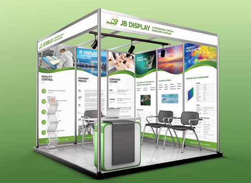 Booth Poster Design for Professional Monitor Product Suppliers
The standard exhibition booth poster projec ...
-
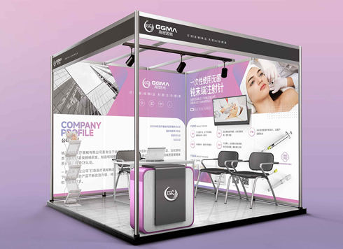 Design of Standard Exhibition Booth Posters for Beauty Instruments
Carefully designed a standard exhibition bo ...
-
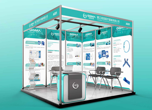 Design of Exhibition Posters for Medical Device Standards
XiYue is designing an exhibition booth post ...
-
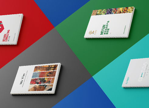 Collection of Brochure Design Cases in 2024 (Cover Series 02)
Our brochure design projects focus on diver ...
-
Black body text in a brochure shows a red fringe when zoomed in, while color photos on the same page look fine—is the black text set in four-color black or is the printer's registration off?
Date: Nov 2, 2026 Read: 2
-
When a client only needs a few price and size changes at project close but insists on layered PSD, is outlined AI plus a note enough?
Date: Nov 1, 2026 Read: 12
-
The same photo shows shadow detail on a phone but prints as solid black in a brochure: before sending to print, should you adjust the image first or ask the printer about total ink coverage?
Date: Oct 30, 2026 Read: 14
-
Matte-laminated sales cards won’t take ballpoint writing: change the film or leave the back blank when reprinting?
Date: Oct 29, 2026 Read: 19
-
The AI image looks clear on a phone, but the client wants it enlarged into a display board—should we regenerate the image or rework the layout first?
Date: Oct 28, 2026 Read: 21