



The same photo shows shadow detail on a phone but prints as solid black in a brochure: before sending to print, should you adjust the image first or ask the printer about total ink coverage?
When a photo prints as a muddy dark mass in a brochure, it is usually not because the original was shot too dark. The difference comes from how backlit additive screen color and reflective subtractive paper color express “dark”: once all four inks stack up in the shadows, tonal separation is easily flattened. In the common 2026 prepress delivery sequence, check first whether the original black point still holds separation, then check the converted total ink coverage and paper stock, and finally confirm with a physical proof. This is usually more reliable than simply brightening the whole image.
1. Screen shadows and paper shadows differ in three ways
A screen is backlit, so even pixels close to pure black can still show subtle differences. Printing applies ink to paper and relies on ambient light reflected into the eye; shadows mainly depend on cyan, magenta, yellow, and black stacking in the same area. The more heavily a shadow area is stacked, the more completely the paper surface is covered by ink, and the fewer transitions the eye can distinguish. So the problem is often not whether the original image is dark, but how much distinguishable difference remains after the shadows enter the printing conditions.
- Different color modes: Screen gamut is wider than printing ink gamut. Highly saturated shadow areas are compressed first when converted to CMYK, so detail is reduced earlier.
- Total ink coverage stacking: When the four-color total in shadows exceeds what the paper and press can tolerate, halftone dots easily fill in into solid areas and transitions are flattened.
- Different paper and finishing: Coated art paper, matte coated paper, offset paper, and recycled paper differ in ink absorption and surface reflection. Matte lamination suppresses reflection and makes shadows look deeper and duller; gloss lamination increases contrast but is more reflective.
2. Run the “four shadow checks” before sending to print
The four-step check exists because shadow collapse often comes from several stages stacking together; brightening alone changes only one variable. The order goes from the image itself toward the output end. Whichever step fails first should be handled there first, to avoid repeated revisions.
- Check the original black point: See whether the left end of the histogram is piled up in single digits. If the original shadows are already flattened, use curves to recover separation first; do not expect the printer to guess.
- Check total ink coverage after conversion: Read the four-color total value. The typical experience range is about 280%–320%; uncoated paper and digital printing are often lower. Follow the printer’s specific printing curve standard.
- Check paper and output method: Offset, digital, and flexographic printing differ noticeably in shadow performance. For large dark-area photos, changing paper or output method is often more effective than obsessing over curves in software.
- Check lamination and finishing effects: Cover shadows should be judged by the actual appearance after lamination. Matte lamination suppresses reflection; gloss lamination increases contrast. Include finishing when making a physical proof.
After these four steps, most cases can be judged as an image problem or a condition problem. If the direction is misjudged, the common cost is revising curves three or four times without satisfaction, then still changing paper or image in the end; the earlier revision time is wasted.
3. On the delivery floor: handling a set of indoor photos on a three-day deadline
A common project constraint looks like this: the client provides a set of indoor photos straight from a phone, the budget only covers digital short-run printing, the deadline is three days, and both the brochure cover and spreads will use the images. The approach is to lightly lift the shadow curve by three to five levels (on a 0–255 scale) before format conversion, bring the four-color total ink coverage back into the typical range, then make a physical proof close to final size and check it once. After confirming that shadow structure is still recognizable, send it to print in one pass. By contrast, the version that was simply converted to CMYK with one click and sent to print had shadows that muddied into a single mass; rework and extra proofing added about two days to the schedule, and proofing and communication costs rose as well. The key here is not how much to brighten the shadows, but to confirm paper, output method, and total ink coverage standard first, then adjust curves.
4. When shadows cannot be rescued, the cost and timeline differences among options
After confirming that the shadows are indeed insufficient, look at the constraints first: can the image be re-exported, or only the file adjusted? Can the paper be changed, or is the budget fixed? The costs of different paths vary widely. The following are typical experience ranges from 2026 projects, not precise quotations.
- Adjust file curves only: Lower cost, with a typical timeline of half a day to one day. The risk is that over-brightening brings out noise and color blocking together, making shadows dirty.
- Change paper or output method: One step higher in cost, typically adding one to two days. The improvement for large dark-area photos is usually more obvious than curve changes alone.
- Re-export from the original or reshoot: Higher in both cost and timeline, often adding several days. Suitable for cover key visuals, packaging front panels, and other positions with larger print runs where rework is painful.
- Adjust the layout to avoid the issue: Reduce the size of hard-to-print dark photos, crop locally, or switch to a lighter background. Lower cost, but it changes design intent and needs early alignment with the client.
5. Where this applies and where it does not
Shadows deserve attention because once they muddy on paper, the next fix is often at the level of a reprint. But not every printed item needs the four checks. Three criteria can help judge: how large the image area is in the final product, whether it is a visual focus, and whether the print run is large enough that rework would hurt.
- Worth the time: Large brochure spread images, packaging key visuals, main exhibition graphics, night scenes or dark product photos, and items with print runs in the thousands.
- Not necessary: Text-heavy one-pagers, small supporting illustrations, internal materials printed in only a few dozen copies, and electronic drafts viewed only on screen. In these cases, converting the file correctly and checking a small proof is usually enough.
- Not applicable: When the design intent is to make shadows into silhouettes or pure black blocks, loss of separation is an effect, not a problem. There is no need to rescue it by the standards above.
Frequently asked questions
If I brighten the whole photo a bit, will the shadows stop muddying?
Overall brightening raises midtones and highlights together, and the image easily turns gray. Adjusting only the shadow curve while checking total ink coverage at the same time is usually a more reliable direction.
The printer says total ink coverage is over the limit. What level is generally appropriate?
There is no universal number. The typical experience range is about 280%–320% for the four-color total; uncoated paper and digital printing are often lower. It is more reliable to follow the printer’s printing curve standard.
For a digital short run of only a few dozen copies, do the shadows still need this check?
Shadows in digital printing are more likely to fill in solid, but the cost of one change is low. Text-heavy materials with small images can be more relaxed; for large dark covers, it is still advisable to make a physical proof and take a look first.
A night photo shot on a phone has muddy shadows. Can it still be rescued?
Partly, but brightening will amplify compression noise and color blocking together. A common approach is to reduce noise first, then lift lightly. For large key visuals, changing the image is often less trouble.
Before the next print run, do not rush to pull the brightness curve: look at the original black point, the converted total ink coverage, the paper, and the lamination, then decide whether to adjust the image or change the conditions. This judgment suits printed materials with a main image subject; pure text drafts, screen-only materials, and images intentionally made into silhouettes do not need to apply it.
-
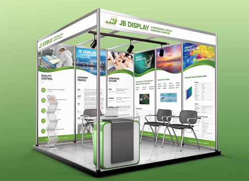 Booth Poster Design for Professional Monitor Product Suppliers
The standard exhibition booth poster projec ...
-
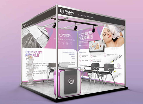 Design of Standard Exhibition Booth Posters for Beauty Instruments
Carefully designed a standard exhibition bo ...
-
 Design of Exhibition Posters for Medical Device Standards
XiYue is designing an exhibition booth post ...
-
 Collection of Brochure Design Cases in 2024 (Cover Series 02)
Our brochure design projects focus on diver ...
-
Black body text in a brochure shows a red fringe when zoomed in, while color photos on the same page look fine—is the black text set in four-color black or is the printer's registration off?
Date: Nov 2, 2026 Read: 1
-
When a client only needs a few price and size changes at project close but insists on layered PSD, is outlined AI plus a note enough?
Date: Nov 1, 2026 Read: 11
-
The client asked for linen paper's feel, but the full-bleed dark cover prints unevenly—what can we do besides switching paper?
Date: Oct 31, 2026 Read: 12
-
Matte-laminated sales cards won’t take ballpoint writing: change the film or leave the back blank when reprinting?
Date: Oct 29, 2026 Read: 18
-
The AI image looks clear on a phone, but the client wants it enlarged into a display board—should we regenerate the image or rework the layout first?
Date: Oct 28, 2026 Read: 21