



If a storefront poster headline looks gray from two meters away in daytime backlight, should I enlarge the text or change the background color?
Conclusion first: When a storefront poster is backlit in daytime and the main headline looks gray from two meters away, it is usually not something that can be judged by saying the type size is set too small. Based on common delivery experience in 2026, first measure the real viewing distance, then distinguish whether the physical type height is insufficient, the strokes are too thin, or the background color and on-site light are eating up contrast. For storefront posters viewed from 2-3 meters, the Chinese character height of the main headline is commonly in the 15-25 mm range; under backlight or with light backgrounds and light text, take the upper end of the range, and if necessary adjust the background color and font weight before deciding whether to enlarge the whole layout. Enlarging the text without changing contrast often still looks gray from a distance.
1. First distinguish whether the type is too small or the light is washing it out
A screen displays by scaling; when the canvas is zoomed out to fit, how much of the layout the main headline occupies depends entirely on the window size. The same artwork viewed at 30% and 100% zoom can look very different, but whether the final piece prints at 20 cm or 2 cm has no corresponding relationship with on-screen perception. What really affects whether it can be recognized from a distance is the combination of physical type height, stroke thickness, and light-dark contrast. At storefront glass doors with light gray backgrounds, white text, or light-colored text, it is common in daytime backlight for the poster to look clear up close but gray from a few steps back. At that point, do not rush to enlarge all the text on the entire layout.
- Insufficient type height: From a distance the whole layout looks small; neither the brand name nor the main headline is recognizable, and the subheadline is even harder.
- Strokes too thin: At the same type height, thin-stroke characters blur into a block first under backlight, and dense-stroke characters also blur easily.
- Background color and light: Light background with light text, or white background with yellow text, has contrast compressed under strong light and looks as if covered by a layer of gray from a distance.
- Material reflection: Lamination, glass door reflection, and backlit environments can reduce readability by another notch.
The judgment order can go like this: first stand at the position people commonly pass by, not directly in front of the poster; then walk closer to see whether details are clear. If the character edges are clear up close but look gray from a distance, it is likely not only a type-height issue. If it also looks crowded up close and the whole layout looks small from a distance, then it is time to adjust type height and layout proportions together.
2. Work backward from viewing distance, then leave one notch for backlight
In real scenes, a poster is usually seen from three distances: a quick glance from far away when passing by, a medium distance when stopping, and a close distance when walking up to scan a code or read an address. Separating information into these three tiers and then setting type height for each is more controllable than uniformly enlarging or reducing the whole layout. This is what is often called the three-tier viewing-distance method in delivery. The purpose of tiering is not to chop the layout into pieces, but to let each tier of information carry only one task.
- First measure scene distance: Measure the distance from the storefront sign to the sidewalk, or from the display rack to the aisle, along the path people commonly take, not the close distance when someone stands directly in front of the poster.
- Divide information into three tiers: Put the brand name and main headline in the far tier; put the subheadline, time, and price in the middle tier; put the address, QR code, and event details in the near tier.
- Set type height by tier: Take the upper end of the experience range for the far tier, the lower end for the near tier, and something in between for the middle tier.
- Add one notch for backlight: For light backgrounds with light text, thin-stroke text, and glass-door reflection scenes, leave extra margin above the type height and font weight for the far tier; do not stay at the lower end of the range.
- Make a proof and test it: Look at an A3 or A4 partial proof at the actual distance; do not judge on screen.
When it comes to the experience range, the Chinese character height of the main headline can be roughly estimated as follows; this is affected by typeface, contrast, and lighting and is only a starting point:
- 1-2 meters (in-store display racks, tabletop signs): main headline type height is commonly 10-15 mm.
- 2-3 meters (storefront posters): main headline type height is commonly 15-25 mm; take the upper end under backlight.
- 5-8 meters (outdoor billboards, high-pole billboards): main headline type height is commonly 50-100 mm or even larger.
There is another often overlooked point: Chinese typefaces vary greatly in stroke density. At the same 20 mm type height, dense-stroke characters tend to blur into a block from a distance, while sparse-stroke and simpler-structure characters are clearer. Therefore, within the same experience range, headline characters with complex strokes usually need to be taken toward the upper end, and if necessary, switch to a bolder and simpler typeface rather than simply enlarging the original. In backlit environments, raising the contrast of far-tier information first and then discussing type size is often more efficient.
3. At the delivery site: A4 to A1, two or three days, phone photos
A common constraint in store opening projects looks like this: the client directly changes the layout of an A4 flyer into an A1 storefront poster, gives only two or three days, the image material is still shot on a phone, the posting position is inside a glass door, and the site is backlit during the day. The usual approach is to first reset the type height of the main headline and price for a 2-3 meter viewing distance, then change the light gray background to a darker block with more stable contrast or increase font weight, and then reduce the amount of body copy and selling points. The cost is that five or six selling points in the original artwork must be cut to two or three, and the material must be re-shot or shot from a different angle; otherwise the edges look soft after enlargement. According to the experience range in our projects, this kind of adjustment often adds half a day to one day of checking and one to two rounds of revision. The time is not saved in layout; it is saved in checking in advance.
Several points that save trouble if checked in advance: confirm the finished size and viewing distance in writing first; check whether the original pixels of the material are enough for enlargement; calculate output resolution according to the finished size; and confirm whether the site is backlit and whether lamination will be used. Once these numbers are set, later type-size adjustments have a basis; otherwise every revision is guesswork.
- Finished size and viewing distance: State in one sentence where it will be posted and from how far people pass by.
- Original pixel size and enlargement factor: First calculate whether it can hold up to the target size, then discuss type size.
- Output resolution convention: Common requirements differ between printing and large-format inkjet; check against the producer's specifications.
- Whether laminated and whether backlit: These two items directly affect contrast and therefore readable distance.
- QR code minimum size and quiet zone: This is near-tier information; do not let it be eaten by trim edges.
4. How to compare enlarging the text with changing the background color
Neither approach is absolutely right or wrong; the difference lies in the scope of change, cycle time, and rework risk. A more stable judgment order is: measure distance first, then look at contrast, and finally adjust type height and information hierarchy. Enlarging only the main headline suits cases where type height is clearly too low and background contrast is acceptable; changing the background color and font weight first suits cases that are clear up close but gray from a distance; rearranging the information hierarchy suits cases such as changing A4 to A1 or having too much far-tier information.
- Only enlarge the main headline: Small change, with a typical cycle from same day to 1 day; the cost is taking space from the subheadline and QR code, and enlarged material may look soft; suitable for storefront posters with clearly low type height and acceptable contrast.
- Change background color, font weight, or outline first: Medium change, with a typical cycle of 0.5-1 day; the cost is that brand colors may be constrained, and white text on a dark background needs a separate reversed artwork; suitable for backlit scenes that are clear up close but gray from a distance.
- Rearrange the information hierarchy: Large change, with a typical cycle of 1-3 days; the cost is cutting selling points, re-shooting material, and rechecking the QR code; suitable for materials such as A4 changed to A1 or with too much far-tier information.
If both budget and schedule are tight, usually first raise the contrast of far-tier information, then move the main headline type height up one notch, and only then change the overall information hierarchy. Doing the opposite and overhauling the layout first often overturns selling points and material that could have been retained.
5. Where it applies and where it does not
The suitable cases are clear: the material has a fixed posting position, the viewing distance can be measured, and at least one piece of information needs to be recognized from a distance, such as the brand name, main headline, or price. For materials such as storefront posters, display racks, storefront signs, bus stop signs, and light boxes, spending half a day checking viewing distance and contrast is usually cheaper than rework afterward. In scenes with backlight, glass doors, and light backgrounds with light text, contrast and type height should be considered together even more.
Cases that are unsuitable or unnecessary should also be stated clearly: for close-reading materials such as A4 flyers, handbook inner pages, business cards, and menus, just lay out according to reading distance; forcing outdoor type-size ranges onto them will only blow up the layout. For temporary internal notices posted at the door or handwritten notices, print at conventional type sizes; there is no need to calculate viewing distance. Working backward from viewing distance to type size is meaningful only for materials that have a clear viewing distance and contain information to be recognized from a distance. Applying this range to close-reading materials usually only damages the layout.
Frequently asked questions
What type height is typical for a storefront poster main headline?
Based on common delivery experience in 2026, for storefront posters viewed from 2-3 meters, the Chinese character height of the main headline is commonly in the 15-25 mm range. Under backlight, with light backgrounds and light text, or with complex strokes, take the upper end; first make a partial proof and view it at the actual distance.
If it looks gray under backlight, does enlarging the text first help?
It helps but is often not enough. If it is clear up close but gray from a distance, check background contrast and font weight first; only enlarging type height will crowd out the subheadline, and a light gray background may still look gray under backlight. A common approach is to raise type height by one notch and change the background color at the same time.
For a poster on a glass door, should the background color be dark or light?
Do not look only at dark versus light; consider whether it is posted inside or outside, the daytime backlight direction, and brand color constraints. As an experience-based rule, use high-contrast combinations for far-tier information; white text on a dark background needs a separate inverse artwork; dark text on a light background needs more font weight; and the final decision should be based on an on-site proof.
If the same poster is used at the storefront and also posted on WeChat Moments, can the type sizes be shared?
Generally, one final artwork cannot be shared. The screen version should be laid out according to reading distance, while the print version should set type height according to viewing distance. The key visual and type rules can be shared, but main headline type height, information density, and QR code size should be checked in separate versions.
If the main headline is found to look gray from a distance just before printing, can it still be fixed?
It can be fixed, but at a cost. Enlarging the main headline usually requires making space and cutting secondary information; changing the background color may affect brand colors and white-text reversal processes. The closer to printing, the smaller the adjustable range, and it commonly adds half a day to one day of checking.
If the poster is not yet finalized, first measure the real viewing distance once, then set the type heights for the main headline, subheadline, and QR code separately according to the three-tier viewing-distance method, and take a look at an on-site proof during the backlit period. This approach suits promotional materials that have a clear viewing distance and require long-distance recognition. For close-reading flyers and handbook inner pages, lay them out at conventional reading type sizes; there is no need to apply outdoor ranges.
-
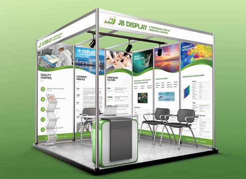 Booth Poster Design for Professional Monitor Product Suppliers
The standard exhibition booth poster projec ...
-
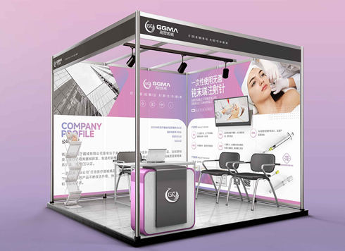 Design of Standard Exhibition Booth Posters for Beauty Instruments
Carefully designed a standard exhibition bo ...
-
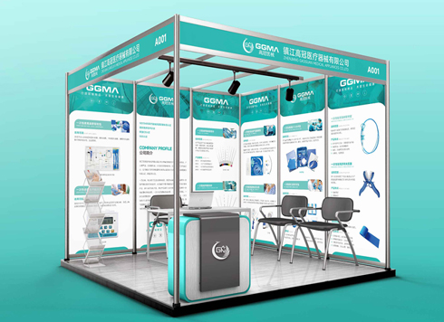 Design of Exhibition Posters for Medical Device Standards
XiYue is designing an exhibition booth post ...
-
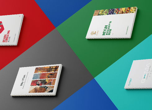 Collection of Brochure Design Cases in 2024 (Cover Series 02)
Our brochure design projects focus on diver ...
-
Full-bleed poster shows white edges after trimming—printer says the file has no bleed. How much should I believe that?
Date: Oct 18, 2026 Read: 33
-
A panel on the booth back wall is unreadable as visitors walk past the aisle — should you measure the distance or change the resolution before printing?
Date: Sep 29, 2026 Read: 45
-
If the logo is finalized and I only received a PDF, and we need to switch printers for packaging next month, can I still ask for the source files now?
Date: Nov 2, 2026 Read: 1
-
Brochure laid out as A4 but finished size is large 16mo: scale the design down or ask the printer for a separate A4 sheet?
Date: Nov 1, 2026 Read: 7
-
Does the main packaging headline font need a separate commercial license—should the designer swap it out or should the brand buy it?
Date: Oct 31, 2026 Read: 11