



Black body text in a brochure shows a red fringe when zoomed in, while color photos on the same page look fine—is the black text set in four-color black or is the printer's registration off?
When black body text in a brochure is printed with a red or blue fringe at the edge, and color halftone dots can be seen when zoomed in, while color photos on the same page look normal, it is usually not a one-sided registration error by the printer. More often, these black characters use four-color black in the file—black built by overprinting cyan, magenta, yellow, and black plates. Even a slight registration difference among the four plates gets magnified on strokes only a few millimeters high into color fringing and blurred edges. According to 2026 prepress delivery experience, details such as body text, notes, page numbers, fine table rules, and barcodes usually use single black K100; only full-page black backgrounds, large solid black areas on covers, and transition areas where black sits over images are worth considering four-color black or rich black. The recommended order is to check the file's separations preview first, then confirm plate position and ink density with the printer; do not blame the machine right away.
Why color photos on the same page look fine, but black text shows a red fringe first
Black on screen is pixels emitting no light; black on paper is ink absorbing light. Four-color black overprints four plates in the same place, so if any plate shifts slightly, that plate's color shows at the edge first. Color photos are made up of all the color plates together, and slight deviations are hidden by image texture and color transitions; black text has fine strokes and high contrast, so any edge shift is obvious.
Body text strokes are often only around 0.1 mm wide, so registration deviation becomes a larger proportion of the stroke width and is magnified, first as color fringing and then as ink filling in at stroke intersections. On the same page, some characters being clear while others look blurred also often points to registration or inconsistent black settings in the file, rather than insufficient ink—insufficient ink usually makes the whole page look lighter.
- Red or blue fringe at the edge: usually a shift in the corresponding magenta or cyan plate, and easier to see on the printed sheet than on screen.
- Ink filling in at stroke intersections: horizontal and vertical strokes overlap, and ink tends to pile up more under four-color overprint.
- More obvious in type below 6 pt and in fine-stroke fonts: fine horizontal strokes and thin serifs in Songti-style type are more likely to break or blur under four-color black.
- Color halftone dots visible when zoomed in: use a loupe or phone macro mode to look at the edge of the text; if non-black dots are visible, it is basically four-color overprint.
Single black, four-color black, and rich black: the difference is not about being black enough
The dividing line among these three blacks is whether they rely on registration. The more they rely on registration, the denser they look and the less stable they are; without relying on registration, they are more stable but have limited density. This dimension is more practical than choosing by which black looks better.
- Single black K100: only the black plate carries ink, so there is no registration deviation; it is more stable for small text, fine lines, and barcodes. The cost is that large flat areas look grayish and less dense than four-color black.
- Four-color black (also commonly called fake black or rich black in the industry): a common mix falls in this experience range: C 40–60, M 30–50, Y 30–50, K 100. Printers and paper habits differ, so specific values should be adjusted based on printer feedback. It looks dense, but all four plates must align.
- Single black with trapping (white-gap compensation): when black text sits on a color background or image, slightly expand the edge of the black text to prevent paper white from showing if registration is off.
With four-color black, more ink is not always better. When the total ink coverage of the four colors is high, drying on coated paper slows down, and overprinted sheets are more likely to scuff or stick. A common practice is to keep total ink coverage around 300% (experience range); the specific upper limit should be checked against the paper and the printer's printing conditions.
Where to use single black and where four-color black can stay
You do not need to rely on feel; three checks are enough: how fine the strokes are, whether the element overprints other colors, and what the substrate is. If any one of the three points to detail, lean toward single black.
- Recommended single black: body text, notes, page numbers, contents pages, fine table rules, icon outlines, barcodes and QR codes, and small text below 6 pt.
- Four-color black can be used: full-page black backgrounds, large solid black areas on covers, transition areas where black sits over images, and cases on dark cardstock where a denser black is needed.
- Counterexample 1: setting the entire document to four-color black to save effort, which leaves all small text blurred; rework requires resetting paragraph styles and delays the schedule.
- Counterexample 2: using single black for white text on black or large solid black backgrounds, so the printed result looks gray and thin, and the client immediately feels it is not dense enough.
- Acceptance criterion: zoom in on the printed black text to about 300%; there should be no obvious color fringe at the edges, strokes should not break or fill in, and type weight on the same page should look consistent.
One often overlooked point: black overprint settings. If black text is set to overprint, it is usually fine when placed on a color background; but the reverse—light text on a black background without trapping—can show a white gap around the edges. Checking these two types of placement separately before sending to print saves more time than arguing with the printer afterward.
What order to check before sending to print, and where rework volume differs
For self-checks, go from how the file is set up to what the output looks like, because the earlier you find a problem, the lower the cost to fix it. Waiting until a proof comes out and then going back often means remaking plates.
- First check the separations/overprint preview: open the separations preview in the design software; if black text shows up as four-color overprint, you can see it immediately.
- Then change paragraph and character styles: set body text uniformly to K100, and leave only a few large solid black areas separate, to avoid missing pages while editing manually.
- Check overprint and trapping: for black text over images and light text over black backgrounds, confirm overprint and edge expansion settings one by one.
- Review after export: export to the PDF standard required by the printer, then spot-check separations on several pages; do not rely only on the screen preview.
- Ask clearly about paper and total ink coverage: the same file performs differently on coated and offset paper, so asking before handing off is safer.
Here is a checkable comparison; the data is a common experience range from 2026 project delivery, not a promise: when changing only body text styles, barcodes, and fine lines, it usually takes 0.5–1 working day, with 1–2 rounds of proof review; resetting the whole book or editing page by page usually takes 2–4 working days, with proof review possibly reaching 2–3 rounds. The former risk is missing pages; the latter risk is changing the layout incorrectly or touching pages that should not be touched. When the budget is tight and the schedule is short, listing the pages with small four-color black text first is usually more realistic than redoing the whole book.
A live delivery case: a 200–300 page brochure going to press in four days
A common constraint on the delivery floor: the client's brochure file was made by someone else; the book is 200–300 pages, only about four days are left from handoff to press, and the budget does not support resetting the whole book. Our team's approach is to run a separations preview first, list the pages with small four-color black text, change only body text styles, footers, and barcode positions, and leave large solid black areas on the cover unchanged; after editing, spot-check the separations results, then send it to the printer. According to the typical range, this often saves one to two rounds of rework. The cost is that during the one or two days of style changes, someone must check page by page, and cross-page tables and special paragraphs still need separate handling; if something is missed, the responsibility remains on the delivery side. This approach suits offset brochures with a lot of text and a tight schedule; it does not suit redesign projects that require resetting the whole layout.
Common questions
The printer says registration is fine, but the black text still has a red edge—who should I believe first?
Check the file's separations preview first. If the black text is four-color overprint, there will be edge color even when registration is accurate; if it is truly K100 and still has a red edge, then ask the printer to check plate position and ink density.
Should a large solid black cover background also be changed to K100?
Not necessarily. Large solid black areas in single black easily look gray and thin; it is common to keep four-color black or rich black, and change only body small text, fine lines, and barcodes to single black.
If I convert RGB black to CMYK in the software, will it come out as single black?
Not necessarily; it depends on the color profile, and it often converts to four-color black. After conversion, check whether the black plate is 100 and the other three are 0; do not assume it is already correct.
If I only discover on press that the small text is four-color black, is there anything I can do?
It depends on the run length and process. For short-run digital printing, you can often stop the press, fix the file, and rerun; on offset after startup, changing text usually means remaking plates, so often you can only accept this batch or correct it in the next batch.
What happens if black table rules and barcodes use four-color black?
Fine lines are even more sensitive to registration than small text. Four-color overprint can make them dark in one segment and light in another, or even broken; it is common to use single black and confirm that line width is not below the printer's recommended minimum.
Next step: open the file you are about to send to print, run a separations preview first, mark the positions of small four-color black text, and then decide which parts to change to single black and which to keep. This approach suits offset-heavy printed matter with a large amount of text; if your material is screen-only, single-color printing, or a very small run with almost no small text, you do not need to agonize over black; spending time on layout and content is more worthwhile.
-
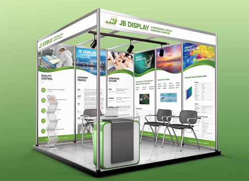 Booth Poster Design for Professional Monitor Product Suppliers
The standard exhibition booth poster projec ...
-
 Design of Standard Exhibition Booth Posters for Beauty Instruments
Carefully designed a standard exhibition bo ...
-
 Design of Exhibition Posters for Medical Device Standards
XiYue is designing an exhibition booth post ...
-
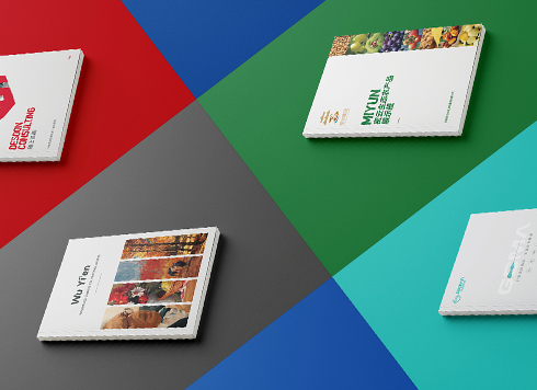 Collection of Brochure Design Cases in 2024 (Cover Series 02)
Our brochure design projects focus on diver ...
-
When a client only needs a few price and size changes at project close but insists on layered PSD, is outlined AI plus a note enough?
Date: Nov 1, 2026 Read: 12
-
The client asked for linen paper's feel, but the full-bleed dark cover prints unevenly—what can we do besides switching paper?
Date: Oct 31, 2026 Read: 12
-
The same photo shows shadow detail on a phone but prints as solid black in a brochure: before sending to print, should you adjust the image first or ask the printer about total ink coverage?
Date: Oct 30, 2026 Read: 14
-
Matte-laminated sales cards won’t take ballpoint writing: change the film or leave the back blank when reprinting?
Date: Oct 29, 2026 Read: 18
-
The AI image looks clear on a phone, but the client wants it enlarged into a display board—should we regenerate the image or rework the layout first?
Date: Oct 28, 2026 Read: 21