



The ingredient list on a food packaging bag sits on the seal edge and folded corner, and channel acceptance says it is hard to read—is the type too small, or should it not have been placed there in the first place?
Conclusion first: when channels say the net content and ingredient list on food packaging are hard to read, it is usually not a matter of font size alone; it is the combination of finished character height in millimeters, placement, and substrate readability. Based on 2026 packaging project delivery practice, first measure the mandatory information layer in mm on a 1:1 canvas, avoid heat-sealed edges and folded corners, and leave margin before discussing the key visual. Most issues can be settled at the proofing stage; changing after mass production often costs new plates and rescheduling.
Why channels say it is hard to read: do not focus on font size alone
For mandatory information such as net content, ingredient lists, producer information, and warning statements on food, beverage, and personal care packaging, the criterion is usually not the font size in pt in design software, but the actual character height measured in mm on the finished product. pt is a relative typesetting unit; when the same artwork is set on 1:1, 1:2, and 1:5 canvases, the finished character height can differ substantially. When a client says verbally that the type is big enough, it is often a judgment made from a screen; on-screen perception is affected by zoom ratio, the font x-height, and monitor resolution.
Another layer is placement and substrate. The seal edge of flexible packaging involves heat sealing, folded corners involve stretching, and curved bottle bodies can make type narrower or taller after forming; different film roll directions produce different directions of deviation. So the judgment should consider character height + font weight + substrate + placement together; looking only at character height easily leads to misjudgment.
- Unit of judgment: finished height in mm, not the pt value shown in the font size panel
- Canvas basis: build the main display panel at 1:1, build the flat artwork at 1:1 according to the die line, and avoid relying on scaled conversion
- Placement risk: seal edges, folded corners, seams, window edges, and highly stretched curved surfaces all reduce readability
- Font differences: at the same character height, different font weights can differ by one readability level; thin light-gray type over photos is even more likely to become unreadable
- Typical range: net content character height is graded by net content size and by experience falls between 2 and 6 mm; the typical range for small type such as ingredient lists is tighter, and specifics should be checked against the current standard text and the compliance checklist provided by the client
Delivery context: how the ingredient list line on the seal edge got rejected
A common type in projects: the client has a tight budget, wants only to change the key visual on old packaging, compresses the timeline to within a week, and reuses the previous version for the text. The designer sets the type according to the old font sizes and sends it to print, but the ingredient list in that version originally sat near the seal edge, and it was small reversed-out type. When the proof comes out and is measured with a ruler, the net content character height is 0.3–0.5 mm below the lower limit in the client's compliance checklist, and after heat sealing the strokes become blurred by another layer. Channel acceptance rejects it, requiring new plates and new proofs, adding 3–7 days to the schedule, with extra plate fees and rush fees (experience range, varying with print run and process).
There is also a correct approach: separate the mandatory information into its own layer, mark mm rulers, keep the placement away from heat-sealed edges and folded corners, leave an additional 0.2–0.5 mm margin above the compliance lower limit for character height, output the proof at 1:1 together with the rulers, and have the client measure and sign for confirmation. The extra front-end check takes half a day to one day (typical range); later revisions touch only the marketing layer while the mandatory layer stays unchanged, reducing one round of back-and-forth. The value of this layer is not whether it looks good, but that it can be verified—when a problem arises, you can speak with a ruler rather than rely on memory of what was communicated at the time.
Three-layer character height check: separate 'can it go on shelf' from 'does it look good'
This method layers by responsibility, not by layout: the mandatory layer determines whether the product can go on shelf, the informational layer determines whether the information is complete, and the marketing layer determines shelf performance. When the three layers are set together, changing one word moves the whole layout and it is also easiest to shrink the character height.
- Layer: separate the mandatory layer (net content, ingredient list, producer and address, shelf life, warning statements), the informational layer (directions for use, storage conditions), and the marketing layer (selling points, key visual) into independent layers or artboards.
- Set canvas and placement: build the main display panel at 1:1 finished size and the flat artwork at 1:1 according to the die line; mark mm rulers as well as fold lines, die-cut positions, seal edges, and window positions.
- Measure character height: use a rectangular box to measure the actual height of the character face, not the font size panel; check net content separately because it is usually graded by content amount.
- Leave margin: leave an additional 0.2–0.5 mm above the compliance lower limit for the mandatory layer (experience range), and avoid curved surfaces, fold lines, seams, and window edges.
- Proof verification: proof at 1:1, measure with a ruler, photograph for records, and start production only after the client confirms in writing.
- Lock the version: after confirmation, save the mandatory layer as a separate version file, and do not touch it when revising the marketing layer later.
Among the six steps, step 3 is the easiest to miss, because the software font size panel shows typesetting units, while what is measured is the finished value; step 4 is especially critical on flexible packaging and curved bottles, where material stretching and film roll direction can deform type after forming, and when the position is wrong, even a compliant character height may still be judged hard to read.
How to combine three verification approaches: experience ranges for cost and turnaround
On character height, the design side can self-check, but the design side should not be the backstop for the regulatory text itself. The three approaches below are not substitutes for one another; they are layered according to project risk. Being clear about what each covers before deciding where to invest is more useful than saying vaguely that compliance needs to be done.
- Designer self-check: the cost is basically included in the design fee, usually takes 0.5–1 day, and covers character height, placement, contrast, and readability, but not regulatory text or claim wording; suitable when the revision is small and the client provides a compliance checklist.
- Brand-side compliance review: cost is calculated by labor, with a typical turnaround of 1–3 working days, and it can cover ingredient order, nutrition information, and claim language; suitable for new product launches and formula changes.
- Third-party label review: billed per item, with an experience range from several hundred to several thousand yuan, and a typical turnaround of 3–10 working days; it covers a broader scope but has a longer schedule; suitable for export packaging, infant formula, and dietary supplements, which are heavily regulated categories.
The conclusion is clear: for revisions that only change the key visual and keep the mandatory information unchanged, the first two combined are usually sufficient; for new products, cross-category projects, or export projects, the third-party schedule should be put into the project plan early, rather than discovering after design is finalized that review takes a week. Under the 2026 project rhythm, such needs are concentrated before the peak season in the second half of the year, when schedules are already tight; getting character height and placement right in advance can save a round of back-and-forth.
Applicable scenarios and boundaries where it does not apply
Suitable cases: typesetting and version changes for prepackaged food, beverages, personal care, dietary supplements, and export packaging; situations where the client already has a compliance checklist and needs the design side to turn it into a verifiable artwork; revision projects that keep the mandatory information on old packaging and only change the key visual, especially flexible packaging and scenarios where small type must be set near seal edges and folded corners.
Cases where it does not apply should also be stated clearly: for purely marketing materials such as posters, flyers, and roll-up banners, discussing character height compliance is meaningless; for internal concept drafts and visual mockups for pitching, there is no need to measure against finished-product standards; even less suitable is a collaboration model that pushes overall compliance responsibility to the design side—what the design side can do is make character height, placement, and contrast verifiable; it cannot replace regulatory review. The final compliance judgment of mandatory information should be borne by the brand side or a qualified reviewer.
Frequently asked questions
Should net content and ingredient list character height be calculated in pt or mm?
Calculate by finished height in millimeters, not by the font size panel. pt changes with canvas scaling; the same artwork set at 1:1 and 1:2 can produce a noticeable difference in finished character height. Only mm can be used to check with channels and printers.
If the ingredient list is placed on the seal edge or folded corner, is compliant character height enough?
Not enough. Seal edges involve heat sealing, folded corners involve stretching, and curved surfaces can also deform type after forming; even if the character height is compliant, placement over the heat-seal area or a folded corner may still be judged hard to read by channels. It is advisable to avoid these areas and leave margin.
Can packaging character height be measured in-house before proofing?
Yes. Build the main display panel at 1:1, turn on mm rulers, and use a rectangular box to measure the character face height; the error is typically 0.1–0.2 mm, which is enough for an initial judgment. Final judgment should still be based on the physical 1:1 proof.
If the old packaging has always been laid out this way, do we still need to measure again when changing substrate?
Yes. An old artwork may come from a different printer, a different substrate, and a different film roll direction; after changing material or size, character height and stretching will change. It is advisable to re-check the entire mandatory information layer.
Should compliance responsibility be written clearly in the design contract?
It is advisable to write it clearly. A common practice is to specify that the design side is responsible for layout implementation and character height checks, while the content of mandatory information and compliance judgment are provided and confirmed in writing by the brand side or a qualified reviewer, reducing later disputes.
If you currently have packaging under revision, first pull out the mandatory layer and measure it separately before discussing the key visual; for projects with tight timelines, put the third-party review schedule into the plan first. The above practices apply to conventional prepackaged categories; for heavily regulated categories such as export packaging and foods for special dietary uses, the current standard text and professional review opinions should still prevail.
-
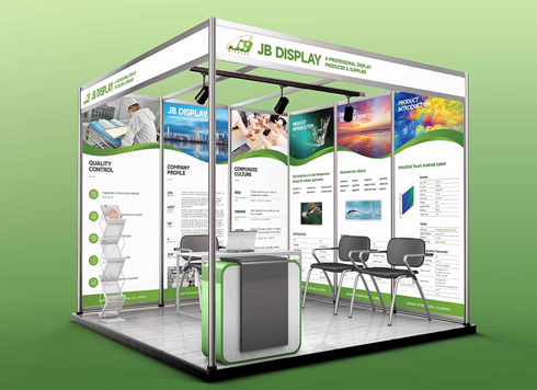 Booth Poster Design for Professional Monitor Product Suppliers
The standard exhibition booth poster projec ...
-
 Design of Standard Exhibition Booth Posters for Beauty Instruments
Carefully designed a standard exhibition bo ...
-
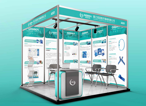 Design of Exhibition Posters for Medical Device Standards
XiYue is designing an exhibition booth post ...
-
 Collection of Brochure Design Cases in 2024 (Cover Series 02)
Our brochure design projects focus on diver ...
-
Black body text in a brochure shows a red fringe when zoomed in, while color photos on the same page look fine—is the black text set in four-color black or is the printer's registration off?
Date: Nov 2, 2026 Read: 1
-
When a client only needs a few price and size changes at project close but insists on layered PSD, is outlined AI plus a note enough?
Date: Nov 1, 2026 Read: 11
-
The client asked for linen paper's feel, but the full-bleed dark cover prints unevenly—what can we do besides switching paper?
Date: Oct 31, 2026 Read: 12
-
The same photo shows shadow detail on a phone but prints as solid black in a brochure: before sending to print, should you adjust the image first or ask the printer about total ink coverage?
Date: Oct 30, 2026 Read: 13
-
Matte-laminated sales cards won’t take ballpoint writing: change the film or leave the back blank when reprinting?
Date: Oct 29, 2026 Read: 18