


When the lower half of an exhibition roll-up banner is always blocked by tables and people, how high should the main headline be so it isn’t wasted?
A roll-up banner is not a surface that is evenly readable from top to bottom. Based on common 2026 delivery experience for exhibitions and stores, when people view it standing, about 90–150 cm above the floor is the more comfortable main reading band; below 60–70 cm above the floor is often blocked by people in the front row, exhibition table edges and display stacks. Remember the conclusion first: the main headline, brand name and core call to action should be placed in the main reading band, while the bottom should hold only secondary information or white space; raising content upward is usually more effective than shrinking type and cramming in more content.
1. A blocked bottom is usually a physical condition, not a layout mistake
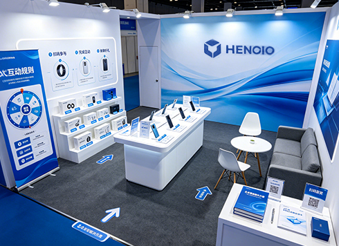
The sources of blocking are fixed and predictable. When a booth is crowded, people in the front row, table edges and sample boxes occupy the lower edge of the graphic; when visitors stand, their line of sight falls near eye height, and they rarely look down at parts close to the floor. At many venues, the lower half of a roll-up banner is a “physically unreadable zone”; the problem is not that the content is poorly written.
Readability also depends on viewing distance. At exhibitions, people usually scan from 2–5 m away first, then decide whether to come closer; at that distance there is a minimum character height threshold. Only at about 1 m do they look at details. So type in the main reading band should be designed for long-distance reading, and even if information is placed at the bottom, it can only serve people who have already come close.
- Blocked band (about 0–70 cm): often blocked by table edges, crowds and goods; do not put information that needs to be read here
- Main reading band (about 90–150 cm): the natural landing point of a standing viewer’s line of sight; put the main headline, brand name and QR code here
- Upper band (about 160 cm and above): long-distance recognition area, suitable for large color blocks, the brand name and short claims
- When content needs to move down: if the audience is mainly children or seated viewers, the eye-level band should move down; on-site measurement is recommended
2. First decide what this roll-up banner is for, then decide how much to raise it
Raising content is not a fixed shift of a few centimeters; it starts with the goal. A common 2026 use is to give one roll-up banner a single task: make people remember the brand, make them scan a code, or direct them to a booth number. With more than two goals, content tends to pile downward, and piling into the blocked band means the work is wasted.
In delivery, a common approach is the “three-band layout + three-second test”: define the zones first, then arrange content, and finally verify at real on-site distances. The division is based on where the line of sight lands and the blocking height, not on whether the composition looks good; size and stand type should be locked first, because getting them wrong forces the whole layout to be redone.
- Set size and stand: common sizes are 80×200, 85×200 and 100×200 cm (experience range); confirm booth width and backwall height first
- Measure blocking height: use the exhibition table edge, display stack and registration desk as references to determine the upper edge of the blocked band
- Sort content into three tiers: what must be read from 3 m away, what is read only after coming closer, and what can be left out
- Place by tier: put tier one in the main reading band, tier two at 100–140 cm, and delete tier three or move it to a flyer
- Three-second test: step back 3–5 m and look for three seconds; if the main headline and brand name can be read, it passes; if not, adjust character height or reduce word count
A common project case: the final artwork is approved only one week before the exhibition, and the only assets are phone photos of products and an unedited list of selling points. The approach is to estimate the table-edge height from site photos, raise the main headline and QR code to 100–140 cm above the floor, and use a solid color for the bottom 60 cm. The trade-off is that the lower half looks empty, and the client does not accept it in the first round; it takes two revisions to pass, but on-site QR code scans are better than the previous version. This kind of on-site check usually reduces revision rounds to one or two (experience range).
3. Acceptance criteria: what counts as acceptable
Acceptance cannot rely only on the on-screen file; it should be judged at actual size, distance and lighting. By experience, if the main headline is readable at 3–5 m, secondary information is readable at 1 m, and the QR code scans smoothly at 1–1.5 m, the three basic criteria are met and it is generally usable. Before delivery, also check the production vendor’s file requirements: bleed, safety margin, color mode and outlined fonts. Standard bleed is about 3 mm (experience range); large-format inkjet printing is calculated separately, and it is not advisable to assume one set of parameters works for everything.
- Main headline: readable at 3–5 m; calculate character height backward from viewing distance; avoid strokes that are too thin
- QR code: place it in the main reading band, no smaller than 8×8 cm (experience range), with a quiet zone around it
- Bleed and safety margin: leave margin between important text and the trim edge so it is not cut off or pressed by the frame
- Contrast: use light text on a dark background or dark text on a light background; avoid low contrast combined with spotlight glare
- Material matching: photo paper or film for indoor use, fabric-based material for outdoor use; lamination depends on on-site light
A counterexample is easy to spot: a full-bleed dark blue background with thin white type looks clean on a computer, but under booth lighting it reflects glare, and from 5 m away only white dots remain; you have to come closer to see what it says.
4. Two common routes for materials and finishing
For the same graphic, material choice directly determines how it looks on site. In common 2026 delivery, indoor exhibitions mostly use photo paper or PP film with an aluminum alloy stand, while outdoor or large-format work mostly uses lightbox fabric, knitted fabric or banner fabric. The two are not a matter of good versus bad; it is about whether the scenario matches.
- Route A: photo paper or PP film + indoor roll-up banner stand
- Cost: by experience range, a single set of graphics is around tens of yuan to about two hundred yuan, depending on size and lamination
- Lead time: standard graphic production and installation commonly take 2–5 working days (experience range)
- Look and limits: saturated color and clear details, suitable for close viewing; vulnerable to water and creasing, and repeated rolling tends to leave marks, so it is generally for indoor use only
- Route B: lightbox fabric or banner fabric + large-format frame
- Cost: usually priced by square meter; unit price is lower than photo paper, but frame and installation are charged separately
- Lead time: graphic production commonly takes 2–4 working days; frame and installation are calculated separately (experience range)
- Look and limits: enough impact from a distance, but close-up detail is average; there can be light transmission and color shift, and thin-stroke text blurs easily
The order of judgment is distance first, then environment. For long-distance, semi-outdoor locations exposed to wind and sunlight, photo paper is not very suitable; for close-distance indoor use where details need to be seen clearly, fabric-based material can look blurry. When deciding, calculate “frame + graphic + installation” together; looking only at the graphic unit price easily leads to miscalculation.
5. Applicable scenarios and boundaries
Scenarios that fit are characterized by short viewing time, fixed distance and small information load: exhibition traffic capture at the entrance, in-store promotions, recruitment information, event wayfinding and temporary signage. For these needs, putting the key points into the main reading band makes the graphic work.
Cases that do not fit, or where roll-up banners should not be forced, are equally clear: explanatory content with many terms and specifications should be turned into a flyer or folded brochure for people to take away; locations that need to hang outdoors for a long time are better served by fixed inkjet printing, lightboxes or storefront signage, because roll-up banner stands and graphics usually cannot support more than a quarter; for content that changes frequently, a changeable graphic frame is more cost-effective.
- If there are more than 5 pieces of information, delete first and then lay out; do not solve it by shrinking type
- If the on-site audience is mainly children or seated viewers, remeasure the eye-level band; do not simply copy exhibition experience
- If scanning is needed to collect leads, put the code in the main reading band and add a short prompt
- For outdoor use, confirm wind force and fixing method first; graphic stability comes before composition
Frequently asked questions
Are there standard sizes for roll-up banner graphics?
Common sizes are 80×200, 85×200 and 100×200 cm, which are an experience range; in practice, set them according to booth width and stand model. Measure the site before layout to avoid finishing the artwork first and then looking for a stand.
How large should the main headline be so it is clear from 3 m away?
By experience, Chinese characters that can be seen clearly from 3–5 m are mostly above 8–12 cm in height; fonts with thin strokes need to be larger. The specific size depends on on-site lighting and background contrast; a small proof sample is best for actual testing.
Why does a QR code at the bottom of the graphic often fail to scan on site?
The bottom often falls into the blocked band, and glare and too-close distance add to the problem; raise the code to 100–140 cm above the floor, make it no smaller than 8×8 cm, and leave a quiet zone, and the scan success rate will be different.
Will white space at the bottom look too empty?
White space is the cost of pushing attention into the main reading band, and it is a normal trade-off; if it is hard to accept, use brand color blocks or supporting graphics to fill the bottom, but do not put text that needs to be read there.
The next time you make a roll-up banner, first stand on site for three minutes to see where others stand and where their line of sight falls, then go back to the computer to lay out. Once size, blocking height and viewing distance are confirmed clearly, revision rounds can usually be reduced to one or two (experience range). If the content is terms and specifications, or if it needs to hang outdoors for a full season, a roll-up banner is not the right carrier; a flyer, fixed inkjet printing or a lightbox is more reliable. In project delivery, doing this on-site check before moving into the visual draft usually saves rework compared with starting the artwork directly.
-
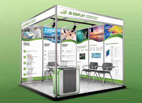 Booth Poster Design for Professional Monitor Product Suppliers
The standard exhibition booth poster projec ...
-
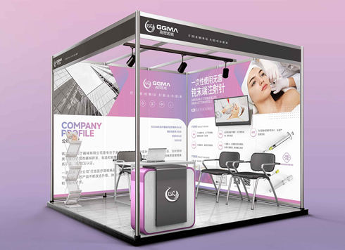 Design of Standard Exhibition Booth Posters for Beauty Instruments
Carefully designed a standard exhibition bo ...
-
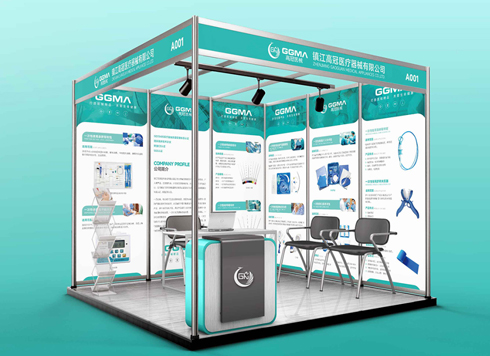 Design of Exhibition Posters for Medical Device Standards
XiYue is designing an exhibition booth post ...
-
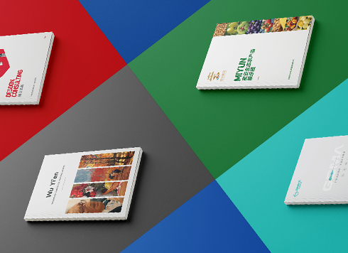 Collection of Brochure Design Cases in 2024 (Cover Series 02)
Our brochure design projects focus on diver ...
-
Why Do Poster Design Quotes Range from Hundreds to Thousands?
Date: Sep 1, 2026 Read: 51
-
Why do advertising poster design quotes vary so much? What's actually different in the deliverables?
Date: Aug 26, 2026 Read: 71
-
If the logo is finalized and I only received a PDF, and we need to switch printers for packaging next month, can I still ask for the source files now?
Date: Nov 2, 2026 Read: 1
-
Brochure laid out as A4 but finished size is large 16mo: scale the design down or ask the printer for a separate A4 sheet?
Date: Nov 1, 2026 Read: 7
-
Does the main packaging headline font need a separate commercial license—should the designer swap it out or should the brand buy it?
Date: Oct 31, 2026 Read: 11