



A large light gray area on a brochure cover prints with cloudy patches and vertical streaks—is it the wrong paper, or is light gray itself unsuitable for large areas?
Large light gray backgrounds that print with patchy light and dark areas and vertical streaks are usually not caused by poor paper or a printer cutting corners. They are caused by low dot coverage in the 5%–15% range falling into a less stable offset printing zone: the dots are small, so slight fluctuations in ink-water balance, blanket pressure, and paper absorption are amplified into visible cloudy patches across the whole area. Based on 2026 project delivery experience, a light gray background should either be raised above 20%, changed to a light spot color, or replaced with light-colored paper; only when the area is large and batch consistency is explicitly required is it worth changing the artwork for it.
Why large light gray areas are more likely to fail than dark solids
Offset printing expresses gradation through dot area coverage. The lower the percentage, the smaller each dot, and the more its transfer from plate to paper depends on ink-water balance, even pressure, and blanket condition. A dark solid is fully inked and relatively tolerant; light gray is a sparse dot array, and any deviation has not enough ink to hide it, so it shows as-is.
The other reason is perception. Image-heavy layouts have detail that distracts the eye, while a large flat tint has no content to hide flaws. The human eye is sensitive to light-dark differences on a uniform plane—density differences may not show in photos, but on a pure gray background they appear in patches.
- Light tint (about 5%–15%): commonly shows mottling, show-through, graininess, and streaks; this is the higher-risk range.
- Mid tint (about 20%–40%): relatively stable, but large areas still depend on machine condition and the blanket.
- Dark solid: problems are mostly thick ink film, easy scuffing, and slow drying, not uniformity.
- Digital printing: no ink-water balance issue, but light tints often show graininess and vertical bands; on uncoated paper, paper texture may also show through.
First distinguish mottling, streaks, and scumming—then contact the printer
These three symptoms have different causes, and mixing them together makes troubleshooting wasteful. What the designer can do is locate the issue first and describe the phenomenon clearly, rather than saying vaguely that 'it printed unevenly'—in that case the printer can only guess from the beginning.
- Check which gray level it falls into—below 10%, suspect the design side first; changing the file is faster than changing the machine.
- Check the direction of the pattern—evenly spaced vertical streaks are often related to ink rollers and the water system; horizontal unevenness is often related to the blanket, paper, and pressure.
- Check whether it is a single sheet or the whole batch—occasional single sheets point to equipment; consistent issues across the whole batch point to the file or process settings.
- Zoom in on the dots—broken dots indicate poor transfer; intact dots with uneven density indicate drift in ink or water volume.
When communicating, clearly state which page, how large the area, what direction, and how many sheets show the issue; this is more effective than repeatedly saying it 'looks dirty'. The same order is recommended when checking against an acceptance checklist: first check the gray level in the file, then the direction on the proof, and only then discuss the machine.
Four alternative routes: where cost and lead time differ
Rather than fighting machine condition, avoid the unstable range at the design stage. The four approaches below are common in 2026 projects; none is the only answer, and the choice depends on tone and budget. Costs and lead times are given as experience ranges; refer to the printer's quote for specifics.
- Option A: Raise the gray level to 20%–30%. Cost: basically no additional printing labor, same lead time; trade-off: the overall tone becomes heavier, suitable for minimal, tech, and industrial layouts, but not for literary or artistic tones that need airy white space.
- Option B: Switch to a light spot color. Cost: an extra plate and spot-color ink fee, with a typical range of about 20%–40% added to four-color; lead time: half a day to one day more; suitable when the brand color is fixed by guidelines and the area is large.
- Option C: Change directly to light-colored paper. Cost: saves some printing labor and uses the paper's natural white, light beige, or light gray to set the tone; trade-off: paper price rises by about one to two grades, paper selection lead time extends by one to three days, and paper color may vary slightly between batches.
- Option D: Replace the flat tint with texture. Cost: adds about half a day to one day of design time, and printing risk drops; the approach is to change uniform light gray into fine lines, paper texture, or dot texture, which looks more durable visually, but a proof needs to be checked in advance.
Spot color is only more cost-effective when all three conditions are true at the same time: the brand gray must be light, the area is large, and it is a production run; in other cases, raising the gray level or changing paper is usually simpler.
At delivery: what to decide when budget and schedule are both locked
A common project situation is: an entire brochure uses large light gray backgrounds across spreads, the client compresses the schedule to five days and keeps the budget at four-color, while explicitly requiring that 'the gray must be light'. Under such constraints, insisting on 8% light gray often results in the first-article sign-off barely passing, mottling starting mid-run, and finally either reprinting the whole batch or downgrading it to inner pages. Based on delivery experience, a more stable approach is to raise the main gray background to 18%–22%, keep a small amount of light gray below 10% on dark pages as an accent, and limit the unstable area to a small range; the trade-off is that the overall tone is one step heavier than the original artwork, and expectations need to be verbally aligned with the client in advance, but the risk of mid-run mottling rework drops noticeably.
Also note an easily overlooked point: four-color gray (gray mixed from CMY) is more prone to color shift and mottling than a single-black tint, because if any of the four plates shifts slightly, the whole gray area shifts with it; a single-black tint is more stable, but over large areas it can look thin and dry. This should be confirmed first in the pre-print file check.
- The proportion of the layout covered by the gray background, which pages it is concentrated on, and whether it crosses the fold.
- The gray percentage, and whether it is a single-black tint or four-color gray.
- Whether the substrate is coated or uncoated; coating significantly affects light-tint performance.
- The print run determines offset or digital; the two perform differently with light tints.
- At proof sign-off, ask to see a mid-run sample and view it under standard lighting, not just the first sheet.
Applicable scenarios and boundaries
Light gray backgrounds depend on area and consistency requirements; not every light gray is worth changing the artwork for. The test is practical: spread out the gray background, look at how much area it occupies in the finished piece, and whether it is viewed side by side with other pages.
- Suitable for early handling: covers, endpapers, large white-space spreads, gift-box mounted paper, and unified background colors across a series of materials, where the area is larger than about A5 and batch consistency is required.
- No need to address: table-header fills, lines, icon backgrounds, and small color blocks—the area is too small for the eye to detect differences; running four-color and confirming with a first-article proof is enough; pure screen use (web pages, PPT, short-video covers) does not involve this issue.
- No need to address: short-run digital printing, or proofing-type materials of a few sheets to a few dozen sheets, where reprint cost is lower than redesign cost.
A boundary sentence to remember: Only when a light gray area is large and batch consistency is explicitly required is it worth raising the gray level, switching to spot color, or changing paper; below that scale, in most cases, run the original artwork and confirm with a signed proof.
Frequently asked questions
If a light gray background is mottled, can a newer machine solve it?
Not entirely. Light tints below 10% are sensitive on most offset presses; a better machine can reduce fluctuation but may not eliminate it; changing the gray level or switching to spot color is often more direct.
A 20% single-black tint and a four-color gray look the same—why is the printed difference obvious?
A single-black tint uses only one plate, so density is relatively controllable; four-color gray builds gray from four plates, and if any plate shifts slightly, the whole area shifts color, which is more obvious over large areas.
Does digital printing also produce mottling on light gray backgrounds?
Digital printing has no ink-water balance issue, but graininess and vertical bands are common; it performs better on coated paper, while uncoated paper tends to show paper texture, which looks uneven.
The first-article proof looked fine, but the production run became mottled—what went wrong?
The first sheet is usually produced just after machine adjustment, when ink is relatively stable; after thousands of continuous sheets, ink and water can drift. An experienced practice is to ask to see a mid-run sample rather than signing off only on the first sheet.
If you are about to send a file with a large light gray background to print, first write three things into the print instructions: the gray percentage, whether it is single-black or four-color gray, and the substrate; then ask to see a mid-run sample. Based on Xiyue Company's experience with brochure-type projects, the time spent on this step is usually much less than reprinting afterward. If the light gray is only a small accent, or the job is short-run digital, run the original artwork and confirm with a signed proof; there is no need to redesign for it.
-
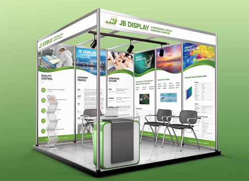 Booth Poster Design for Professional Monitor Product Suppliers
The standard exhibition booth poster projec ...
-
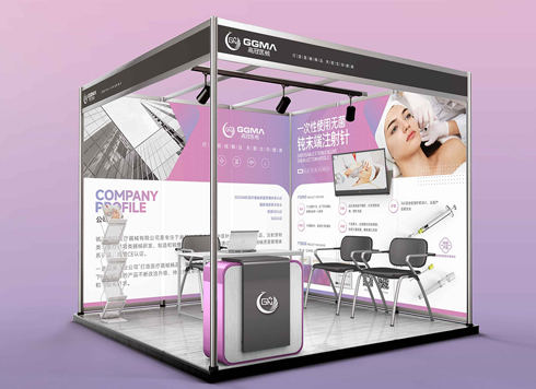 Design of Standard Exhibition Booth Posters for Beauty Instruments
Carefully designed a standard exhibition bo ...
-
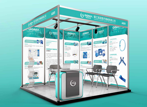 Design of Exhibition Posters for Medical Device Standards
XiYue is designing an exhibition booth post ...
-
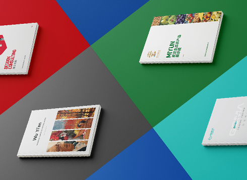 Collection of Brochure Design Cases in 2024 (Cover Series 02)
Our brochure design projects focus on diver ...
-
Black body text in a brochure shows a red fringe when zoomed in, while color photos on the same page look fine—is the black text set in four-color black or is the printer's registration off?
Date: Nov 2, 2026 Read: 2
-
When a client only needs a few price and size changes at project close but insists on layered PSD, is outlined AI plus a note enough?
Date: Nov 1, 2026 Read: 12
-
The client asked for linen paper's feel, but the full-bleed dark cover prints unevenly—what can we do besides switching paper?
Date: Oct 31, 2026 Read: 13
-
The same photo shows shadow detail on a phone but prints as solid black in a brochure: before sending to print, should you adjust the image first or ask the printer about total ink coverage?
Date: Oct 30, 2026 Read: 14
-
Matte-laminated sales cards won’t take ballpoint writing: change the film or leave the back blank when reprinting?
Date: Oct 29, 2026 Read: 19