



When I turn to the full-page image pages in a yearbook, the headers and page numbers look like they belong to a different book—is that normal?
Not normal, but very common: yearbook text pages and full-page image pages usually do not need to share the same type-area dimensions, but they should share the same finished outer frame, gutter, and header/page-number baseline. Based on common 2026 delivery experience, text pages use the main text block to protect characters per line and reading rhythm, while full-page image pages use the image area to protect image integrity and bleed safety. When headers and page numbers look like they “belong to a different book,” it is usually not a problem with the image itself, but because the image plate pages start a separate type area without being tied back to the same baseline.
Why do type areas start to conflict when full-page images increase?
The text block governs how many characters go on each line, how open the line spacing is, and how much white space is left at the head and foot; it directly affects whether readers can follow line endings from one line to the next. Full-page image pages govern whether the image can reach the trim line and whether the subject will be eaten by the gutter. The two have different goals; forcing them into the same type area usually means either the image is shrunk inward or the text line width is stretched too wide.
To judge whether an image should leave the text block, first look at its role on the page: run-in images, diagrams, and tables usually follow the text block so the reading rhythm is not broken; only full-page images, spread images, and image plate pages need a separate image area. If run-in images are also pushed into the image area, headers and page numbers are easily displaced; if full-page images are forced to shrink to the text block, an unnecessary ring of white space appears around the image.
- Goal of text pages: stable characters per line, consistent line spacing, and no visual jump when turning pages.
- Goal of full-page image pages: complete image, sufficient bleed, and the subject kept away from the gutter and trim line.
- Point of conflict: the text block is usually a ring smaller than the finished outer frame, while a full-page image needs to reach the frame or even bleed; sharing the same area makes the two pull against each other.
One frame, two blocks: lock the outer frame first, then separate the text block and image area
“One frame, two blocks” does not mean making two layouts. It means locking the outer frame that cannot move, then separating two movable ranges: the text block and the image area. The outer frame includes the finished trim line, safety line, gutter line, and header/page-number baseline; the text block is responsible only for body copy, and the image area only for the usable image range. If the order is reversed—drawing the type area first and adding the gutter later—every later change in binding method requires re-layout.
- Set the finished outer frame and gutter first: allow for the gutter according to binding method, paper thickness, and number of text pages; a common practice is to check against the printer’s white proof, and the experience range is to leave 1–3 mm more than an estimate based on paper weight.
- Then set the text block: work backward from the trim size and characters per line; Chinese body copy commonly has 28–40 characters per line, line spacing is fine-tuned by type size and paper reflectivity, and passing a test read without lines jumping or merging is the benchmark.
- Set the image area separately: inset a safety line from the outer frame; when a full-page image reaches the trim line, leave 2–3 mm of bleed—this is a typical range—and keep the subject away from the gutter side.
- Add cross-over rules: which baseline captions, page numbers, and headers hang on, and how spread images compensate for the gutter, must be written clearly before layout.
- Keep an acceptance checklist: sample several text pages, full-page image pages, and spreads across the whole book for checking; do not judge by whether a single page looks good.
What is easily missed is the cross-over rules. Defining the image area does not mean captions automatically follow it; if captions are still set to the text block, they will compete with page numbers during imposition. Spread images also need a little allowance on both sides of the gutter, and the subject must not fall on the binding line.
On delivery: when source materials are uneven, which line should be protected first?
In yearbook projects, common constraints are uneven pixel quality in historical event images supplied by the client, inconsistent full-page image sizes, a schedule compressed to about three to four weeks, and a budget that does not support reshooting everything. The approach is to lock the finished outer frame and gutter first; scale the image area uniformly by the shortest edge of the image; list images with insufficient pixels separately for replacement instead of forcing enlargement; and set upper and lower limits for full-page images, switching images or layouts when they exceed the range. As a result, there is less rework during imposition, but a few images still need to be reshot, and the send-to-print time moves back two or three days. Revision rounds commonly drop from 4–6 to 2–3, at the cost of spending an extra half day to one day on rules up front. These figures are an experience range and a typical range in projects, not fixed values.
Single text block or one frame, two blocks: start with the share of image plate pages
Neither approach is inherently better; the difference lies in rule complexity and image presentation. A single text block has fewer rules and imposes faster, and suits publications with few images and mostly run-in images; one frame, two blocks requires more rule sorting up front, but full-page images and spread images are less likely to be boxed in by the text block. To decide, first count the proportion of image plate pages in total pages, then look at the number of full-page images and the revision frequency.
- Single text block: 1–2 fewer workdays for rule sorting up front and faster imposition; the cost is limited full-page image presentation, and repeated image shrinking when there are many images. It suits text-only books, publications dominated by run-in images, and shorter page counts.
- One frame, two blocks: 1–2 extra workdays up front to define the image area and cross-over rules, and commonly 1–2 fewer revision rounds later; it suits publications with many full-page images, such as yearbooks, brochures, magazine special issues, and exhibition catalogues.
- How to decide: when image plate pages stay below 10–20% of total pages over time and run-in images dominate, two type areas are usually unnecessary; when full-page images account for 20–30% or more and involve spreads and bleed, a single text block is often insufficient.
Binding method and paper also matter. Saddle stitching and perfect binding need different gutter compensation; the thicker the paper, the more easily spread images are eaten near the gutter. If the binding method is not fixed, do not lock the image area too early. A common 2026 practice is to put binding method, paper, and type-area rules on the same confirmation sheet, so layout and the printer do not each follow their own interpretation.
Where it applies and where it does not
One frame, two blocks is suitable for printed and bound publications with a high share of image plates and many full-page and spread images, such as corporate yearbooks, industry reports, product brochures, magazine special issues, and exhibition catalogues. If such publications use only a single text block, full-page images are easily shrunk inward, and both visual impact and information hierarchy tend to be weakened.
The unsuitable cases should also be stated clearly: text-only books, projects with few images dominated by run-in images, and short one-off deliveries often add maintenance cost with two type areas; for e-books or screen-reading-first projects, check the type area against platform specifications and actual renderer behavior, and do not directly apply a print type area. This sentence can be taken on its own: When image plate pages are a low share and run-in images dominate, a single text block is simpler; only when full-page and spread images are many and bleed and gutter must be controlled is it worth separating an image area.
- Suitable: yearbooks, brochures, magazine special issues, exhibition catalogues, and industry reports with many full-page images and print binding needs.
- Not necessary: text-only books, run-in-image-dominated publications, short projects with no revisions, and e-book-first projects.
- Use caution: when binding method, paper, or overall image pixel quality is not settled, lock the outer frame and gutter first, then discuss the image area.
Frequently asked questions
Do all full-page images need bleed?
It depends on whether the image reaches the finished trim line. When it reaches the edge, leaving 2–3 mm of bleed is a typical range; images that already have white borders do not need to be forced to full bleed, and forcing bleed adds another trimming risk.
If the image area differs from the text block, will headers and page numbers fail to line up?
As long as headers and page numbers hang on the same baseline of the outer frame, the image area only affects the usable image range and usually does not shift page numbers; displacement is more often because captions use a separate text-block style.
If there are not many images, is it unnecessary to make two type areas?
When image plate pages stay below 10–20% of total pages over time and run-in images dominate, a single text block is simpler; setting up separate rules for a few images can cost more in maintenance and handover than it returns.
If the printer says inconsistent type areas will increase imposition costs, should I believe it?
Type-area variation itself does not necessarily add cost; what affects imposition is whether page size, bleed, and binding method are consistent. Ask the printer to state the billing basis clearly in the quotation, then decide whether to separate the image area.
Should figure captions be numbered by chapter or by page?
The caption numbering basis must be fixed before layout; numbering by chapter suits publications with many images and cross-chapter references, while numbering by page suits journals read page by page, and mixing the two easily falls apart after revisions.
If you have a yearbook with many images and a fair amount of text, do not rush to draw the type area: set the finished outer frame, gutter, and header/page-number baseline first, then decide whether the text block and image area should be separated. When image plate pages are a low share and run-in images dominate, a single text block is simpler; when full-page images are many and bleed and gutter must be controlled, use one frame, two blocks. For specific values involving binding and bleed, check against the printer’s white proof and the delivery acceptance checklist.
-
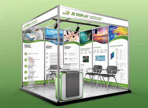 Booth Poster Design for Professional Monitor Product Suppliers
The standard exhibition booth poster projec ...
-
 Design of Standard Exhibition Booth Posters for Beauty Instruments
Carefully designed a standard exhibition bo ...
-
 Design of Exhibition Posters for Medical Device Standards
XiYue is designing an exhibition booth post ...
-
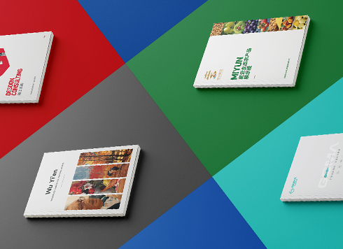 Collection of Brochure Design Cases in 2024 (Cover Series 02)
Our brochure design projects focus on diver ...
-
A thin booklet starts every chapter on a right-hand page and adds 10+ blank pages—should you change the binding first or the chapter-start rule first?
Date: Oct 29, 2026 Read: 17
-
Single-column text with two-column figures: is a missing column-grid rule behind reflowing text every time a figure moves?
Date: Oct 11, 2026 Read: 32
-
For a book series, if you create a master first and then apply it, why does the layout still drift when someone else takes over?
Date: Oct 5, 2026 Read: 39
-
Body text one size smaller and fewer signatures: why do trial readers say they can't get into it?
Date: Sep 29, 2026 Read: 42
-
Print is already at the printer, but the ebook goes live two months later — can the earlier layout still be reused?
Date: Sep 23, 2026 Read: 45