


Drop Shadow and Outer Glow Nearly Invisible in the Proof: Printer Error or an Effect That Can't Be Printed?
Drop shadows, outer glows, and glassmorphism in a design are often nearly invisible once printed on paper. In most cases this is not the printer missing an element. These effects are essentially additive light on screen: after conversion to CMYK dots, soft edges retain only a very low lightness difference, which is then absorbed by the paper and eaten by dot gain. Based on 2026 experience delivering print materials, whether an effect can survive depends on three things—what medium it is printed on, how much contrast there is between the effect and the background, and how large the area is at final size. If any one of the three is missing, change the way the effect is expressed instead of forcing the printer to print it. This judgment is mainly for paper-based print materials; pure screen deliverables do not need to apply it.
Screens Emit Light, Paper Only Reflects It: A Drop Shadow That Won't Print Is First a Physics Problem
A white drop shadow on screen works by making pixels brighter. White on paper can only come from the paper reflecting light; ink works by subtracting light. So a white soft glow on a light background, or a faint outer glow on a dark background, has no natural room on paper. The same file will light up again on a light box or backlit screen—which is why the same effect gives opposite results on two media.
The print side has two more variables. The first is minimum distinguishable contrast: as a rule of thumb, a dot difference of about 5%–10% is needed to see tonal separation. The second is dot gain: soft edges are created by transitions among large, medium, and small dots, but in actual printing they get flattened and spread outward, and low-opacity areas merge directly into the background. So 'it looks too faint' often does not mean the printer did not apply enough force; there simply is not enough ink coverage to carry the effect.
- Screen: additive display; brightness can exceed paper white; soft transitions are almost lossless; the finer the shadow, the better it looks.
- Paper: subtractive reflection; the brightest point can only be paper white; to create a white light effect on a dark background, you need white ink or processes such as foil stamping.
- Viewing environment: screens emit their own light, while paper depends on ambient light; in warm gallery lighting or a dim restaurant, soft-edge effects look weaker than in the proof.
Which Effects Are More Likely to Fail in Printing
Not all screen effects are impossible to produce. The ones that really fail usually combine three conditions at once: low contrast, soft edges, and a small area. Low contrast means the effect is already inconspicuous; soft edges let dot transitions flatten; and a small area leaves not even a trace after trimming and finishing. When all three are present, four-color printing usually cannot reproduce the effect reliably.
- Outer glow and soft glow: low opacity and soft edges often merge with the background after printing and look as if they were never there.
- Large-area soft drop shadows: a dark shadow on a dark background turns into a muddy patch, while a light shadow on a light background easily disappears.
- Glassmorphism and translucent overlays: after multiple translucent layers are stacked, opacity becomes uncontrollable; the combined result often only shows after the file has gone to print.
- Gaussian blur and background blur: blurry areas are made of extremely fine dots and often show noise or banding after printing.
- Inner shadows and fine embossing: when the width is only one or two millimeters, dots have not yet formed a transition before finishing presses them away.
- Fine highlight strokes: when a stroke is too fine to transfer reliably, it often becomes a broken bright line after lamination.
Use a Medium–Contrast–Size Three-Layer Check to Decide Whether an Effect Can Stay
The order cannot be reversed: the medium sets the lower limit of printing, contrast determines whether the effect can be seen, and size determines whether it is still recognizable at a normal viewing distance. Deciding the medium before discussing how strong the effect should be is much more reliable than adjusting parameters first and asking the printer afterward, and it avoids repeated revisions. In common 2026 print material deliveries, whenever someone skips the medium and asks directly 'can this be printed?', they often have to rework once more later.
- Set the medium: first confirm the paper, printing method (four-color or spot color), and whether lamination will be used. Dark cardstock and white cardstock tolerate the same shadow very differently, and matte lamination removes another bit of gloss separation.
- Set the contrast: check the dot difference between the effect color and the background. As a rule of thumb, anything below 5% is basically equivalent to nothing; a dark shadow on a dark background often has enough difference but the wrong direction—the more you darken it, the dirtier it looks.
- Set the size: judge by the actual final size and viewing distance. A 3 mm soft glow band in a brochure may be only a dirty edge at a 30 cm viewing distance.
- Set the alternative: if any item fails, switch to shape, solid color, or a process. Do not keep trying 'a little darker'—darkening cannot fix soft edges and small areas.
- Check with a proof: if possible, make a digital proof first and focus on the soft-edge area and the small text next to it; these two are the most likely to drag each other down.
When an Effect Won't Hold, How to Choose an Alternative
The core idea of an alternative is to shift from simulating light to expressing depth with shape, color steps, and material. It may not look worse, but the result is controllable and will not fluctuate between one batch and another because of ink variation. The options below are ordered from low to high investment; the costs and lead times given are typical experience ranges, and exact quotes and schedules still depend on the printer's quote at the time.
- One-sided solid offset plus a fine outline: no extra printing work and no change in lead time; a common low-cost fix; the tradeoff is harder edges, suitable for small elements such as buttons, cards, and labels.
- Two to three levels of solid color layering: still four-color, with basically unchanged cost; use lightness differences instead of gradient shadows; more than three levels easily looks dirty.
- Spot color: requires a separate plate and ink mixing; cost is typically one tier higher than four-color, and lead time is typically 1–3 working days longer; suitable for a block of color that must stay stable on a large background.
- Emboss or deboss: no ink; relies on raised or recessed texture; requires tooling, and lead time is typically 2–5 working days longer; suitable for small-area emphasis.
- Foil stamping and spot UV: texture and cost are both one tier higher; cost rises with area; short-run materials often have minimum order quantity thresholds, and lead time is typically 3–5 working days longer.
At Delivery: Ask About Use First, Then Decide How Much of the Effect to Keep
A common constraint on projects is this: the budget is mid-to-low, only three days are left, the client has chosen digital short-run, and the assets are still phone screenshots. The approach is to change the soft outer glow to a one-level solid offset plus a fine outline, and keep the shadow only on the side near the subject. The result was on-time delivery and two rounds of revisions saved; the cost is losing that light floating feel, which needs to be made up with whitespace in the layout. According to 2026 project records, the extra cost of this kind of change on short-run materials typically falls in the experience range of zero to a few hundred RMB, with basically no increase in lead time. If spot color or spot UV is used instead, the cost typically rises one tier and lead time is typically 2–5 working days longer.
Clients often get stuck at 'it looks fine on my computer.' The easiest way around this is to view the artwork at 100% physical size, or look at the screen from a normal reading distance; the effect usually recedes by half. For brochure and packaging delivery, we usually put elements with effects on a separate layer and label the process, so the printer can check before output and later version changes only need to touch that layer. This habit does not add design hours, but it saves a lot of back-and-forth confirmation.
Applicable Scenarios and Boundaries
This judgment mainly applies to paper-based materials: brochures, leaflets, packaging, business cards, display boards, and other scenarios mainly using four-color printing, especially projects that require batch reproduction and involve lamination or finishing. The standard is direct—can this effect be described reliably at final size? If not, change it.
- Suitable for a printability check first: batch printing, multi-batch reuse, projects involving spot color or finishing, and artwork with large soft-edge and translucent overlays.
- No need for major changes: pure screen uses such as web pages, UI, short-video covers, and event screens; drop shadows and glows are the correct expression there, and you do not need to sacrifice visuals for print.
- Not applicable, or do not force it: trying to use four-color offset to simulate metallic reflection, neon glow, or glass transparency usually only produces an approximation; the safer approach is to change the process or the expression, not to keep darkening it. Projects delivered only on screen do not need to be redone to print standards.
Common Questions
Does making the drop shadow darker make it print?
Darkening only addresses contrast; it cannot fix soft edges and small areas, and the edges will still be eaten by dot gain. Changing the shadow to a one-sided solid offset is usually more stable; the tradeoff is harder edges.
How much do digital printing and offset differ on these effects?
Digital short-run has a slight advantage on small-area soft effects. Offset has more obvious dot gain, and soft edges on light backgrounds merge more easily. For both, proof according to the actual process; do not just look at the screen.
The client insists on the transparency of glassmorphism—can four-color printing do it?
Four-color can only approximate it; after multiple translucent layers are stacked, opacity is uncontrollable. A safer approach is to simplify the number of layers, or combine with spot UV or foil stamping; cost and lead time typically rise one tier.
Do designs viewed only on screen also need to follow print standards?
No. Glow on screen is a normal expression; set the standard by the output. If the same visual will be used in both places, it is better to split it into a screen version and a print version and deliver them separately, to reduce mutual compromise.
In practice, before sending to print, put elements with drop shadows, glows, and blur on a separate layer, check them at physical size, and replace any effect that cannot be explained clearly at a normal viewing distance. That is the more rework-saving approach. The judgments above are for paper-based print materials; pure screen deliverables do not need them. When spot color, foil stamping, and other processes are involved, the printer's current quote and proof results still take precedence.
-
 Booth Poster Design for Professional Monitor Product Suppliers
The standard exhibition booth poster projec ...
-
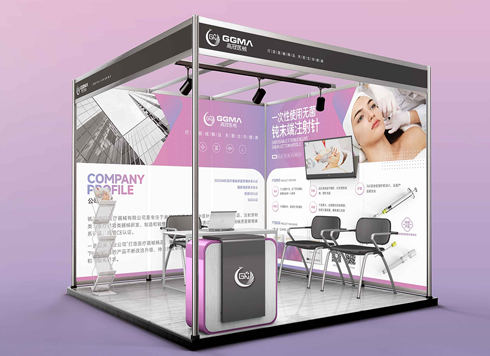 Design of Standard Exhibition Booth Posters for Beauty Instruments
Carefully designed a standard exhibition bo ...
-
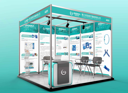 Design of Exhibition Posters for Medical Device Standards
XiYue is designing an exhibition booth post ...
-
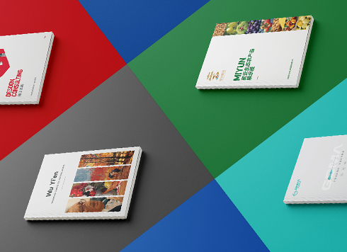 Collection of Brochure Design Cases in 2024 (Cover Series 02)
Our brochure design projects focus on diver ...
-
Black body text in a brochure shows a red fringe when zoomed in, while color photos on the same page look fine—is the black text set in four-color black or is the printer's registration off?
Date: Nov 2, 2026 Read: 2
-
When a client only needs a few price and size changes at project close but insists on layered PSD, is outlined AI plus a note enough?
Date: Nov 1, 2026 Read: 12
-
The client asked for linen paper's feel, but the full-bleed dark cover prints unevenly—what can we do besides switching paper?
Date: Oct 31, 2026 Read: 13
-
The same photo shows shadow detail on a phone but prints as solid black in a brochure: before sending to print, should you adjust the image first or ask the printer about total ink coverage?
Date: Oct 30, 2026 Read: 14
-
Matte-laminated sales cards won’t take ballpoint writing: change the film or leave the back blank when reprinting?
Date: Oct 29, 2026 Read: 19