



The same brand red looks different on a storefront print and a packaging box—is one color code in the manual enough?
Conclusion first: in VI system design, if the brand color is written as only one CMYK value, storefront prints, packaging boxes, and online stores will look mismatched. In most cases the problem is not the producer's craftsmanship, but that the color value is not layered by output method. A more stable approach in 2026 is to give each primary color four layers: screen value, four-color print value, spot-color approximation, and material notes, plus a prohibited-use note. This one-page color value card usually reduces later rework more than adding ten pages of application mockups.
One color code across three scenarios: the difference lies in the color rendering mechanism
CMYK describes the output state of four-color offset printing on a certain paper; it is not the whole of the brand color. Screens are emissive additive color, signboard printing is large-format inkjet, and screen printing and hot stamping use spot-color ink or metallic foil—the color rendering mechanisms differ. When the same set of values is moved directly from print values to screens, dark colors can look muddy and true red can turn orange; this is mostly a mechanism difference, not someone adjusting it wrong.
Brand color is repeatedly questioned in VI system design because it needs each producer to convert it once. Clients often assume that writing the color code into the manual unifies it, but in reality the packaging factory, sign maker, and e-commerce designer each convert according to their own habits. Errors stack up layer by layer, and in the end every reorder fails to match.
- Screen: online stores, WeChat official accounts, and presentations use sRGB or HEX; do not directly convert CMYK into them.
- Paper products: brochures, packaging, and business cards use CMYK, with the corresponding paper and process conditions noted.
- Large format: storefronts, banners, and light boxes are usually produced according to the printing machine's ink set and substrate; colors generally tend to be more vivid and brighter.
- Special printing: screen printing, hot stamping, acrylic, and embroidery thread follow spot-color logic; four-color values are basically not applicable.
Split the brand color into a four-part color value set
This split is based on who is viewing it and what it is printed on, not on color. The same primary color is inherently hard to match across materials; what the manual should do is keep deviation within an acceptable range and tell each producer which row to check.
- Screen value: Write HEX and sRGB, note the applicable scope, and remind users not to fill this set directly into CMYK files.
- Four-color print value: Write CMYK, and note the test paper and process conditions, such as a certain type of coated paper with no lamination. Attach a small physical proof as reference when possible.
- Spot-color approximation: Use for large solid color blocks, storefronts, and main color areas on packaging. Mark it as an approximation, not an equivalence, and state that actual color card comparison prevails.
- Material notes: Write one note each for banner printing, screen printing, acrylic, embroidery thread, and hot stamping, e.g., dark acrylic with backlighting tends to look cooler, and embroidery thread cannot reproduce highly saturated colors.
- Prohibited combinations and minimum usage: Clearly state on which backgrounds thin reversed-out lines are not allowed, and the minimum spacing when two brand colors are placed side by side, reducing room for producers to improvise.
Among these five steps, the third and fifth are most easily skipped. Spot-color approximation is often omitted as close enough, and prohibited combinations are often deleted as restricting creativity; only when thin lines break on packaging or two color blocks blur together do people realize that this is exactly the missing line.
At delivery: align output standards first, then talk about color adjustment
In one project, the client could only find an old manual PDF from several years ago, and the source of the color values was unclear. At the same time, packaging, storefront, and online store redesigns were needed, the producers belonged to three different companies, the budget was in the typical range, and the schedule was only two to three weeks. We did not adjust colors first. Instead, we first produced a one-page color value card, aligned the three producers' output standards according to the four-part set, and then asked each to make a small sample for comparison. The cost was two to four extra working days for proofing and comparison, and the overall schedule was pushed back slightly; in return, mass production had one to two fewer rounds of reprinting and back-and-forth disputes. In such projects, the extra upfront time has a typical range of two to five days; if there are many materials and samples must be sent across cities, extending to one to two weeks is also a typical range.
Single color value set vs. layered color values: how to weigh the cost
Neither approach is absolutely better; it depends on how many materials the brand will appear on in the next year and how many outsourced producers it will use. The criteria can be summarized in two dimensions: the number of touchpoints and the number of outsourced producers. If both are low, layered values are unnecessary.
- Single color value set: If you only produce one or two paper-based materials, have long worked with the same producer, and mainly operate online, one HEX set plus one CMYK set is usually enough. The organization period has a typical range of two to five working days, with low upfront cost; the risk is concentrated in the moment you change producers.
- Layered color values: When spanning packaging, storefronts, apparel, and e-commerce, with two or more outsourced producers, experience suggests the four-part set is worth doing. Including proofing and comparison, the typical range is one to three weeks; proofing and comparison costs commonly fall in the range of hundreds to thousands of yuan depending on materials and quantity; the main cost is upfront organization.
- Phased approach: First do the four-part set for primary colors; for secondary colors, provide only screen and print values, and add the rest after materials are rolled out. The first-round period is typically 30% to 50% shorter than full layered values, but a follow-up addition must be scheduled.
How do you judge whether it is enough? A usable check is: send the color value card alone to someone who did not participate in the project and ask them to make a small sample accordingly; if they do not need to come back and ask what paper this color code is printed on, it passes.
Before writing it into the manual, check these items
Acceptance of the color value section does not need to rely on feeling; it can be checked item by item. The following items are relatively easy to miss at delivery and relatively easy to add, and are suitable for direct use as a checklist.
- Does each primary color have all three sets—HEX or sRGB, CMYK, and spot-color approximation—with the applicable scope noted for each?
- Does each CMYK set note the paper and process conditions, rather than being an isolated number?
- Does it clearly state approximation rather than equivalence, and indicate that the color card or proof prevails?
- Is there at least one prohibited-use note, such as thin reversed-out lines on a dark background or two brand colors directly touching?
- Is a physical reference attached: a color card, proof paper block, or retained sample of a previous finished product?
Counterexamples are also common: the manual has a beautifully laid-out color page, with a string of numbers under each of the four color blocks, but not a single sentence explaining under what conditions those numbers were measured. Such a page offers limited practical help to producers, and in the end it still takes a phone call to resolve.
Applicable and non-applicable boundaries
Layered color values are not worth doing for every project. The key judgment is whether the same brand color needs to appear across materials; company size matters little.
- Suitable: multi-channel deployment, cross-material production, two or more outsourced producers, and brand visuals expected to be used for more than three years.
- Not necessary: single-store operation, materials concentrated with one or two long-term partners, pure online business, or a possible complete visual change within one year.
- Can be phased: first do the four-part set for primary colors, provide only screen and print values for secondary colors, and add the rest after materials are rolled out.
Frequently asked questions
Must the brand color use Pantone spot colors?
Not necessarily. Spot colors are only worth using for large solid color blocks and scenarios with high consistency requirements; for regular four-color printing, clearly writing CMYK plus paper conditions is enough for most projects.
Is it normal for a color that looks right on screen to print darker?
This is very common. Screens are emissive additive color, while printing is ink-based subtractive color; deviations are more obvious with deep blue, true red, and fluorescent orange. Comparing with a color card or proof is usually less trouble than repeatedly adjusting values.
How long does it take to add a color value card set?
In terms of experience range, organizing existing color values alone typically takes two to five working days; including proofing comparison and cross-material confirmation, it typically takes one to three weeks, depending on producer cooperation and the number of materials.
Does writing approximate Pantone in the manual make it look unprofessional?
Marking it as approximate is actually more reliable. Consistency is inherently difficult across different papers, ink batches, and lighting conditions; clearly stating the conditions holds up better to checking than fixing a single number.
If you need to move forward right now, one thing is recommended first: extract the brand's primary colors separately and make a one-page color value card, fill it out according to the four-part set, and then check it with existing producers. This action suits multi-channel, multi-producer projects; if materials are only implemented in one place, clearly writing the screen values and one CMYK set is enough—there is no need to lengthen the overall cycle for this.
-
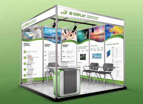 Booth Poster Design for Professional Monitor Product Suppliers
The standard exhibition booth poster projec ...
-
 Design of Standard Exhibition Booth Posters for Beauty Instruments
Carefully designed a standard exhibition bo ...
-
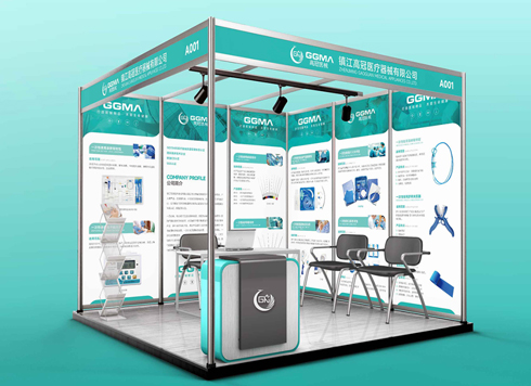 Design of Exhibition Posters for Medical Device Standards
XiYue is designing an exhibition booth post ...
-
 Collection of Brochure Design Cases in 2024 (Cover Series 02)
Our brochure design projects focus on diver ...
-
Storefront is installed and packaging is printed—will newly added supporting graphics still match the earlier materials?
Date: Nov 21, 2026 Read: 6
-
Six months after the brand red was signed off, the reprint packaging still doesn’t match—is the issue the retained sample or the printer?
Date: Nov 9, 2026 Read: 23
-
The sub-brand is still internal-only—should the VI system include the master–sub relationship in advance?
Date: Oct 16, 2026 Read: 46
-
Switching embroidery factories means the logo has to be redrawn—is the grid construction page the problem?
Date: Oct 10, 2026 Read: 56
-
Brand logo has only one horizontal version—when hang tags, ID badges, and packaging frames won't fit, should you add versions or force-scale?
Date: Oct 4, 2026 Read: 57