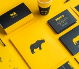




Small foil-stamped text on packaging: why do the middle characters blur first in a proof?
When a row of small text is foil stamped on a packaging box and the middle two characters blur together first in the proof, in most cases it is not caused by tight character spacing alone, nor does it mean foil stamping cannot handle fine strokes; rather, character height, stroke width, negative space between strokes, paper surface roughness and foil die precision are not matched to the same level. Based on 2026 project delivery practice, on glossy coated card stock, character heights of around 3 mm and strokes of around 0.2 mm still have some margin; on specialty papers with obvious texture, matte-laminated surfaces, or strokes as fine as around 0.1 mm, blurred edges and broken lines tend to appear together. The usual diagnostic order is paper surface first, strokes second, with temperature and pressure adjusted later.
When small foil-stamped text blurs together, check negative space and paper surface first
Foil stamping does not print ink onto paper; it heat-transfers an aluminum layer from a carrier onto the substrate using temperature and pressure. Stroke edges are mainly determined by the shape of the foil die and pressure. Slightly too much pressure can make the edge spread outward, while slightly too little pressure may transfer incompletely. On fine text, blurring and broken lines are often the result of the same set of parameters drifting in either direction.
- Blurred edge: the foil die edge has a bevel, temperature is too high or pressure is too great, leaving a fringe outside the stroke;
- Broken line: the paper surface is rough, pressure is insufficient, or the foil die is etched too deep, so a segment is missing in the middle of a fine line;
- Pinholes exposing the substrate: laminated, varnished or low-surface-energy materials were not pre-treated, so the foil layer does not adhere firmly;
- Looks blurred but is actually misregistration: the foil position does not align with the printed artwork, which is a registration datum issue; adjusting temperature and pressure will not help.
When the middle two characters in a row blur first, a common cause is that the negative space between these characters is too small, or they happen to sit in recesses of the paper texture. Character spacing is only part of negative space; simply widening the spacing may not be enough, and stroke weight and substrate should be checked at the same time.
Before releasing artwork, check paper surface, strokes, die material and finishing sequence
Fixing this check order is useful because the earlier items are harder to change: once the paper is set it is difficult to switch, stroke weight belongs to the design stage, die material and foil die precision are decided by the processor, and only temperature and pressure are adjustable on press. Putting on-press adjustments last reduces repeated foil trials.
- Paper surface: glossy coated card stock and matte coated paper transfer more stably; specialty papers with obvious texture, embossing or lots of fibers need strokes enlarged.
- Strokes: check character height, minimum line width and negative space between strokes together. When negative space is smaller than stroke width, blur risk rises; this is more often overlooked than font size itself.
- Die material and process: flat foil stamping and dimensional foil stamping have different requirements for strokes; dimensional foil stamping presses embossing at the same time, making fine lines harder to preserve.
- Finishing sequence: foil before lamination, lamination before foil, and foil followed by embossing have different effects on edge sharpness and reflectivity; confirm with the processor which route will be used before approving a sample.
- Proof closure: use the actual paper, actual foil and actual foil die to stamp a small patch, and evaluate it at finished size rather than only looking at an enlarged effect rendering.
Acceptability can be checked very concretely: on the proof, stroke edges are clean with no overflow; the gaps between strokes still breathe; and at a normal reading distance of about 30–40 cm, the text is clear. If any one of these three fails, change the strokes or the material rather than continuing to add pressure.
Treat glossy card stock, textured paper and laminated surfaces differently
Different substrates differ noticeably in the lower limit of stroke width they can handle. For the same row of foil-stamped text, glossy card stock and textured specialty paper can produce results an order of magnitude apart from the same file; this is also a common reason why the same job can foil well at one supplier and blur at another.
- Glossy coated card stock: within the experience range, character heights of around 3 mm and strokes of around 0.2 mm are relatively stable; leaving negative space above stroke width is safer;
- Matte coated paper, offset paper: the surface is slightly more open, so strokes need to be thickened accordingly; areas over dark solid ink also need consideration of underlying ink adhesion;
- Textured specialty paper: the deeper the texture, the more disadvantage; a common approach is to enlarge strokes 1.5–2×, or step back to metallic ink printing or screen-printed metallic ink;
- Laminated or varnished surfaces: first confirm whether foil can adhere firmly, then discuss fineness; if it cannot adhere, treat the surface first or switch to an alternative effect such as spot UV;
- Corrugated board, deeply embossed board: the surface undulates greatly, so fine strokes usually should not be expected; these are only suitable for solid areas.
Comparing foil stamping, metallic ink printing and screen-printed metallic ink
Wanting a metallic look does not mean foil stamping is the only option. In fine-text scenarios, comparing foil stamping with metallic ink printing and screen-printed metallic ink, many projects find the latter simpler because they avoid making a foil die and an extra proofing round; the trade-off is weaker metallic luster and fewer reflective layers.
- Metallic feel: true foil stamping has obvious reflectivity, followed by screen-printed metallic ink, then four-color process metallic ink; spot UV only gives gloss, not a metallic look;
- Fine text reproduction: four-color process metallic ink and screen-printed metallic ink are more stable on text around 1 mm, while foil stamping is more stable on solid block characters around 3 mm;
- Cost and lead time: foil stamping requires a foil die; die-making cost is commonly in the range of a few hundred RMB, varying with die area and region, and adds a proofing round; four-color process metallic ink does not require an extra foil die and runs with printing;
- Suitable batch size: for small batches that still need a metallic feel, screen-printed metallic ink can be used as a transition; for larger batches with fixed artwork, foil stamping per-unit cost is easier to amortize.
Suitable use cases and boundaries where it does not apply
In packaging and brochures, foil stamping is more of an accent process: it is responsible for pulling the key visual out on dark paper, not for carrying large amounts of information. Giving explanatory small text to it carries high risk and often leads to more revisions.
- Suitable: logos and product names on dark card stock or black card; positions such as cover main titles and gift box key visuals that need reflective contrast; artwork that is solid areas rather than fine lines, such as solid stamps or bold characters.
- Not suitable: explanatory text or addresses in a row of six to eight characters with a character height below 2.5 mm; barcode areas, QR code areas and other areas that need to be scanned; fine halftone dots, gradient blocks and lines around 0.1 mm; curved surfaces with very small radii, where uneven pressure amplifies blurred edges.
The boundary can be stated directly: if a line of text is lower than 2.5 mm in height and its strokes are only around 0.15 mm, leave foil stamping for the key visual and switch that line to single-color printing or metallic ink printing; this is usually simpler and more controllable than repeated foil trials.
Where delivery projects usually get stuck
In gift box projects, a common situation is: after seeing the proof, the client enlarges the logo slightly at the last minute and also changes the specified glossy card stock to a textured specialty paper. Neither change looks large on its own, but together they push strokes that were just sufficient below the lower limit. Based on 2026 project delivery practice, such changes should either be locked down before the foil die is made or accepted as requiring an extra proofing round.
Our usual approach is to issue a separate annotated drawing for the foil-stamped area, put character height, minimum stroke, material and finishing sequence on the same sheet for the processor, and stamp a small 1:1 sample on the actual paper before approval. Within the experience range, an extra 1–2 proofing rounds and a 2–4 day delay in lead time are common costs; if the foil die has already been made and the text is changed, the die cost is charged again.
- Using renderings instead of proofs: the gold glow on screen and the reflection of real foil are two different things;
- Marking foil stamping but not the area: the processor may interpret it as a full-sheet die, causing cost and registration problems;
- Quoting foil before lamination while actually laminating before foil: if the process sequence changes, adhesion must be reconfirmed;
- Foil position over four-color dark background with underlying ink not fully dry: mottling easily appears.
Frequently asked questions
If the characters blur together, is tight character spacing the cause, and is widening the spacing enough?
Not necessarily. Character spacing is only part of negative space; character height, stroke weight and paper surface roughness can also make middle characters blur first. Stamp a 1:1 sample on the actual paper first, then decide whether to widen the spacing or thicken the strokes.
Can textured specialty paper not be used for fine foil-stamped text?
It is not impossible, but the margin is small. Common practice is to enlarge strokes 1.5–2×, leave enough negative space, or switch to solid areas; at around 0.1 mm, most projects switch to metallic ink printing or screen printing.
Does foil stamping before lamination versus lamination before foil stamping affect fine text?
Yes. If foil is applied before lamination, the film covers the foil surface and the reflection becomes dull; if lamination comes before foil, first confirm whether foil can adhere firmly to the film. Writing the sequence into the handover sheet before proof approval is simpler than fixing it afterward.
For small-batch packaging that still needs a metallic look, how should foil stamping and metallic ink printing be chosen?
Look at volume and character height. Within a few hundred units and with small text, metallic ink printing usually saves die-making and proofing; for larger volumes, fixed artwork and mainly solid areas, foil stamping per-unit cost is easier to amortize. Check against the processor's quotation.
For the next packaging job that needs foil stamping, do three things before releasing artwork: mark the foil-stamped area on a separate drawing, stamp a small 1:1 sample on the actual paper, and write character height and minimum stroke into the handover sheet. If character height is already below 2.5 mm and the material is a clearly textured specialty paper, consider metallic ink printing or screen printing directly and reserve the budget for the key visual—craft serves the image, and not every element needs foil stamping.
-
 Booth Poster Design for Professional Monitor Product Suppliers
The standard exhibition booth poster projec ...
-
 Design of Standard Exhibition Booth Posters for Beauty Instruments
Carefully designed a standard exhibition bo ...
-
 Design of Exhibition Posters for Medical Device Standards
XiYue is designing an exhibition booth post ...
-
 Collection of Brochure Design Cases in 2024 (Cover Series 02)
Our brochure design projects focus on diver ...
-
Why do thin table lines in a brochure show in the proof but vanish on some pages after the production run starts—too thin, or four-color misregistration?
Date: Nov 4, 2026 Read: 3
-
Why does a deep-blue-to-light-blue display board gradient look smooth in a proof but show horizontal bands in production—is the gradient too short or is the output provider's screening off?
Date: Nov 3, 2026 Read: 8
-
Black body text in a brochure shows a red fringe when zoomed in, while color photos on the same page look fine—is the black text set in four-color black or is the printer's registration off?
Date: Nov 2, 2026 Read: 13
-
When a client only needs a few price and size changes at project close but insists on layered PSD, is outlined AI plus a note enough?
Date: Nov 1, 2026 Read: 19
-
The client asked for linen paper's feel, but the full-bleed dark cover prints unevenly—what can we do besides switching paper?
Date: Oct 31, 2026 Read: 20