



Why do thin table lines in a brochure show in the proof but vanish on some pages after the production run starts—too thin, or four-color misregistration?
Thin table lines in a brochure that are visible in the proof but disappear on some pages in the production run are usually not the printer cutting corners. More often the line width is already close to the minimum printable width of the output process, combined with four-color registration deviation and ink spread on paper. Based on 2026 prepress delivery experience, check two things first: whether the line width is below the typical range of 0.25 to 0.3 pt, and whether the line is built from several colors. In most cases, thickening the line by one step or changing it to a single-color solid can save it; switching printers outright often gives the same result.
Why a line is still there in the proof but breaks in the production run
Proofs and production printing image things differently. Digital proofs or blue-line proofs image directly from the file, so a vector line is output at whatever width it has; offset printing goes through plate making, inking, blanket transfer, and impression onto paper, and thin lines can be lost at at least two points in this chain: during plate exposure and development, lines that are too thin can narrow or even break, and during printing, ink-water balance and pressure can spread or flatten an already thin line on paper. So having it in the proof but not in the run is a typical process gap, not a file randomly going wrong on different machines.
More subtle is multicolor overprint. If a line is built from cyan, magenta, yellow, and black, a four-color registration shift of only 0.05 to 0.1 mm can turn the line into a color fringe on one side and a fuzzy edge on the other; from a distance it looks lighter or broken. Registration deviation is normal in printing, not an exception. Thin lines have far less tolerance than thick lines: the same deviation is invisible on a large solid area but can make a 0.25 pt line look gone.
- The line is built from four colors, and registration deviation splits the thin line into a color fringe and a fuzzy edge;
- The line width is close to the resolvable limit of plate making and development;
- Uncoated or textured paper spreads ink, so line edges become fuzzy and visually lighter;
- Reverse thin lines, knocked out of a dark background, fill in more easily than solid lines;
- Lines are set as hairlines or extremely thin strokes in the file, and scaling reduces the width again.
Check order: measure line width first, then look at color and process
The four steps are in this order for a reason: from the file itself to output conditions, and from what you can change yourself to what you need to confirm with the printer. Measure line width before color because width sets the lower limit, while color determines how much a deviation is magnified. Confirm the printing process before checking paper because the process already frames the printable range, and paper only adds or subtracts within that range.
- Measure line width: check the actual value in the file (points or millimeters), not how it looks when zoomed on screen. 0.25 pt is about 0.09 mm, and that scale is already at the edge for many processes.
- Check the color build: confirm whether the line is single-color solid, spot color, or built from four colors; whether four-color black is used; and whether it sits on an image or dark background.
- Confirm the printing process: offset, digital, screen, and flexo have very different tolerance for thin lines, and the same file can lead to a different conclusion under another process.
- Check paper and finishing: coated paper holds thin lines better than uncoated or textured paper; thin lines under lamination, varnish, or creasing also need separate checking.
What counts as acceptable: line width is above the experience-based lower limit for that process, the color is single-color or spot, the line does not cross a fold or crease, and it is not placed on a dark image. If any one of these four is not met, it is worth changing the file before the run starts rather than betting on the proof.
Line width experience ranges by process and the cost of rework
The following are experience ranges summarized from common 2026 equipment and delivery practices, used to judge whether a line should be thickened in advance; they are not hard standards. The same 0.25 pt line may be stable in digital printing but essentially not drawn at all in screen printing. For a specific machine and a specific batch of paper, the printer's proof and approval sample should still govern.
- Offset (coated paper, single-color solid line): the typical starting range is 0.25 to 0.3 pt; for a line that appears reliably on every page, an experience range above 0.3 pt is safer.
- Offset reverse thin lines: these need to be wider; typical advice is 0.4 to 0.5 pt or above, because ink control in the knocked-out area is harder.
- Digital printing: thin lines perform relatively well, typically starting at 0.2 to 0.25 pt, but light thin lines on a large dark area can fill in.
- Screen and flexo printing: tolerance is clearly lower, typically requiring 0.3 to 0.5 mm or above; packaging products especially should not copy brochure experience directly.
Comparing options and costs makes it clearer: thickening a thin line by one step at the file stage typically takes about 0.5 to 2 hours and costs almost nothing, with the only trade-off being a slightly heavier look in the layout. Finding out after the run starts that lines have disappeared typically means re-making plates, re-running the press, and reworking the whole batch; the typical cycle is 2 to 5 working days, the cost depends on press time and paper waste, and the range varies widely. This is also why thin-line problems are better solved before sending to print rather than trying to save them by chasing color on press.
Details most easily missed
A common situation in projects is that the designer gets the line width right but then fails on the details below. A simple standard: view the file at 200% zoom; any line whose width and color build cannot be stated clearly has not been fully checked.
- Using four-color black for lines: it looks black but is actually a four-color build, so misregistration produces color fringes; single-color black or spot color is more stable.
- Not widening reverse thin lines: lines knocked out of a dark background fill in most easily and need to be one step wider than solid lines.
- Thin lines crossing folds, creases, or binding positions: lines near folds and the gutter of inner pages shift because of paper deformation and look broken.
- Lines placed on dark images or gradient blocks: when contrast is insufficient, even a printed line cannot be read, which makes the work pointless.
- Tables use the software default hairline: the default value often sits just below the printable lower limit and is most easily missed when applying a template.
Where this applies and where it does not
Cases suited to the logic above: brochures with many tables, forms and tickets, manuals, packaging back labels, and layouts that need thin lines as separators. This is especially true for production-run offset printing, uncoated paper, and projects requiring lamination or creasing, where thin lines must be checked in advance.
Cases that do not need this process: pure text layouts, single-page posters, and decorative divider lines. Here the easier approach is not to agonize over fractions of a point but to drop thin lines altogether: use white space, light color blocks, or a light gray background to separate content; the information hierarchy stays clear and the process risk is avoided. Small-batch digital printing can also be relaxed somewhat, but the physical proof should still govern.
Experience from one delivery site: put table rules into a style before sending to print
In one fairly common delivery, the constraints were specific: the brochure had many tables, only two or three days were allowed, the budget did not support reopening a version, the client's old template still contained many hairlines, and the job had to work for both offset printing and later lamination. The approach was to screen all table lines below 0.3 pt before sending to print, put them into a single style, change them to single-color black, and raise them to the typical range of 0.3 to 0.35 pt; reverse lines were increased separately to 0.4 to 0.5 pt, and positions crossing folds and the gutter were avoided as much as possible. The result was that the whole batch did not need rework because of broken lines; the trade-off was that the lines on the received proof were slightly thicker than the original and the layout looked a little heavier. Such experience ranges are better used as a starting point for preflight self-checks before sending to print, not as a replacement for the printer's proof.
Common questions
How thin does a line have to be to count as risky?
In practice, below 0.25 pt (about 0.09 mm) enters the risk zone; for offset and packaging processes, 0.3 pt is recommended, and reverse lines should be 0.4 to 0.5 pt or above.
If the proof is fine, can I ignore it?
No. Digital proofs image directly from the file and do not show plate-making and registration losses. Thin lines must be checked against the process lower limit, not against how the proof looks.
If I change the line to a spot color, will it definitely print?
A spot color can reduce color fringes caused by four-color registration, but if the line is too thin it can still be lost in plate making and ink absorption. Width is still the first threshold.
If the table lines really must be very thin, is there an alternative?
You can use a light gray background or alternating color blocks instead of rules for separation; this looks lighter and is not limited by minimum line width. When lines are truly needed, prioritize thickening the main horizontal rules.
Before sending to print, run a dedicated check: screen all lines below 0.3 pt in the file and confirm one by one their color build, whether they are reverse lines, and whether they cross folds. This is suited to production-run offset and multicolor overprint projects; if the job is only a few digital proofs or a pure text layout, changing lines to light background blocks is easier. The printer's proof and approval sample should govern in the end.
-
 Booth Poster Design for Professional Monitor Product Suppliers
The standard exhibition booth poster projec ...
-
 Design of Standard Exhibition Booth Posters for Beauty Instruments
Carefully designed a standard exhibition bo ...
-
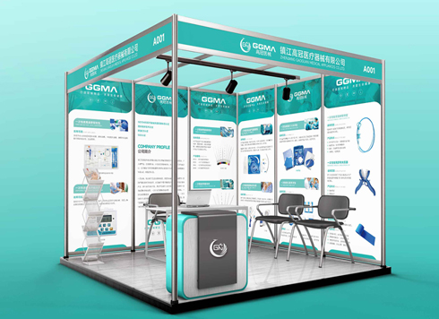 Design of Exhibition Posters for Medical Device Standards
XiYue is designing an exhibition booth post ...
-
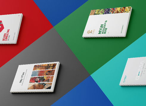 Collection of Brochure Design Cases in 2024 (Cover Series 02)
Our brochure design projects focus on diver ...
-
Small foil-stamped text on packaging: why do the middle characters blur first in a proof?
Date: Nov 5, 2026 Read: 2
-
Why does a deep-blue-to-light-blue display board gradient look smooth in a proof but show horizontal bands in production—is the gradient too short or is the output provider's screening off?
Date: Nov 3, 2026 Read: 7
-
Black body text in a brochure shows a red fringe when zoomed in, while color photos on the same page look fine—is the black text set in four-color black or is the printer's registration off?
Date: Nov 2, 2026 Read: 13
-
When a client only needs a few price and size changes at project close but insists on layered PSD, is outlined AI plus a note enough?
Date: Nov 1, 2026 Read: 19
-
The client asked for linen paper's feel, but the full-bleed dark cover prints unevenly—what can we do besides switching paper?
Date: Oct 31, 2026 Read: 20