



Why does a deep-blue-to-light-blue display board gradient look smooth in a proof but show horizontal bands in production—is the gradient too short or is the output provider's screening off?
The conclusion first: when a display board or poster background runs from deep blue to light blue, looks smooth on screen, but shows band after band in print, it is usually not a gradient drawing error and not a broken press. It is the step pattern exposed after continuous tone is quantized into halftone dots in subtractive printing. Based on the typical range for 2026 prepress delivery, first measure the gradient's actual length on the finished piece and the start/end CMYK difference, then decide whether to lengthen it, add grain, switch to spot color, or change the output method. If both are in the safe zone, sending it as-is is the simplest option.
Gradient bands in print are usually not a drawing error or a broken press
On screen, a gradient is a continuous additive transition, and each pixel can take many brightness levels. Printing builds tone by overlapping dot area coverage from four plates—cyan, magenta, yellow, and black—and the number of midtone levels a single plate can hold stably is limited. The rougher the paper and the more dot gain, the fewer levels it can hold. Once the gradient span is smaller than the step size distinguishable by the halftone levels, the steps show.
When judging, first look at two physical quantities: how long the gradient is on the finished piece, and how much the CMYK differs between the two ends. Based on our experience range from booklet and display board projects over the past two years, when the single-channel dot difference is about 10%–20% and the transition distance is under 30–40 mm, the probability of banding rises; with the same color difference stretched to over 70–80 mm, the steps are spread thinner, and most close-viewing cases will not notice them. These numbers are a typical range for checking, not guaranteed values; paper, screening, and ink volume still matter.
- Gradient too short: logo background blocks and narrow-strip backgrounds—the color difference has not changed, but the distance is not enough.
- Start/end color difference too small: a transition between two similar gray-blues, with fine steps concentrated together.
- Multi-color overprinting: three or four color plates change at the same time, and a one-level jump on any plate can amplify into a band.
- Output and screening: higher screen ruling and paper with strong ink absorption make midtones more likely to jump.
To judge whether a gradient will hold, measure two numbers first, then check the process
This order is design first, process second, budget last, because the first two steps cost nothing and are fast to change. If you wait until the proof comes back, you are often already in the rework cycle.
- Measure length: mark the actual millimeter span the gradient covers at finished size; calculate from the finished piece, not from the pre-scaling ratio in the design file.
- Read color values: use an eyedropper to read the start/end CMYK and see how many percentage points the single channel spans; large spans with short lengths should be flagged as key concerns.
- Match the process: confirm whether it is offset, digital, or large-format inkjet, ask for the screen ruling or output resolution, and check against the printer's output specifications.
- Decide treatment: if it passes, send as-is; if there is risk, fix it before proofing—do not bet on the production run.
The step most often skipped is the first one. Design files are often viewed at 25% or 50%, where the gradient looks like it fills the whole layout, but the finished piece is only a few dozen millimeters wide, so the step density is underestimated.
A checkable comparison of four treatments: cost, lead time, and stability
Making the same gradient smoother can cost very different amounts depending on the approach, so before choosing, check whether the gradient is part of the main visual. The following are common experience ranges from projects; actual quotes and scheduling from the printer prevail.
- Lengthen the gradient: suitable when the layout can still be adjusted and the gradient is not locked into a narrow strip. The added cost is usually very small, and most projects do not need an extra plate; the lead-time impact is typically zero to one business day, mainly for revising the file and re-outputting a digital proof.
- Add grain or noise: suitable for inside-page illustrations, chart backgrounds, and display boards with lower purity requirements. Cost is basically unchanged; lead-time impact is typically zero to one business day; keep single-color noise at 1%–3%, and use it cautiously on large light-color areas.
- Switch to a spot-color gradient: suitable for color-sensitive large-area gradients such as a cover main visual or a packaging main color block. Cost is typically one extra plate and one ink matching compared with four-color, and the share is more noticeable on short runs; lead time is typically one to three business days longer, so confirm spot ink and proofing method with the printer in advance.
- Change the output method: suitable for large-format display boards, backboards, and light boxes, not for paper booklets that need folding and binding. Cost is calculated by area and material and is often on a different basis from offset; lead time is affected by scheduling, typically one to three business days, and weather resistance and materials are counted separately.
Based on 2026 project delivery habits, for an oversized cover main-visual gradient, prioritize spot color or lengthening; for inside-page illustration backgrounds and chart gradients, adding grain is usually enough, and spot color is not necessary. Stability is not determined by a single process—gradient length, color-difference span, paper, and output method must be considered together.
At delivery: tight budget, short lead time, and compressed source material
A more common scene is a tight budget, a lead time of only three to five business days, and a compressed JPG background supplied by the client. The designer lays a brand deep blue to near-white across a finished cover of 210 × 285 mm—large span and sufficient length—and it looks fine on screen. The proof comes back with a bright band floating in the middle. The rework is to flatten the gradient curve, overlay about 1.5% noise, and output another proof; the cost is one to two extra business days. Based on our 2026 experience range for booklet and display board projects, this kind of mid-section banding usually needs one to three days of buffer; the later it is found, the more likely it squeezes downstream steps.
- Pitfall 1: viewing only at screen zoom: check at 100% view plus a proof to get close to the real appearance of the gradient.
- Pitfall 2: making the gradient into an image and embedding it: the bitmap itself does not have enough levels—this is effectively quantizing it once before handing it to the printer.
- Pitfall 3: digital proof for proofing but offset for production: the two may not band the same way; for color-sensitive large gradients, state this in advance.
In booklet-type delivery, we put gradients on the prepress checklist and review them together with bleed, fonts, and effective image pixels—precisely to reduce rework where a proof looks fine but the production run comes back with horizontal bands.
Where it applies and where it does not: what is worth fixing and what can be let go
Gradient banding truly affects perception mainly on materials that are large-area, viewed up close, and viewed for a long time: booklet covers, packaging main visuals, display board backgrounds, and light box graphics. On these materials, one horizontal band will be seen repeatedly, so it is worth cleaning up at the proof stage.
Boundaries matter too: gradients in small on-screen buttons and icons are often only a dozen millimeters in the finished piece, and the steps usually fall below the range the naked eye can distinguish—using spot color is a waste. Solid color blocks and single-color backgrounds have no gradient to begin with, so this check does not apply. For storefront signs and hoardings viewed from a distance, the viewing cone flattens the steps once the distance increases; unless the color-difference span is very large, conventional output is fine.
- Worth fixing: finished area larger than A4, viewing distance within one meter, the gradient itself is the main visual, or the same image will be mounted on a booth back wall and viewed repeatedly.
- Can let go: gradients in small icons and buttons, only a dozen millimeters in the finished piece; distant storefront signs and hoardings; gradients occupying only a small corner and not a visual focus.
- Does not apply: solid color blocks, single-color backgrounds, screen-only delivery, and purely digital posters—no need to apply the print-gradient check sequence.
Common questions
Will adding grain to a gradient make the image look dirty?
At 1%–3% single-color noise, on most papers it reads more like fine grain than dirt; only above that range, or on large light-color areas, does it tend to look dirty.
Digital proof is smooth, but the offset production run shows bands—is the proof lying?
Not necessarily lying. Digital proofs and offset differ in screening, ink volume, and paper, so large gradients may band differently; for color-sensitive jobs, state in the print instructions that the production process prevails.
The printer says the gradient does not have enough levels—are they asking me to convert it to a bitmap?
Usually not. 'Not enough levels' mostly means the transition is too fast and the midtone halftone steps are insufficient; the direction is to lengthen the distance, flatten the curve, or add grain. Converting to a bitmap may actually reduce it by another level.
Do small buttons and icon gradients also need this check?
Mostly no. When the finished piece is only a dozen millimeters, the steps rarely fall within the range the naked eye can distinguish; unless the gradient is the main visual and viewed repeatedly up close, conventional output is fine.
Next time you schedule a spread or display board gradient, first measure its length on the finished piece and the start/end CMYK difference. If both are in the safe zone, send it as-is; if one is out of range, fix it before proofing by lengthening the gradient or adding grain. This judgment only applies to materials that will be printed; screen-only delivery and purely digital posters do not need it. If you are truly unsure, send a screenshot of the gradient together with the finished dimensions to the printer for confirmation—that saves one round of rework compared with guessing repeatedly.
-
 Booth Poster Design for Professional Monitor Product Suppliers
The standard exhibition booth poster projec ...
-
 Design of Standard Exhibition Booth Posters for Beauty Instruments
Carefully designed a standard exhibition bo ...
-
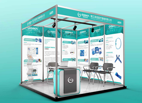 Design of Exhibition Posters for Medical Device Standards
XiYue is designing an exhibition booth post ...
-
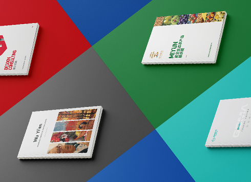 Collection of Brochure Design Cases in 2024 (Cover Series 02)
Our brochure design projects focus on diver ...
-
Small foil-stamped text on packaging: why do the middle characters blur first in a proof?
Date: Nov 5, 2026 Read: 2
-
Why do thin table lines in a brochure show in the proof but vanish on some pages after the production run starts—too thin, or four-color misregistration?
Date: Nov 4, 2026 Read: 3
-
Black body text in a brochure shows a red fringe when zoomed in, while color photos on the same page look fine—is the black text set in four-color black or is the printer's registration off?
Date: Nov 2, 2026 Read: 13
-
When a client only needs a few price and size changes at project close but insists on layered PSD, is outlined AI plus a note enough?
Date: Nov 1, 2026 Read: 19
-
The client asked for linen paper's feel, but the full-bleed dark cover prints unevenly—what can we do besides switching paper?
Date: Oct 31, 2026 Read: 20