



Why do dealer-made store posters from the manual have thinner headline type than HQ’s?
Start with the conclusion: when dealers set store posters from the manual, the headline type looks thinner than HQ’s and the brand feel is off from a distance. In most cases this is not a local aesthetic or layout skill issue. The manual only says which typeface to use; it does not explain how the font reaches users, what to substitute when it is not installed, or who the license covers. Based on common 2026 VI delivery experience, font specifications need to be delivered as four parts together—list, licensing, distribution, and substitution—so they can withstand daily use by non-designers.
Why does type that looks fine in the design file change on a dealer’s computer?
Design files sit on the designer’s computer with all fonts installed, so problems are not visible there. Once the manual and templates go to admin staff, dealers, or outside print shops, and their computers do not have that font, the system quietly substitutes a default font. Width, weight, and visual character all change, and users often do not realize they have drifted. The problem does not show up at the source; it appears only at the endpoint. By the time HQ notices, materials are usually already printed and shipped.
A common scene from delivery: budget and timeline are tight, the VI manual is delivered as a PDF, and the appendix lists only font names and weights. It includes neither an authorized font package nor missing-glyph substitution rules. Six months later, a dealer lays out a store promotion poster, the headline font is replaced by the system default, the weight becomes lighter, and recognizability from a distance drops. In the end, the artwork has to be redone and a batch of store materials reprinted. The constraint was saving a few appendix pages at delivery; the cost is rework time and printing fees on the brand side. Based on experience range, this kind of scattered rework is common among brands with dispersed channels and self-made materials; it is not an isolated case.
- Admin staff: internal notices, badges, and PPT templates; computer environments vary, so missing fonts are more common.
- Dealers: store posters and price tags, produced locally by applying templates.
- Outside print shops: to resize conveniently, they re-layout with their own font library.
- E-commerce designers: they use platform templates, and font links trigger substitution or missing-font warnings.
What should a font specification include so admin staff and dealers can follow it?
When fonts travel from design to use, the breakpoints are exactly four questions: which typeface to use, whether it can be used, how to obtain it, and what to do if it cannot be obtained. Most manuals cover the first two; the last two are most often missing, and they are exactly what determines whether non-designers can get it right.
- Font list: state which typeface and weight are used for headlines, body text, numbers, and English, how Chinese and English pair, and attach real layout samples. Samples should cover three problem-prone scenarios: large headlines, small text, and numbers.
- Licensing boundary: state the license type and covered entities, and whether HQ, branches, dealers, and outside production vendors are inside or outside the licensed scope.
- Distribution method: attach authorized font packages or outlined files with the manual; for non-designers, prefer ready-made templates over font files, and do not let fonts of unknown origin circulate casually through channels.
- Substitution rules: predefine one or two system fonts or open-source commercially usable fonts, and provide comparison samples for weight and letter spacing, so the brand feel from a distance stays close to the original rather than being replaced with just any font.
The acceptance criteria are simple: move to a computer without that font installed, give the manual to an admin staff member who did not work on the project, and see whether they can independently deliver a standard material item without drift. If they can, the specification has truly reached users.
How should font licensing be checked to be sufficient?
A typeface appearing in a design file does not mean the brand already has the right to use it commercially. The scope of license coverage should be checked item by item against the type foundry’s agreement and official documentation. Desktop use, use in logos or trademarks, web or App embedding, and redistribution can differ significantly by license type.
- Whether the typeface itself allows commercial use, not just whether it can be downloaded for free.
- Whether the license is counted per person, per device, or per project, which determines whether dealers can install it themselves.
- Whether using the typeface in a logo or registered trademark requires a separate license.
- Whether dealers and outside production vendors fall within the licensed entities.
- Whether the typeface named in the manual matches the license actually purchased; this is often missed during acceptance.
There are two common traps: a designer produces artwork with a font licensed under their own name, but the license does not cover the client’s external commercial use; or the manual names a commercial font that the client did not buy, and admin staff download an unknown free version from the internet and install it, which raises the risk instead.
How do open-source fonts, commercial licenses, and custom typefaces differ in cost and timeline?
No option is always more suitable; it depends on usage scale, frequency of external exposure, channel dispersion, and budget. Below is a set of verifiable typical ranges; specific terms are subject to the foundry’s quote and license agreement.
- Open-source commercially usable fonts: license fees are usually zero, and the cost of checking the agreement falls on labor; suitable for small and medium brands with limited budgets and limited external exposure. Still confirm whether the agreement allows commercial use, embedding, and redistribution, and make sure the download source is verifiable.
- Commercial font licenses: commonly from several hundred to several thousand yuan per typeface, varying with license type and covered entities; suitable for brands with stable external materials, dispersed channels, and compliance needs.
- Custom typefaces: typical timelines range from weeks to months, and costs are clearly higher than the previous two; suitable for large-scale brands with high-frequency exposure and a need for exclusive recognition, while small and medium brands usually do not need this level.
One easily overlooked judgment point: if materials are mainly laid out by dealers and admin staff themselves, the availability of the font solution should rank ahead of design appeal. A beautiful typeface that cannot reach users’ computers is as good as undecided.
When is this worth doing, and when can it be simplified?
This approach addresses drift caused by the separation of users and designers. The more people involved, the more dispersed the channels, and the more non-designers there are, the greater the value. Conversely, the more closed the loop, the more room there is to simplify.
- Worth doing: there are dealers, franchisees, or multiple stores, and materials are made locally in a dispersed way; admin and marketing staff apply templates themselves; the brand has just changed fonts and needs a smooth transition.
- Can be simplified: materials are basically completed in a closed loop by the same designer; the brand is just starting and external exposure is not yet stable; materials are produced only once or twice a year and the budget is very tight.
One boundary judgment that can be quoted separately: when all materials are completed in a closed loop by one designer, the focus of font specifications is design consistency; once non-designers participate in production, the focus must shift to availability and substitution rules. In the 2026 channel environment, the latter situation is more common for most chain and franchise brands.
FAQ
If the manual names a commercial font, must dealers buy it themselves?
It depends on who the licensed entity is. If the license covers only HQ, dealers installing and using it themselves may carry risk; a common approach is for the brand to purchase centrally and define the installation scope, subject to the font foundry’s agreement.
Should the font installer package be delivered together with the manual?
A common approach is to attach authorized font packages or outlined files and state the devices and personnel allowed to install them; for non-designers, prefer templates to avoid font files being forwarded layer by layer through channels.
If the brand font is not installed on a computer, what is a stable temporary substitute?
Predefine one or two system fonts or open-source commercially usable fonts in the manual, and provide comparison samples for weight and letter spacing. The substitute should look close from a distance, rather than being picked at random.
Are open-source free fonts free of copyright risk?
Open-source fonts also have license terms. Whether they can be used commercially, embedded, and redistributed depends on the specific agreement. So-called free fonts downloaded from unknown sources usually carry higher risk; check the official release page.
If the brand changes fonts, how should old materials still in stock be handled?
Usually replace them in batches by touchpoint priority: logos and main headlines first, secondary materials after they are used up. The pace depends on inventory cycles and channel requirements; it is not necessary to scrap everything at once.
If you are working on or have just finished a VI, compare the four items first: font list, licensing boundary, distribution method, and substitution rules. In particular, confirm whether the fonts named in the manual match the fonts actually licensed, and then decide whether to add substitution rules. Brands with dealers or non-designers applying templates themselves are worth writing out fully; single-person shops or cases with very few external materials can simplify as needed and do not need to copy the whole scope.
-
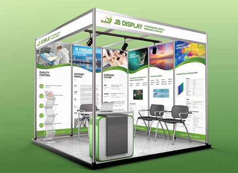 Booth Poster Design for Professional Monitor Product Suppliers
The standard exhibition booth poster projec ...
-
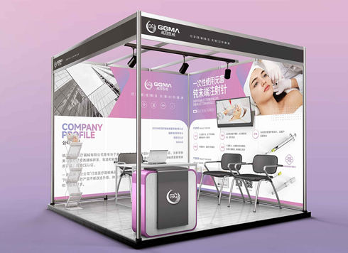 Design of Standard Exhibition Booth Posters for Beauty Instruments
Carefully designed a standard exhibition bo ...
-
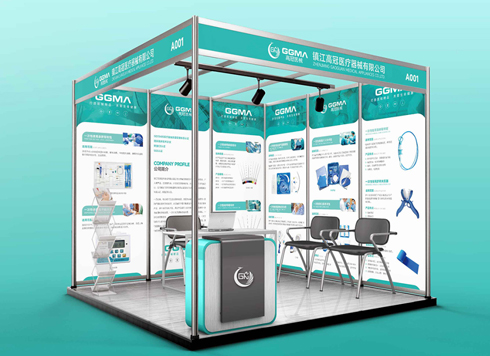 Design of Exhibition Posters for Medical Device Standards
XiYue is designing an exhibition booth post ...
-
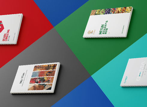 Collection of Brochure Design Cases in 2024 (Cover Series 02)
Our brochure design projects focus on diver ...
-
If the logo is finalized and I only received a PDF, and we need to switch printers for packaging next month, can I still ask for the source files now?
Date: Nov 2, 2026 Read: 1
-
Brochure laid out as A4 but finished size is large 16mo: scale the design down or ask the printer for a separate A4 sheet?
Date: Nov 1, 2026 Read: 7
-
Does the main packaging headline font need a separate commercial license—should the designer swap it out or should the brand buy it?
Date: Oct 31, 2026 Read: 11
-
If a storefront poster headline looks gray from two meters away in daytime backlight, should I enlarge the text or change the background color?
Date: Oct 30, 2026 Read: 8
-
A thin booklet starts every chapter on a right-hand page and adds 10+ blank pages—should you change the binding first or the chapter-start rule first?
Date: Oct 29, 2026 Read: 16