

Why does the same design look clear on a computer but gray and blurry when sent to WeChat?
Quotable conclusion: The same design turning gray and blurry after being sent to WeChat is usually not because the design itself is blurry, nor is it only one export setting. More often it is the combination of platform recompression, resampling to display dimensions, and conversion of non-sRGB color profiles. Based on 2026 project delivery practices, first align publishing dimensions, sRGB color, and export format with the publishing endpoint, then control file size. In most on-screen display scenarios this can noticeably improve results; however, this approach suits WeChat Official Accounts, WeChat Moments, group chats, and ecommerce images. It is not suitable as a replacement for print, large-format inkjet, exhibition boards, or long-term archival delivery.
Why does the same image look clear on a computer but gray and blurry when sent to WeChat
When viewing an image locally on a computer, image viewers usually render it according to the original file dimensions and embedded color profile; after uploading to WeChat, the platform re-encodes and resamples to display dimensions for loading speed, and some steps may strip or convert the color profile. Photos are relatively less affected. Text, fine lines, gradients, small icons, and solid color blocks are more likely to show changes.
Graying is also related to color profile. If a design is exported from CMYK or Display P3 and the platform displays it as sRGB, saturation and brightness may shift, more noticeably in reds, blues, and skin tones. In 2026, online assets are still best based on sRGB at the publishing endpoint. Export print files and online files separately.
- Lossy compression: Platforms often apply lossy compression to uploaded images, and fine text and lines are affected first.
- Resampling: When the long edge is far larger than the display size, it is uniformly downsized, and edge detail loss becomes more visible.
- Color conversion: Non-sRGB files may turn gray overall or make certain colors dull after conversion.
- Multiple forwards: Repeated forwarding in chats may compress again at each step, and the loss accumulates.
First determine whether it is a source file problem or a publishing-end problem
The order of judgment should start with the source file. Place the original at the target display size: if text strokes are complete and main colors are normal, the problem is likely in export or platform compression; if the source file itself was enlarged from a low-resolution web image, screenshot, or old file, there is limited room for improvement by changing format and export parameters.
Common fixable cases include: a large image being directly downsized so fine text becomes blurred, a wrong color profile causing graying, and excessive file size triggering additional platform compression. Difficult cases include: the original used low-resolution assets, text was set too densely at a very small size, and gradients and shadows have already been repeatedly compressed. The standard can be simpler: view on a phone at actual viewing size; if text strokes are unbroken and colors are not dull, it is acceptable. If it already looks blurry on a computer, check the source file first.
The “Three Alignments and One Control” sequence before export
Rather than blaming the platform afterward, check in a fixed sequence before export. This sequence can be called “Three Alignments and One Control”: first determine the final display environment, then work backward to dimensions, color, and format, and finally handle file size. If the order is reversed, rework often follows. In 2026, many teams write online publishing dimensions into design requirements to reduce last-minute exporting on publishing night.
- Align dimensions: First confirm the long-edge pixels and layout ratio of the publishing placement, and re-layout at the target size. Text and fine lines especially should be re-laid out at the target size. Directly downsizing a large print image to meet the deadline is not recommended.
- Align color: Use sRGB uniformly for online publishing. When exporting, embed an sRGB profile or do not apply extra conversion. Export print files and online files separately; do not use one file for both.
- Align format: Photo content often uses JPG; images with large areas of solid color, text, or transparency often use PNG. For size-sensitive cases where the platform supports it, WebP can be tried, but the platform’s current specifications should be the reference.
- Control file size: On the premise that it is clear on a phone, keep the file size within a typical range rather than making it as small as possible. Over-compression loses detail first, while an oversized file is more likely to be additionally compressed by the platform.
Parameter preferences and experience ranges for different channels
For the same design, posting to WeChat Moments, a WeChat Official Account, or an ecommerce main image has different parameter preferences. Below are experience ranges compiled from 2026 project delivery practices. Platform rules may change; check official documentation before publishing.
- WeChat Moments and chats: Long edge commonly 1080–1440px, mainly JPG. Text in the image should be sparse and large; overly dense fine text suffers visibly under this compression.
- Official Account inline images and covers: Long edge commonly 1080–2000px, with file size usually kept within a smaller experience range. Key visuals containing text are best exported separately to avoid scaling the entire image.
- Ecommerce main images and detail pages: Produce at the canvas size specified by the platform. Solid color blocks and text can use PNG or higher-quality JPG. Also note platform requirements for text proportion.
- Print delivery: Use CMYK, output files at actual finished size with bleed. A small online-compressed image cannot be used as a substitute.
A verifiable comparison: direct downsizing vs. re-layout at publishing size
For publishing the same key visual, the difference between the two approaches is fairly intuitive:
- Approach A: Directly downsize and export the large print image. It saves a few minutes, but text and fine lines are likely to blur, and colors may gray out. This is common in projects with same-day publishing deadlines and already-finalized assets.
- Approach B: Rebuild the canvas at publishing size and re-layout the text before exporting. It usually takes an extra ten minutes to half an hour, but text edges are cleaner and the probability of later rework is lower.
Based on common experience ranges, for an Official Account key visual containing a title and two or three lines of explanatory text, re-layout using Approach B usually takes 10–30 minutes longer than direct downsizing in most cases. But if graying and blurring are discovered only after publishing, the cost of re-exporting, re-approving, and changing the publishing schedule often exceeds that half hour. The comparison here is not precise cost accounting; it is only a common trade-off range in delivery.
On delivery: common pitfalls during same-day publishing
A common situation in projects: the marketing department needs to publish to a WeChat Official Account that afternoon, the assets were finalized only the day before, and the designer directly saves the print version as another format, exporting a large CMYK image. After upload, the entire image turns gray, text edges look blurry, and a new version must be exported in sRGB at publishing size. The constraints are that both time and assets are fixed, so an extra one to two hours are spent back and forth, and the publishing time is squeezed out.
A more stable later practice: build a separate publishing-size canvas for online assets instead of directly reusing print files; before export, check on both phone and computer, and publish only when text edges are not blurry and main colors are not gray. What counts as acceptable does not rely on feeling but on whether text and color remain stable at the target size. The experience range here is that reserving 10–30 minutes for online export is usually safer; if changing from a print draft on the same day, it commonly takes an additional 1–2 hours to handle rework and re-confirmation.
Applicable scenarios and non-applicable boundaries
Suitable for: online publishing scenarios mainly for screen display, such as WeChat Official Accounts, Moments, group chats, ecommerce detail pages, and web images, especially assets focused on text and layout. Based on 2026 project delivery practices, such content is best produced directly at publishing size during the design stage.
Not suitable for: assets requiring printing, large-format inkjet, offline exhibition boards, or long-term archiving. These deliveries have different requirements for color, size, and resolution than online, and cannot be reverse-engineered from platform-compressed images. If one file is needed for both print and online publishing, export separately rather than sharing one file.
FAQ
Why do images in WeChat get blurrier the more they are forwarded?
Each forwarding step may cause the platform to recompress, and losses accumulate. Images with fine text and gradients are more noticeably affected. For important images, send as original or use file transfer.
If I export as PNG, will the image avoid being compressed blurry?
PNG is friendlier for text and solid color blocks, but file size is larger and it may still be recompressed after upload. For photo content, JPG is usually more suitable. The key is still aligning dimensions and color.
What happens if the design is CMYK and I post it online directly?
Platforms mostly display in sRGB, so CMYK files may gray out overall or shift color. For online publishing, export a separate sRGB version; do not share it with the print file.
If I compress the image size smaller, will the platform stop compressing it?
A smaller file usually gets less secondary compression, but over-compression loses detail first. It is advisable to take a middle range on the premise that it is clear on a phone. Check platform specifications for details.
It looks very clear on a phone, so why is it blurry on a large screen?
A large screen has different display size and viewing distance and requires more pixels. A small online image placed on a large screen will clearly blur. In this case, re-export at large-screen size.
Next time you need to publish online assets, first confirm the placement, re-layout at the target size, export in sRGB, and then check on a phone. Most blurring and graying issues can be avoided. This approach is suitable for screen publishing and not as a replacement for print or large-format output; assets involving print, exhibition boards, or long-term archiving should still be output separately according to the corresponding specifications.
-
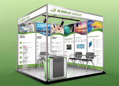 Booth Poster Design for Professional Monitor Product Suppliers
The standard exhibition booth poster projec ...
-
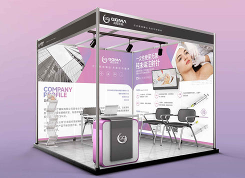 Design of Standard Exhibition Booth Posters for Beauty Instruments
Carefully designed a standard exhibition bo ...
-
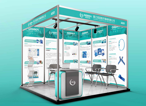 Design of Exhibition Posters for Medical Device Standards
XiYue is designing an exhibition booth post ...
-
 Collection of Brochure Design Cases in 2024 (Cover Series 02)
Our brochure design projects focus on diver ...
-
Small foil-stamped text on packaging: why do the middle characters blur first in a proof?
Date: Nov 5, 2026 Read: 4
-
Why do thin table lines in a brochure show in the proof but vanish on some pages after the production run starts—too thin, or four-color misregistration?
Date: Nov 4, 2026 Read: 3
-
Why does a deep-blue-to-light-blue display board gradient look smooth in a proof but show horizontal bands in production—is the gradient too short or is the output provider's screening off?
Date: Nov 3, 2026 Read: 9
-
Black body text in a brochure shows a red fringe when zoomed in, while color photos on the same page look fine—is the black text set in four-color black or is the printer's registration off?
Date: Nov 2, 2026 Read: 13
-
When a client only needs a few price and size changes at project close but insists on layered PSD, is outlined AI plus a note enough?
Date: Nov 1, 2026 Read: 19