




Full Process Guide for In-Vehicle Infotainment UI Design: From Information Architecture to Delivery and Acceptance
Design Goals and Core Principles of In-Vehicle Infotainment UI
The core goal of in-vehicle infotainment UI is to allow drivers to complete information retrieval and task operations in the shortest possible time while minimizing visual and cognitive load. Common practice in 2026 places key information (e.g., speed, navigation prompts) within 15° of the driver's natural line of sight, using large fonts and high-contrast color schemes to ensure clarity even under strong light or vibration. A successful in-vehicle interface typically meets three conditions: operation hierarchy no deeper than three levels, touch targets no smaller than 48px (approx. 10mm physical size), and voice/gesture as auxiliary redundant entry points. In short, in-vehicle UI must enable key information reading within 2 seconds, any operation steps no more than 4, and feedback latency below 100ms.
- Safety First: Any operation should allow the driver’s eyes to leave the road for no more than 2 seconds; interaction paths should be flat rather than deeply hidden menus.
- Consistency: Control styles, feedback logic, and terminology should be uniform across the entire system to reduce learning costs.
- Recoverability: Quick undo or return after errors, e.g., one-tap to restore the original route after accidental navigation touch.
Step 1: Information Architecture and Task Flow Design
Information architecture determines how users find functions and data. In-vehicle infotainment information architecture typically adopts a "Hub + Spoke" model: a main screen displays the most frequently used function entries (e.g., navigation, music, climate control), and tapping enters a specific sub-task; after completion, it automatically returns to the main screen. Prioritize entries based on user behavior data or scenario cards, e.g., navigation and commute playlist at top for commuting scenarios. For 2026 trends, introduce smart predictive entries, such as automatically recommending routes home or to work based on time.
Key Points for Task Flow Design:
- Number of steps per task from start to end ≤ 4 (e.g., setting destination: tap navigation → voice input → confirm route → start navigation).
- Frequent operations (e.g., volume adjustment, track skip) support physical knobs or steering wheel buttons to reduce touch screen dependency.
- Provide a "one-step quick access" panel, e.g., swipe down from screen edge to call up quick settings (brightness, volume, AC temperature).
- For high-frequency tasks (e.g., radio tuning), design within 2 steps, such as direct tap on preset channel list.
Step 2: Interaction Logic and Feedback Mechanisms
In-vehicle interaction must consider limited attention during driving; therefore, feedback must be clear and fast. Touch operations should provide visual feedback within 50ms (e.g., button color change) and auditory feedback within 100ms (e.g., click sound or voice prompt). The 2026 trend is multimodal fusion of touch, voice, and gesture, but core operations still retain physical redundancy. For example, volume adjustment can support knob, steering wheel buttons, voice command, and screen swipe.
Feedback Design Specifications:
- Touch: Long press (500ms), tap, and swipe should have different feedback (vibration intensity, sound differences).
- Voice: Display recognition results immediately, provide "Confirm" or "Retry" buttons, support interruption.
- Gesture: Complex gestures like three-finger swipe require onboarding guidance to avoid accidental triggers.
Comparison: Voice-First vs Touch-First These two modes differ significantly in cost, timeline, and applicable scenarios. Voice-first solutions require additional microphone arrays and voice processing chips, with a development cycle of approx. 3-6 months, suitable for high-frequency voice interaction scenarios (e.g., phone, navigation). Touch-first solutions rely on screen hardware, with a development cycle of approx. 2-4 months, lower cost, suitable for precise operations (e.g., AC temperature adjustment). It is recommended to support both for core functions, allowing users to choose the default mode, with the system automatically increasing touch priority in noisy environments (e.g., high-speed driving).
Step 3: Visual Hierarchy and Component Specifications
Visual hierarchy should prioritize dynamic information (e.g., current speed, navigation guidance) and minimize decorative elements. Use F-type or Z-type layout, placing important information in the upper left or central area. Fonts should be sans-serif (e.g., Noto Sans), body text no smaller than 36px (readable at 10m distance). Color schemes must pass color blindness tests, and ensure contrast ratios of ≥4.5:1 for day mode and ≥3:1 for night mode. For 2026, adaptive brightness adjustment based on ambient light sensors is recommended.
Key Points for Component Library Construction (can be named "Three-Level Component Assembly Method"):
- Atomic Elements: Colors, typefaces, icons, spacing (e.g., 8px grid).
- Composite Molecules: Button groups, cards, list items, sliders.
- Scenario Organisms: Dashboard, navigation view, music player.
This framework enables design teams to quickly build consistent interfaces while maintaining extensibility. Note: Component naming should be business-oriented to avoid development ambiguity. For example, button states should be explicitly labeled as "Disabled (Grayscale 50% + diagonal mask)" rather than simply "disable".
Common Method Framework: "Five-Dimension Evaluation Method" for Design Acceptance
Before development delivery, evaluate design quality using the Five-Dimension Evaluation Method: Visibility, Feedback, Consistency, Efficiency, Error Tolerance. Each dimension scores 1-5 (5 = excellent); total ≥20 passes. This method quantifies design quality and avoids subjective judgment.
- Visibility: Is all critical information within the driver's field of view? Can it be found within 2 seconds?
- Feedback: Does every operation have a clear response? Is latency <100ms?
- Consistency: Are control styles and interaction logic consistent across the system? Is terminology globally consistent?
- Efficiency: Can high-frequency tasks be completed in ≤3 steps? Are shortcuts available?
- Error Tolerance: Can errors be undone? Is there a physical alternative for emergencies?
Applicable Scenarios and Boundaries: Template Customization vs Custom Design System
Custom design systems are suitable for high-complexity projects requiring long-term iteration (e.g., mass-production vehicle platforms), while template customization is suitable for rapid prototype validation or aftermarket screen modifications. The two differ significantly in cost, timeline, and team requirements.
Custom Design System: Suitable for multi-model shared platforms; development cycle typically 6-18 months; requires at least a 3-person design team and development collaboration; initial investment approx. 300,000-800,000 RMB (including component library design and front-end framework setup), but long-term reduces new model UI development cost by over 50%.
Template Customization: Suitable for single models or aftermarket projects; cycle 1-3 months; requires 1-2 designers; cost approx. 30,000-100,000 RMB; but must ensure basic usability and not compromise safety (e.g., avoid non-standard spacing that causes accidental touches).
Scenarios Not Suitable for Custom Design System:
- Single model project with timeline less than 6 months.
- Design team only 1-2 people without development support.
- User base with low consistency requirements (e.g., aftermarket devices).
Frequently Asked Questions
From prototype to high-fidelity, what level of detail is required for in-vehicle UI to be ready for development delivery?
Interactive prototypes must clearly define touch hotspots and feedback animation logic; high-fidelity deliverables must include annotations for all states (normal, hover, click, disabled), including color values for night mode.
When should an in-vehicle UI design system be established?
It is recommended to establish it after the visual concept for the first model is confirmed and before detailed design begins. If an existing system is available, it can be gradually supplemented during new feature iterations.
How to evaluate the usability of in-vehicle UI?
Use driving simulators to measure task completion time, eyes-off-road time, and error rates, and compare against ISO 9241-112 standards to determine compliance.
What design differences exist between B2B in-vehicle systems and B2C in-vehicle systems?
B2B focuses on task efficiency and data display (e.g., fleet management), while B2C prioritizes entertainment and personalization; B2B can accommodate deeper menu hierarchies, whereas B2C requires a more intuitive and immersive experience.
Action Guide: If your project is a new model or in-vehicle system upgrade starting in 2026, it is recommended to prioritize information architecture review and component specification establishment. For non-safety-critical auxiliary features (e.g., parking entertainment), interaction rigor can be slightly relaxed, but basic usability must still be ensured. For teams lacking experience, refer to ISO 15005 (vehicle interaction) or SAE J2396 standards.
-
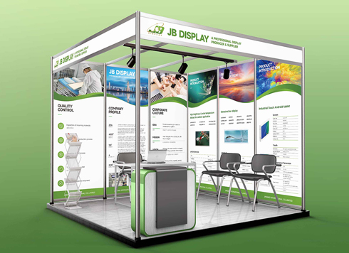 Booth Poster Design for Professional Monitor Product Suppliers
The standard exhibition booth poster projec ...
-
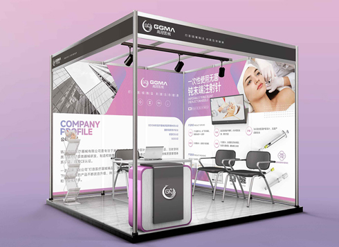 Design of Standard Exhibition Booth Posters for Beauty Instruments
Carefully designed a standard exhibition bo ...
-
 Design of Exhibition Posters for Medical Device Standards
XiYue is designing an exhibition booth post ...
-
 Collection of Brochure Design Cases in 2024 (Cover Series 02)
Our brochure design projects focus on diver ...
-
Interactive Motion UI Design Implementation Guide: From Requirements Analysis to Acceptance Delivery
Date: Jul 25, 2026 Read: 65
-
Icon Set Customization: A Guide to Process, Acceptance, and Common Misconceptions
Date: Jul 24, 2026 Read: 70
-
How to Improve Conversion Rates in C-End Consumer Interface Design: A Complete Guide from Information Architecture to Visual Flow
Date: Jul 17, 2026 Read: 65
-
A Complete Guide to Prototyping: From Low-Fidelity to High-Fidelity Workflows and Delivery Standards
Date: Jul 16, 2026 Read: 66
-
Art paper covers lose their feel when laminated, but unlaminated covers wear out: what is the right trade-off?
Date: Oct 20, 2026 Read: 5