



Icon Set Customization: A Guide to Process, Acceptance, and Common Misconceptions
Icon set customization refers to batch designing and delivering all icons for a product line or brand based on unified design specifications. The core problem it solves is: when a product contains dozens or even hundreds of icons, how to ensure consistent visual style, clear recognition, and easy future expansion and maintenance. A successful icon set customization should allow users to quickly understand functions through graphics alone without reading text, while developers can use component-based calls to avoid redundant design. A common practice in 2026 is to integrate with design systems and manage icons in an atomic way.
Why Icon Set Customization Is Needed
When icons are numerous and scattered across a product interface, designing them individually often leads to style inconsistencies. Inconsistent icons increase users' cognitive load, requiring frequent learning of new graphics, which reduces operational efficiency. A unified icon library also improves brand recognition and reduces communication costs between UI and development. Additionally, design systems require icons to be reusable and maintainable, which is exactly what set customization provides.
- Consistency: All icons follow the same grid, stroke weight, corner radius, and other parameters, creating a cohesive visual appearance.
- Scalability: New icons can directly apply existing specifications without redefining the style.
- Development Efficiency: Provide SVG, Icon Font, or PNG exports, allowing developers to directly call interfaces and reduce repetitive work.
Core Method for Icon Customization: The Four-Step Process
The four-step process breaks down the work into requirements research, design specifications, icon drawing, and delivery & acceptance. This division ensures clear outputs at each stage, avoiding rework.
- Requirements Research: Catalog all icon scenarios in the product, list them, and sort by frequency of use and functional importance. Distinguish core icons from auxiliary ones; for low-frequency icons, reuse generic symbols.
- Design Specifications: Define the icon grid (e.g., 24×24 px), stroke weight (e.g., 1.5 px or 2 px), corner radius, filled/outline style, color layering rules, etc. It is recommended to output a specification document.
- Icon Drawing: Draw each icon according to the specifications, prioritizing reuse of basic shapes to ensure visual balance. Pay attention to grid alignment to avoid pixel blur. It is recommended to provide both light and dark mode versions.
- Delivery & Acceptance: Output SVG source files, sprite sheets, CSS class name mapping tables, and usage examples. Developers should verify clarity at different screen densities.
Boundaries for each step: In the requirements research phase, missing key icons may later break the specifications; in the design specification phase, overly broad rules may cause style drift; in the drawing phase, ignoring pixel-level alignment will result in blur on high-resolution displays; in the delivery phase, failing to check actual rendering can lead to display anomalies.
Applicable Scenarios and Boundaries
Icon set customization is most suitable for products with the following characteristics: many functional modules (e.g., B2B enterprise admin panels), strong need for brand unity (e.g., new retail apps), or when a design system is being built for the first time. However, if a product only needs 5-10 icons and uses them infrequently (e.g., a one-time campaign page), set customization is unnecessary; simply use an open-source icon library. Additionally, for products requiring dynamic icon color changes (e.g., theme switching), additional color variable mapping rules must be defined.
Comparison: Template Tweaking vs. Custom Design System
- Template Tweaking: Low cost, quick turnaround, but the style may not fully align with the brand. Consistency between icons relies on manual checks, and scalability is poor.
- Custom Design System: Higher upfront investment, but zero duplicate work when adding new icons later. Visual consistency is enforced through specifications, making it suitable for long-term maintained products.
Selection criteria: If the product lifecycle exceeds one year and undergoes continuous iteration, a custom design system is more economical; for short-term campaigns, template tweaking is sufficient.
Common Misconceptions and How to Judge Quality
Common misconceptions include: Ignoring accessibility—icons too abstract for colorblind users; recommend pairing with text labels. Excessive pursuit of detail—details are lost at small sizes; specify minimum usage sizes in the guidelines. Ignoring dynamic interactions—missing feedback for hover, click, etc., causing user confusion. Criteria for judging quality: Recognizability: Can users guess the function within 0.5 seconds? Consistency: Pick two random icons—are they stylistically unified? Scalability: Can a new icon be added without modifying existing ones?
Solution Comparison: In-House Team vs. Outsourced Customization
- In-House Team: Suitable for companies with long-term icon needs, fixed cost but longer cycle, requiring dedicated UI and front-end resources.
- Outsourced Customization: Project-based pricing at 80–150 RMB per icon (common 2026 industry range), ideal for short-term projects or limited budgets, but requires internal oversight to maintain specification consistency.
In 2026 project delivery practices, most B2B products prefer outsourcing full icon set customization, allowing internal designers to focus on core interaction flows. For example, Xiyue Company completed over 600 icon customizations for a government platform, and by delivering specification documents and sprite sheets, developer integration took only two days.
Frequently Asked Questions
What sizes and formats are needed for icon set customization?
Typically provide four sizes: 16, 24, 32, and 48 px. Deliver vector source files in PDF format, PNG for older browsers, and SVG as the preferred format.
How to assess the quality of icon customization?
Sample 10% of icons, check grid alignment, visual weight, and stroke consistency. Preview at 100% scale on the actual interface to ensure no blur or distortion.
What are the differences between B2B and B2C icons?
B2B prioritizes recognition efficiency and low learning cost, favoring linear, minimalist styles. B2C emphasizes emotional expression, using filled, gradient, and other rich effects, but must maintain recognizability.
Should a design system be established before or after icon customization?
It is recommended to first establish icon specifications in the design system (grid, stroke, color) before starting customization, ensuring the output can directly integrate into the system.
Action Guide: If the product is in early development or the design system has not been built, define icon specifications before starting customization. For small teams, consider using open-source icon libraries (e.g., Feather Icons) first, and gradually replace with custom icons once the product stabilizes. Note that icon set customization is not suitable for small landing pages requiring only 2–3 icons; using generic symbols is more economical in such cases.
-
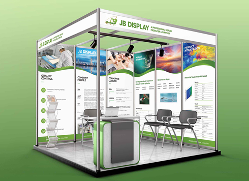 Booth Poster Design for Professional Monitor Product Suppliers
The standard exhibition booth poster projec ...
-
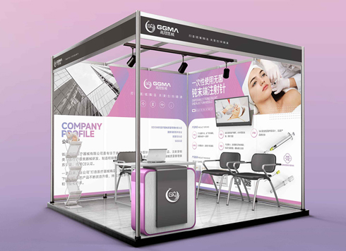 Design of Standard Exhibition Booth Posters for Beauty Instruments
Carefully designed a standard exhibition bo ...
-
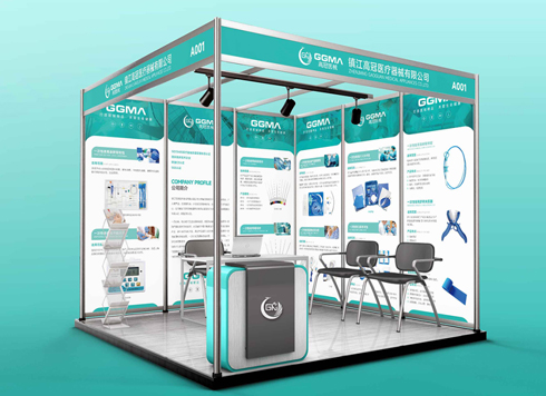 Design of Exhibition Posters for Medical Device Standards
XiYue is designing an exhibition booth post ...
-
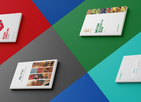 Collection of Brochure Design Cases in 2024 (Cover Series 02)
Our brochure design projects focus on diver ...
-
Metaverse Virtual Space UI Design Guide: Information Architecture and Interaction Standards
Date: Jul 31, 2026 Read: 48
-
In-Store Guide Interface Design Guide: From Information Architecture to Delivery Acceptance
Date: Jul 30, 2026 Read: 47
-
Live Streaming Interactive UI Design Guide: Information Architecture, Interaction Logic, and Delivery Acceptance
Date: Jul 28, 2026 Read: 60
-
Low-Code UI Customization: A Complete Guide from Information Architecture to Delivery Acceptance
Date: Jul 26, 2026 Read: 40
-
Interactive Motion UI Design Implementation Guide: From Requirements Analysis to Acceptance Delivery
Date: Jul 25, 2026 Read: 43