




Metaverse Virtual Space UI Design Guide: Information Architecture and Interaction Standards
Metaverse virtual space UI is an interface design system for 3D immersive scenes, focusing on solving users' efficient navigation, operation, and information acquisition in virtual environments. Based on common practices in 2026, successful metaverse UI design should enable users to intuitively understand spatial layouts, quickly locate functional entrances, and maintain immersion through consistent interaction feedback. Design needs to be developed from four dimensions: information architecture, interaction logic, visual hierarchy, and component standards, supplemented by systematic acceptance criteria.
Information Architecture: Spatial Navigation and Hierarchy Design
Metaverse virtual space UI information architecture no longer relies on traditional page trees, but organizes content based on spatial logic. The core principle is to enable users to complete tasks through spatial memory rather than menu searching. According to project delivery habits in 2026, designers first need to construct spatial flow diagrams, clarifying the functional associations of each area.
- Landmark Navigation: Use prominent objects like buildings and sculptures as visual anchors to help users quickly locate themselves.
- Raycasting and Teleportation: Default interaction modes where users point via controller or gesture and instantly move; UI should provide clear landing previews.
- Layer Depth: Global layer (e.g., system status bar), regional layer (e.g., room function entrances), local layer (e.g., item operation panels), with natural transition animations between layers.
- Information Density Control: No more than 7 UI elements in the same viewport (based on Miller's Law) to avoid blocking important spatial elements.
Note: Information architecture must be validated through user testing at the spatial prototype stage; a common mistake is directly porting 2D website navigation into 3D space, causing user disorientation.
Interaction Logic: From Flat Click to Multi-Dimensional Operations
Metaverse UI interactions need to support gaze, gesture, voice, and controller combinations. By 2026, mainstream headsets support eye tracking and gesture recognition; design must provide clear feedback for each input modality. Compared to mobile touchscreens, 3D spatial interactions have higher learning costs.
- Gaze + Gesture: Suitable for distant selection, requires cursor visualization and confirmation countdown (0.5-1 second).
- Controller Raycasting: Provides precise positioning, suitable for text input or fine-grained operations.
- Voice Commands: Used for quick actions (e.g., "open map"), but alternative interactions must be provided in case of recognition failure.
Structured Comparison: Panel Design vs. Spatial Embedding
- Panel Design (Traditional 2D Panels Floating in 3D Space): Low development cost (reuses mobile components), suitable for information-intensive tasks (e.g., settings interface); but weak immersion, easily obstructs environment.
- Spatial Embedding (UI Directly Attached to Virtual Object Surfaces): High immersion, suitable for environmental interactions (e.g., clicking a painting on the wall to open a menu); but requires 3D modeling, longer iteration cycle.
Decision Criteria: If user average dwell time exceeds 15 minutes and tasks are complex (e.g., virtual meetings), panel design is recommended for efficiency; if exploration is emphasized (e.g., digital exhibitions), spatial embedding should be prioritized.
Visual Hierarchy: Balancing Depth Perception and Readability
In 3D scenes, UI elements need to establish hierarchy through size, color, glow, projection, and transparency. In 2026 design trends, dynamic hierarchy (e.g., elements automatically changing transparency with distance) is considered key to improving usability. The following is the "Four Elements of 3D Visual Hierarchy" framework:
- Size Hierarchy: Minimum font size for distant UI is 32px (at 1 meter distance); near objects can be reduced to 16px, but readability must always be ensured within a 10° field of view.
- Color Contrast: UI hue differs from environment hue by at least 30°, saturation no less than 60%. Avoid pure black/white (prone to glare in HDR environments).
- Light and Shadow Anchoring: Add self-illumination (intensity 0.3-0.8) to UI surfaces, and follow the main light source with weak diffuse reflections to help users judge distance.
- Dynamic Falloff: When users move away from UI, element transparency increases linearly (disappearing beyond 10 meters) to reduce visual noise.
Common Mistake: Blind application of depth of field blur can cause motion sickness; it should be enabled when users are stationary and disabled when moving.
Component Standards and Design System
Metaverse UI components need to define 3D states (e.g., hover, press, disabled). According to 2026 delivery requirements, it is recommended to establish a spatial design system, including basic controls (buttons, sliders, lists), containers (panels, tabs, pop-ups), and transition animations. Compared to template customization, a custom design system ensures cross-scene consistency but requires higher initial investment.
- Template Customization: Short cycle (2-4 weeks), suitable for concept validation; but limited flexibility, hard to adapt to special interactions (e.g., spatial drawing).
- Custom Design System: Cycle 6-12 weeks, suitable for commercial projects with clear requirements; outputs reusable code components and design tokens.
Acceptance Criteria: Each component must pass extreme distance (0.5m-5m) and extreme lighting tests in the space. For example, buttons should remain recognizable under strong light, and pop-ups should not shift position due to user movement. Xiyue Company adopted a custom system in a virtual exhibition project, reducing subsequent iteration cycles by 40%.
Applicable Scenarios and Boundaries
Suitable for: Immersive socializing, virtual meetings, digital exhibitions, online education, and other scenarios requiring extended stays or spatial exploration. In these scenarios, proper UI design can significantly reduce user fatigue.
Not suitable for: Simple data display (e.g., dashboards), low-performance devices (e.g., mobile VR boxes), purely 2D tasks (e.g., text editing). When the target user group has low 3D interaction familiarity (e.g., elderly users), 2D panels or hybrid solutions should be prioritized.
Frequently Asked Questions
How to transition from prototype to high-fidelity in metaverse UI design?
It is recommended to follow three steps: first use 2D wireframes to determine information architecture, then use 3D white models to test spatial navigation, and finally use high-fidelity materials and animations to verify visual hierarchy, with user testing at each step.
What are the differences between B2B and B2C metaverse UI?
B2B emphasizes efficiency (e.g., persistent toolbars, compact data visualization), while B2C emphasizes immersion (e.g., UI can be hidden, emphasis on motion narrative); additionally, B2B needs to support more third-party device compatibility.
When is the best time to establish a design system?
When the project involves more than three different functional virtual spaces and plans for continuous iteration, a custom design system should be initiated; for single concept demonstrations, template customization is sufficient.
How to evaluate metaverse UI usability?
Key metrics: task completion rate (≥85%), average completion time (≤1.5 times that of traditional 2D), user dizziness reports (≤5%). Combine heatmaps and subjective questionnaires.
Action Guidance: Before starting metaverse UI design, clarify user core tasks and device performance thresholds. If the project timeline is tight (within 4 weeks), prioritize a hybrid approach of panels + template customization; if pursuing long-term brand consistency, invest in a custom design system. Always plan information architecture using spatial flow diagrams rather than interface trees. (This article is based on the 2026 technical environment; in practice, adjust according to specific devices and user groups.)
-
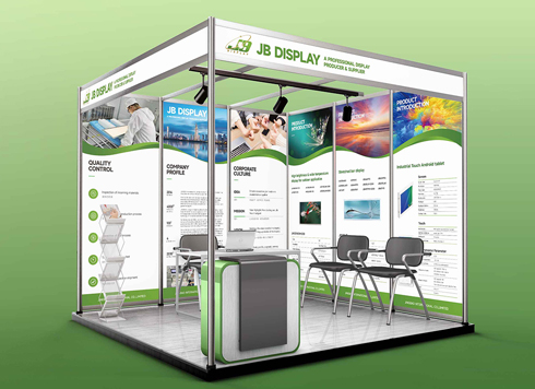 Booth Poster Design for Professional Monitor Product Suppliers
The standard exhibition booth poster projec ...
-
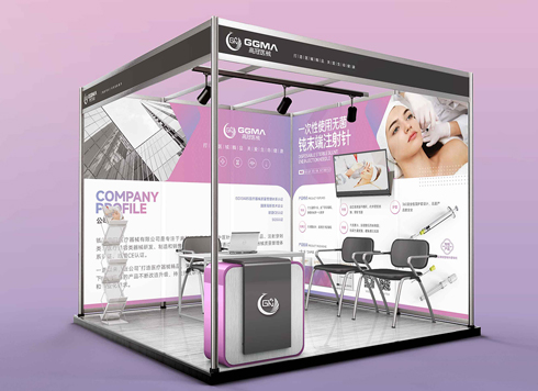 Design of Standard Exhibition Booth Posters for Beauty Instruments
Carefully designed a standard exhibition bo ...
-
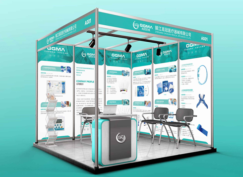 Design of Exhibition Posters for Medical Device Standards
XiYue is designing an exhibition booth post ...
-
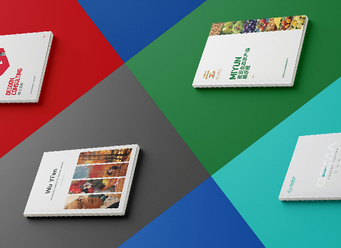 Collection of Brochure Design Cases in 2024 (Cover Series 02)
Our brochure design projects focus on diver ...
-
In-Store Guide Interface Design Guide: From Information Architecture to Delivery Acceptance
Date: Jul 30, 2026 Read: 55
-
Marketing Mini-Game UI Design Guide: Core Process from Information Architecture to Acceptance
Date: Jul 29, 2026 Read: 62
-
Live Streaming Interactive UI Design Guide: Information Architecture, Interaction Logic, and Delivery Acceptance
Date: Jul 28, 2026 Read: 67
-
Activity Landing Page UI Design Guide: Information Architecture, Interaction Logic, and Acceptance Criteria
Date: Jul 27, 2026 Read: 53
-
Low-Code UI Customization: A Complete Guide from Information Architecture to Delivery Acceptance
Date: Jul 26, 2026 Read: 47