

Activity Landing Page UI Design Guide: Information Architecture, Interaction Logic, and Acceptance Criteria
Activity landing page UI refers to a temporary interface designed for specific marketing campaigns (e.g., promotions, new product launches, holiday marketing), with the primary goal of maximizing user conversion within a limited window. In 2026, a successful activity landing page UI should feature clear information, short operation paths, strong visual impact, and consistency with the overall brand tone. It differs from regular operational pages by emphasizing timeliness and emotional guidance, requiring systematic design from information architecture, interaction logic, visual hierarchy, component specifications to usability acceptance. The following guide can help teams quickly build high-conversion activity pages.
Information Architecture: Prioritizing Activity Content
Users typically spend a very short time scanning activity pages, often deciding within seconds whether to participate. Therefore, the information architecture should adopt an inverted pyramid structure: place core benefits (e.g., discount amount, free gifts, deadline) above the fold, then gradually present rules, details, and trust elements. This arrangement aligns with users' mental model of quick scanning. In 2026, the mainstream approach is to directly display countdown timers and main offers above the fold to reduce cognitive load.
- Above-the-fold essentials: Main headline, subheadline, core benefits, primary CTA button (e.g., "Buy Now").
- Secondary information: Activity rules, countdown timer, FAQ entry.
- Trust supplements: Brand logo, user reviews, purchase limits, etc.
- Counterexample: Placing fine-print rules above the fold while benefits require scrolling to see leads to user drop-off.
A typical case is an e-commerce 618 campaign page in 2026, which displayed "Spend ¥200, save ¥30" in large font above the fold with a countdown below, boosting conversion by 15% compared to an earlier version with rules first.
Interaction Logic: Guiding Users to Conversion
The core of interaction design is reducing user operation load; each additional step should be carefully evaluated. Common practices in 2026 include fixed bottom bars showing countdown and CTA buttons, swipeable cards for multiple products, and simplified form fields. Special attention must be paid to error states: when network fails, show friendly prompts with a retry button.
- Number of steps: Ideal steps from entry to conversion should be no more than 3 taps or swipes.
- Feedback mechanisms: Button states (loading, success, failure) need immediate feedback to prevent repeated actions.
- Navigation strategy: Use anchor links or sticky navigation for quick jumps between modules.
- Motion use: Moderate animations (e.g., progress bars, number counters) can enhance immersion, but keep file size small to avoid slowing load times. For instance, a countdown number animation can heighten urgency.
Interaction walkthroughs should cover all exception paths: when inventory runs out, show "Sold Out" and recommend similar items instead of a simple error.
Visual Hierarchy: Focusing Attention
Visual hierarchy guides user gaze through color, font size, whitespace, and element size. Use high-contrast colors for CTA buttons and whitespace to separate information blocks. A simple self-check: hold your phone at arm's length—can you immediately spot the core CTA? If yes, the visual hierarchy is effective. In 2026, accessibility receives more attention: text contrast ratio must be ≥4.5:1, and all interactive elements must be ≥44pt.
- Color strategy: Use brand colors as primary, but CTA buttons can use complementary or highlight colors (e.g., red, orange) for emphasis. Avoid multiple highlight colors that cause visual clutter.
- Font hierarchy: Main heading ≥20px, subheading 16–18px, body text 14px, captions 12px; line spacing ≥1.5.
- Visual guidance: Use arrows, gaze direction of people, or module gradients to guide users toward CTA.
- Counterexample: Stacking multiple promotional labels (original price, discounted price, discount) together makes the actual price unclear. Differentiate hierarchy with font size and color.
For dark mode, test color contrast to ensure readability of all text.
Component Specifications and Design Systems: Template Tweaking vs. Custom Design
Component selection for activity landing pages depends on cycle, budget, and brand needs. The following compares cost and duration ranges for two common approaches (2026 market data):
- Template tweaking: Replace content and colors using an existing design template. Duration typically 1–2 days, cost about 5,000–15,000 CNY (incl. design fee). Suitable for one-off campaigns with limited budget, but lacks visual uniqueness and may not handle complex interactions.
- Custom design system: Build a component library from scratch, including buttons, cards, forms, modals, with a visual specification. Duration typically 5–10 days, cost about 20,000–50,000 CNY (incl. design and frontend collaboration). Strong brand consistency, ideal for serialized campaigns or premium brands.
Recommendation: Use template tweaking for single campaigns with limited budget; invest in a custom design system for repeated themed campaigns (e.g., quarterly promotions). In 2026, many teams adopt a "lightweight component library" approach: standardize only frequently used elements (e.g., countdown, limited-edition labels), reuse existing system for the rest, balancing efficiency and quality. Duration 3–5 days, cost about 10,000–25,000 CNY.
Usability and Delivery Acceptance
Acceptance is critical to ensure design intent is fully realized in development. Cover the following dimensions:
- Loading performance: First-screen load time <1.5 seconds (2026 standard); total animation file size <500KB. Use Lighthouse tool to check.
- Exception states: Check UI feedback for network disconnection, server timeout, empty content, out-of-stock scenarios—should be friendly, with close or retry options.
- Basic accessibility: Text contrast ≥4.5:1, all interactive elements ≥44pt, support screen readers (e.g., provide aria-labels).
- Interaction walkthrough: Test taps, swipes, back actions against interaction prototypes for consistent responses, especially when countdown ends.
- Assets and annotations: Confirm all resources (icons, background images, animation assets) are exported per specs, and developers can identify spacing, color annotations.
One internet company applied this checklist in a large 2026 promotion project, reducing exception feedback by 40% online, especially effective in remote collaboration.
Applicable Scenarios and Boundaries
Suitable scenarios: Short-term promotions (e.g., Double 11, Black Friday), new product launches, holiday marketing (Spring Festival, Valentine's Day), brand flash events. These have clear conversion goals and time windows; the limited nature of activity pages helps users focus.
Unnecessary or unsuitable: Daily brand image pages (require long-term operation), informational websites (e.g., help center), very low budget without KPI requirements. Activity landing page UI emphasizes timeliness; if content needs frequent updates (e.g., news site), a regular design system is more flexible. Also, if the team lacks rapid iteration capability (e.g., no frontend/backend support), starting custom design may cause delays.
Boundary note: The premise for using activity landing page UI is "clearly measurable conversion goals" and "limited operational cycle"; otherwise, revert to regular page design process.
Frequently Asked Questions
How long does it take from prototype to high-fidelity for an activity landing page?
Typically 2–5 working days, depending on page complexity, animation count, and team collaboration efficiency. Plan buffer time.
What is the difference between B2B and B2C activity landing pages?
B2B focuses on detailed information and decision support, such as feature comparison and security notes; B2C emphasizes emotional resonance and quick conversion, using large images, promotional labels, and countdowns.
When should a design system be separately built for activity landing pages?
When campaigns are serial (multiple runs with same visual theme) or require unique visual assets, build a lightweight component library instead of full custom design.
How to evaluate usability of an activity landing page UI?
Use a 5-second test: show the page to target users for 5 seconds, then ask them to describe core information. If they cannot accurately recall the offer or CTA location, optimize information hierarchy.
Does activity landing page UI need interaction animations?
Moderate animations (e.g., countdown, button hover feedback, page transition) can enhance experience, but avoid more than 3 different types to prevent distraction and slow loading.
Action guide: If you are planning a 7-day promotion, prioritize information hierarchy (put core benefits above the fold), then choose template tweaking or custom lightweight components based on budget. Reserve 1–2 days for walkthrough and performance testing, and ensure error states are well designed. For brand exposure pages without clear conversion goals or requiring long-term operation, do not apply the activity page design process; instead, use a regular design system for better efficiency.
-
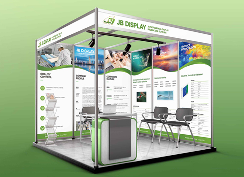 Booth Poster Design for Professional Monitor Product Suppliers
The standard exhibition booth poster projec ...
-
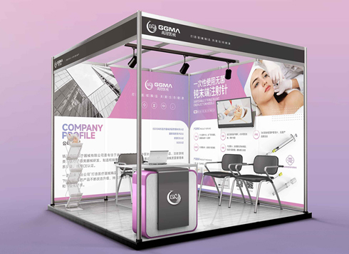 Design of Standard Exhibition Booth Posters for Beauty Instruments
Carefully designed a standard exhibition bo ...
-
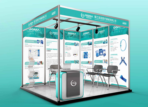 Design of Exhibition Posters for Medical Device Standards
XiYue is designing an exhibition booth post ...
-
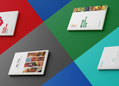 Collection of Brochure Design Cases in 2024 (Cover Series 02)
Our brochure design projects focus on diver ...
-
How to Improve Conversion Rates in C-End Consumer Interface Design: A Complete Guide from Information Architecture to Visual Flow
Date: Jul 17, 2026 Read: 42
-
Should You Ask for Source Files When Outsourcing Graphic Design? How Much Extra Does It Usually Cost?
Date: Aug 28, 2026 Read: 30
-
AI can already make posters, so which parts of graphic design still require humans?
Date: Aug 21, 2026 Read: 45
-
Why Do Graphic Design Projects Require Constant Revisions and Rework? The Problem Usually Lies in Which Stage?
Date: Aug 11, 2026 Read: 37
-
What is Visual Hierarchy in Graphic Design? How to Build a Clear Information Hierarchy with a Four-Step Method?
Date: Aug 1, 2026 Read: 42