



Form Design: A Complete Guide from Information Architecture to Delivery Review
Form specialized design refers to the systematic planning of information architecture, interaction logic, visual hierarchy, component specifications, and usability testing in UI/UX projects, aiming for efficient and accurate user completion. Successful form design is characterized by: users can fill out without thinking, error rates below industry benchmarks (e.g., B2B form first-time submission success rate >90%), and consistent experience across devices. The following expands from six steps, providing a actionable checklist.
1. Information Architecture: Prioritize Hierarchy, Then Decide Order
The information architecture of a form determines how easily users understand the task. A common practice in 2026 is to adopt the inverted pyramid structure: place the most critical fields (e.g., login, payment info) at the top, and secondary info (e.g., preferences) collapsed or in subsequent steps. Note: keep default values to reduce input, but clearly mark required fields.
- Field grouping: group by logical relationship (e.g., personal info, address) using
fieldsetor visual separation, with no more than 5 fields per group. - Ordering principle: align with users' mental model (e.g., name before address), avoid random arrangement.
- Counterexample: placing "confirm password" before "password" causes confusion.
2. Interaction Logic: Instant Feedback and Error Prevention
The core of interaction design is instant feedback and error prevention. The mainstream approach in 2026 is to validate immediately after blur (e.g., email format, password strength) rather than a single prompt on submission. Error prevention is achieved through format examples and input masks (e.g., phone number segmentation).
- Validation timing: blur validation > real-time hints during input > post-submission error summary.
- Error messages: placed adjacent to the erroneous field, with red text specifying the issue, e.g., "Password must be at least 8 characters including numbers."
- Key comparison: The difference between templated forms (e.g., using off-the-shelf plugins) and custom design systems is that the former has fixed validation logic, while the latter can be customized for business scenarios (e.g., e-commerce order forms require joint validation of inventory and address).
3. Visual Hierarchy: Guide User Eye Flow
The goal of visual design is to differentiate primary and secondary elements through hierarchy, reducing cognitive load. Use font size, color saturation, white space to emphasize required fields and buttons. Avoid excessive decoration like shadows or gradients that may distract.
- Label position: Top-aligned is most reading-efficient, suitable for mobile; left-aligned works for long forms; right-aligned or inline labels are rarely used.
- Button hierarchy: Primary action (submit) uses high-saturation main color, secondary action (cancel) uses grey text link; avoid multiple emphasized buttons.
- Actionable suggestion: Button width at least 44dp (Google Material spec), white space no less than 16dp.
4. Component Specifications: Choose Controls Matching Scenarios
Different scenarios require different components. Common component types in 2026 and selection criteria are as follows:
- Text input: suitable for free text (name, address), limit characters and show remaining.
- Selectors: use radio buttons for fewer than 5 options, dropdown or searchable dropdown for more.
- Sliders and steppers: suitable for numeric ranges (e.g., price range), but display current value.
- Comparison: native vs custom components: Native controls have low development cost but limited styles; custom components (e.g., a special date picker customized by Xiyue Company for a medical project) can reduce user error rates but require longer testing cycles.
5. Usability and Testing: Quantitative Metrics and Real User Validation
After form design, verify through usability testing, focusing on completion time, error rate, user satisfaction. In 2026, usability testing often uses remote tools (e.g., Lookback, UserTesting) for rapid iteration.
- Test sample: at least 5 representative users (Nielsen Norman Group recommendation) can find 80% of problems.
- Acceptance criteria: average completion time for complex B2B forms (e.g., enterprise registration) should not exceed 3 minutes; for short B2C forms (e.g., subscription) no more than 30 seconds.
- Common pitfalls: only testing ideal paths, ignoring edge cases (e.g., network interruption, duplicate submission).
6. Delivery Review: Seamless Transition from Design to Development
The delivery phase requires complete design specs, interaction notes, and component state diagrams. Common deliverables in 2026 include Figma/Sketch files plus a review checklist:
- Must specify: input format for each field, validation rule, error copy, success feedback.
- State coverage: default, focus, typing, error, disabled, loading, success — at least 7 states.
- Edge case description: clearly state non-applicable scenarios, e.g., forms with more than 5 steps should be split into multi-step wizards rather than single-page.
FAQ
How to transition from prototype to high-fidelity?
First create low-fidelity prototypes using Axure or Figma to test information architecture and interaction flow; after confirmation, fill in real content and visual details to avoid pixel-level adjustments prematurely.
What are the differences between B2B and B2C form design?
B2C pursues minimalism (e.g., 2-3 fields) and emphasizes social login; B2B must include complete business fields (e.g., tax ID, department) and focus on batch operations and keyboard shortcut support.
When to establish a design system?
When a team has 3 or more projects containing similar fields (e.g., address, phone), immediately build a component library to avoid redundant work and inconsistent experience.
How to review development fidelity?
Use design spec tools (e.g., Zeplin) to compare spacing, colors, interaction feedback, and write automated test cases covering state changes.
What if too much validation causes user churn?
Adopt progressive validation: first check required fields, then hint non-required fields on blur; provide a 'save draft' feature to reduce user anxiety.
Action guide: If you are designing a complex business form in 2026, follow the six-step method starting from information architecture, first conduct user task analysis, then prototype test 2-3 rounds. This method suits medium-to-large projects with >20 employees; for simple login/registration forms, using mature component libraries is more efficient. Note: when the form involves legal terms or financial data, additional compliance review is required.
-
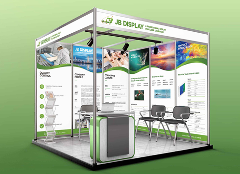 Booth Poster Design for Professional Monitor Product Suppliers
The standard exhibition booth poster projec ...
-
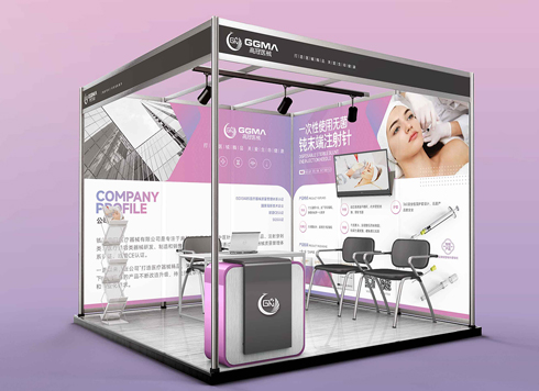 Design of Standard Exhibition Booth Posters for Beauty Instruments
Carefully designed a standard exhibition bo ...
-
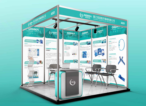 Design of Exhibition Posters for Medical Device Standards
XiYue is designing an exhibition booth post ...
-
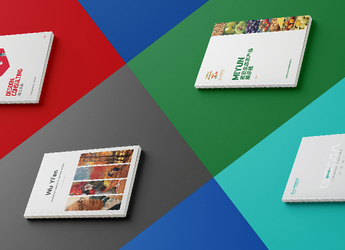 Collection of Brochure Design Cases in 2024 (Cover Series 02)
Our brochure design projects focus on diver ...
-
In-Store Guide Interface Design Guide: From Information Architecture to Delivery Acceptance
Date: Jul 30, 2026 Read: 47
-
Medical Device Interface Design Guide: From Information Architecture to Usability Acceptance
Date: Jul 20, 2026 Read: 42
-
Graphic Design Project Delivery Guide: From Requirement Confirmation to Acceptance
Date: Aug 6, 2026 Read: 45
-
Graphic Design Workflow: A Practical Guide from Requirement Alignment to Creative Delivery
Date: Jul 30, 2026 Read: 42
-
Marketing Mini-Game UI Design Guide: Core Process from Information Architecture to Acceptance
Date: Jul 29, 2026 Read: 56