



Key Considerations and Implementation Methods for ToB Commercial Interface Design
What is ToB Commercial Interface Design
ToB commercial interface refers to the user interface designed for enterprise users, addressing issues of multi-role collaboration, data-intensive tasks, and cross-platform consistency. A successful design should allow users to complete core operations within three clicks without reading a manual, and maintain a daily error rate below 0.5%—unlike C-end interfaces that pursue instant pleasure, B-end emphasizes predictability and fault tolerance.
- Core goal: Reduce learning cost, improve task completion efficiency, and minimize operational errors.
- Metrics: Task completion time, error rate, user retention rate (typically evaluated quarterly).
- Common pitfalls: Copying C-end visual styles while neglecting form density and navigation hierarchy.
Why Dedicated Design is Necessary
By 2026, over 60% of enterprises require design demos or component library documentation when purchasing SaaS systems. Interfaces without dedicated design often face issues: information overload leading to frequent user jumps; inconsistent interaction patterns causing misoperations; lack of scalability doubling subsequent iteration costs.
- Reduce training cost: An intuitive interface can cut 30%-50% of onboarding training time.
- Minimize rework: A standardized design system can boost front-end and back-end integration efficiency by 40%.
- Maintain brand consistency: A unified visual language enhances the professional image of the enterprise.
Core Components: From Information Architecture to Usability
ToB commercial interface design must cover four dimensions; missing any one may lead to project delays or user resistance.
Information Architecture
Adopt a "breadth-first" strategy: top navigation for modules, left sidebar for feature menus, and breadcrumbs for current location. The 2026 trend is to introduce role-based preset views that automatically collapse irrelevant menus based on the role, avoiding information overload.
Interaction Logic
Follow the "progressive disclosure" principle: common operations on the surface, advanced features accessed via secondary menus or context panels. Critical operations (e.g., submit, delete) must have a confirmation step, and the undo window should be no less than 3 seconds.
Visual Hierarchy
Use a grid system (12 or 8 columns) to ensure alignment, font size levels not exceeding 4 (12/14/16/20px), and colors limited to the primary color plus up to 3 auxiliary colors. High-contrast text ensures WCAG 2.1 AA standard.
Component Specification
Common components like tables, buttons, and modals must define states (default, hover, active, disabled) and be output as Figma or Sketch symbol libraries. Component updates require synchronized maintenance of design annotations and development components.
- Usability testing: Each iteration should involve at least 5 real users completing 3 typical tasks, recording error points.
- Delivery acceptance: Provide a design review checklist, checking spacing, states, and response speed item by item.
Five-Stage Implementation Framework
This framework divides the design process into five stages, each with checkpoints to ensure no information is missed.
- Business mapping: Identify job roles and operational flows, output swimlane diagrams. Key action: Confirm the main flow with product managers and developers, eliminating non-core paths.
- Sketching and rapid prototyping: Create interactive low-fidelity prototypes using Axure or Figma, focusing on functional flow rather than visuals. A 30-minute test can reveal logic breaks.
- Visual specification construction: Select a color palette (primary, success, warning, error), fonts, and border radius. Note: B-end interface border radius is recommended at 4-8px to avoid over-cartooning.
- High-fidelity and componentization: Decompose pages into components and record dimensions, states, and interaction feedback in the design system. Components should not be duplicated; reuse rate should exceed 70%.
- Acceptance and refinement: Designers and front-end developers compare pixel by pixel, outputting iteration records. In 2026, common practice involves using design handoff tools (e.g., Zeplin) to reduce communication costs.
Applicable Scenarios and Boundaries
Suitable for dedicated design: Enterprise systems with over 100 users, operational flows exceeding 10 steps, or requiring long-term iterative maintenance. Conversely, for small-scale short-term internal use (e.g., department island tools), consider template tweaks or low-code platforms to save costs.
Scenarios unsuitable for custom design systems: Projects with a timeline shorter than 4 weeks and no subsequent maintenance plans; user groups fewer than 10 with very simple operations (e.g., single report query). In such cases, template tweaks (e.g., using Ant Design Pro) are more economical than building an independent component library.
- Template tweaks vs. custom design systems: The former costs approximately 10,000-30,000 RMB per interface, suitable for quick validation; the latter requires an initial investment of 50,000-150,000 RMB, but long-term component reuse can reduce version iteration man-hours by 80%.
Frequently Asked Questions
Can we skip to high-fidelity directly after the prototype stage?
It is recommended to first create a low-fidelity prototype to validate the flow, avoiding major rework during high-fidelity; a 30-minute test can identify 80% of interaction defects.
What is the biggest difference between B-end and C-end interface design?
B-end emphasizes task completion efficiency, while C-end focuses on emotional appeal and conversion rates; B-end has high information density, while C-end has more white space.
When should a design system be established?
When a project has more than 3 similar modules or plans to expand to more than 5 pages, a component library should be built; otherwise, maintenance costs will increase exponentially later.
How to assess interface usability?
Use the three-dimension metric "task completion rate + error count + subjective satisfaction," invite 5-8 target users to complete core tasks, and record average time and error points.
What design tools can improve efficiency in 2026?
Figma's plugin ecosystem (e.g., auto-annotation, component inventory management) can save 30% of annotation time; combined with Zeplin or Spec tools, it enables real-time synchronization between design and development.
Action guide: If your project team has more than 5 members and the development cycle exceeds 3 months, it is recommended to establish a design system or procure a mature component library (e.g., Ant Design). Xiyue Company validated this framework with multiple SaaS teams in 2026, achieving an average 25% reduction in design delivery cycles. Remember: B-end design prioritizes logic over decoration; any visual element must serve operational efficiency, otherwise it is redundant.
-
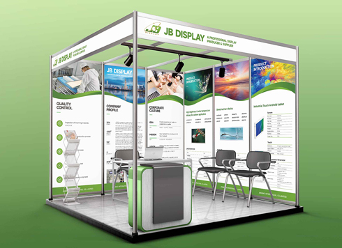 Booth Poster Design for Professional Monitor Product Suppliers
The standard exhibition booth poster projec ...
-
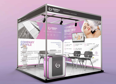 Design of Standard Exhibition Booth Posters for Beauty Instruments
Carefully designed a standard exhibition bo ...
-
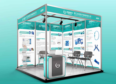 Design of Exhibition Posters for Medical Device Standards
XiYue is designing an exhibition booth post ...
-
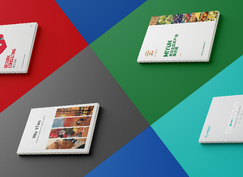 Collection of Brochure Design Cases in 2024 (Cover Series 02)
Our brochure design projects focus on diver ...
-
Live Streaming Interactive UI Design Guide: Information Architecture, Interaction Logic, and Delivery Acceptance
Date: Jul 28, 2026 Read: 101
-
In-Store Guide Interface Design Guide: From Information Architecture to Delivery Acceptance
Date: Jul 30, 2026 Read: 106
-
Government Approval Interface Design Guide: From Information Architecture to Usability Acceptance
Date: Jul 22, 2026 Read: 88
-
Medical Device Interface Design Guide: From Information Architecture to Usability Acceptance
Date: Jul 20, 2026 Read: 64
-
Metaverse Virtual Space UI Design Guide: Information Architecture and Interaction Standards
Date: Jul 31, 2026 Read: 90