



When a pack front is packed with selling points, why does the shelf shopper pick up the less-wordy pack next to it?
The front of a pack should first let people recognize the brand and category, and then let them read selling points after they pick it up; every extra selling point on the front thins out type size, white space, and the key visual by one more layer. Based on common delivery experience in 2026, the pack that gets picked up first on a physical shelf is often not the one with the most information, but the one that can be recognized from three meters away. One sentence is worth remembering first: the front does recognition, while the sides and back do explanation.
Why a front packed with selling points is often ignored first on shelf
Information hierarchy on the front of a pack is not an aesthetic issue; it is a reading-order issue. People scan before they read at the shelf: when scanning, they only process shape, color blocks, and the largest line of text; when reading, they look at small text. Spreading selling points across the front is effectively putting reading content into the scanning step, and the two fight each other.
A judgment that can be excerpted on its own: print the front at a scaled size based on the finished dimensions, convert it to black and white, and if the brand and category can still be distinguished, the front works; if not, selling points have taken over the recognition slot. In 2026, the same product often has to face physical shelves, e-commerce main images, and livestream thumbnails at the same time, and the shortest recognition window is still physical shelf.
- Area is thinned out: the front area is fixed, and when the number of selling points doubles, the area available for the brand name and key visual is commonly compressed by 30% to 50% (experience range).
- No visual landing point: when three lines of the same size sit side by side, the eye jumps back and forth, and then puts the pack down.
- Series extension becomes harder: the more copy on the front, the harder it is to swap multiple flavors and sizes within the same layout, raising revision cost.
Three viewing distances: what goes on the front, sides, and back
Split the front into three layers by viewing distance, based on what people do in a store: walk past, stop, pick up. The three layers are not three styles; they are three reading conditions that the same front must satisfy at the same time.
- Three-meter layer (walk past): carries only brand recognition and category belonging, usually just a logo or strong color block plus category name. The pass line is that after blurring, people can still say which brand it is and what it sells.
- One-meter layer (stop): carries product name, size, flavor or model, and one main selling point. A second type hierarchy is allowed, but it is advisable to keep only one main selling point, at most one main plus one support.
- 30 cm layer (pick up): carries usage instructions, ingredients, supplementary selling points, and regulatory information. Type can be small, but it must be readable and printable; what does not fit on the front goes to the sides and back.
The most often ignored point is the migration to the third layer: many clients treat empty space on the front as waste, but moving explanatory information to the sides shifts cost from recognition to explanation, which is a worthwhile trade. Conversely, pressing all regulatory information onto the bottom of the front pushes the key visual upward, and all three layers suffer.
- For the three-meter layer, it is advisable to use only one or two color relationships; multiple overlapping colors tend to turn gray from a distance.
- For the one-meter layer, the type height of the main selling point commonly falls in a typical range no lower than two-thirds of the product name height; below that ratio it sinks.
- For the 30 cm layer, print the body type at a scaled size based on finished dimensions before judging it; type that looks large enough on screen often prints too small.
Delivery in practice: more than twenty selling points, four-color plus one spot color, and how to land it
A common situation: the client sends more than twenty selling points at once, plus a product photo taken with a phone; the pack allows only four-color plus one spot color, and the budget does not allow extra print sheets. The usual approach is to first divide the selling points into two piles, purchase reasons and usage instructions, keep only one main selling point and one support on the front, and move the rest to the sides and back; where the product photo is not sharp enough, replace it with illustration or color blocks to avoid noise after enlargement.
The cost is real too: the first two review rounds are often challenged for not listing all selling points, and scaled printouts and shelf-distance comparison images are needed to align perceptions; revision rounds commonly run one to two rounds more than pure layout projects (experience range). Delivery teams usually put the three-distance scaled samples on the meeting room wall before the first review and look from three meters away, moving disputes forward, which saves far more than changing after printing.
- Asset constraints: when the original product image resolution is insufficient, decide first whether the key visual will be a photo or an illustration, then discuss layout; otherwise every image change requires a new layout.
- Process constraints: the number of spot colors and whether hot stamping or embossing is possible directly determine whether the front can use process instead of text to create hierarchy.
- Copy constraints: when selling points exceed the front's carrying capacity, rank them by whether they affect purchase decisions, not by departmental importance.
Two front-of-pack approaches compared: recognition-first and selling-point-first
This comparison is not about right or wrong; it is to let clients see the cost each route pays. Recognition-first suits products with a high share of physical shelf sales and many series sizes; selling-point-first has room to work only when there is single-point display, an on-site salesperson, or sufficient e-commerce detail page support.
- Option A, recognition-first: enlarge brand and category on the front, keep only one main selling point. Three-meter recognition is fast, and series extension only requires changing color bands and flavor words; revision rounds commonly fall in an experience range of 2 to 4 rounds, but the initial internal persuasion cost is high.
- Option B, selling-point-first: spread three to six selling points across the front. A single box carries a large amount of information, and people do not need to turn it over after picking it up; the cost is weak three-meter recognition, forced smaller type, and a full layout reset for every series extension, with revision rounds commonly in an experience range of 4 to 6 rounds.
- Compromise: keep one main selling point plus one icon-based secondary selling point on the front, and give the rest to the sides, balancing recognition and information volume, but with higher demands on icon design quality.
Three low-cost acceptance tests
Front-of-pack acceptance should not stop at renderings; a common practice in 2026 is to make scaled proofs for real testing. The criteria should state what counts as passing; otherwise every review falls back into subjective argument.
- Scaled shelf test: print at actual finished size, attach it to a wall 1.2 to 1.5 meters above the floor, step back three meters and look for three seconds; passing means being able to state the brand and category.
- Black-and-white and blur test: convert to grayscale and then blur; if brand and category are still distinguishable, the hierarchy is not relying on color alone.
- Series side-by-side test: place sizes in the same series side by side and check whether color band height, logo position, and type size match; if they do not, the layout rules have not been written into a reusable file.
A typical counterexample: the hierarchy is clear in the rendering, but once scaled to actual size, the main selling point and explanatory text blend into a gray mass. This kind of problem cannot be seen on screen and can only be exposed by scaled printing, so the acceptance checklist should list a physical scaled proof as a required deliverable, not an optional one.
Applicability and boundaries
This method suits products whose main sales scenarios are physical shelves, convenience store coolers, and supermarket end caps, and also suits categories with many sizes that need series extension. Its premise is that consumers have a process of scanning on their own; once that premise disappears, the weight of the method should be lowered.
- Suitable: fast-moving consumer goods, food and beverages, personal care, products with series sizes, and categories that need side-by-side display.
- No need to force it: products sold mainly online or via livestream, where the detail page carries all explanation; B2B industrial packaging, where buyers look at parameters and models; high-end gift boxes and other gifting scenarios, where less information and more texture and unboxing experience come first.
- Use with caution: categories with a very high share of legally required information, where the front has little room to compress and needs earlier alignment with compliance and the printer.
FAQ
If the front of the pack only has the brand name and product name, will it look too empty and will no one read the selling points?
They will not go unread; only the timing of reading changes: the front is responsible for making people stop, and the selling points on the sides and back are responsible for confirmation. The freed-up area is usually absorbed by the key visual and white space, making recognition more stable.
There is so much legally required labeling; can the front still keep the key visual?
In most cases, the front only needs to keep a small part of the required information, with the rest distributed to the sides and back. For specific layout positions and character sizes, check item by item against the packaging specifications of the platform where the sales channel sits and the delivery acceptance checklist.
For six flavors in the same series, should the front layout be exactly the same?
Same skeleton with different recognition points is more common: keep logo position, color band height, and type hierarchy unified, and replace only the flavor color and flavor name. Exactly the same makes them hard to tell apart; completely different loses the series feel.
The boss insists on putting 'more volume, no price increase' on the front; how should design push back?
No need to reject it head-on; make it into scaled comparison samples: one version on the front, one moved to the side, then look from three meters away to see which one gets the brand recognized first. Replacing argument with a real test is usually more effective than reasoning.
If you currently have a draft with the front packed with selling points, do not rush to change the layout: print a scaled proof at finished size, attach it to the wall, step back three meters and look for three seconds; whether you can recognize the brand and category will basically set the direction. If the product is sold mainly online with limited shelf exposure, the front information density can be relaxed appropriately; if there are many sizes and side-by-side display is needed, give priority to reserving enough recognition space before discussing selling points.
-
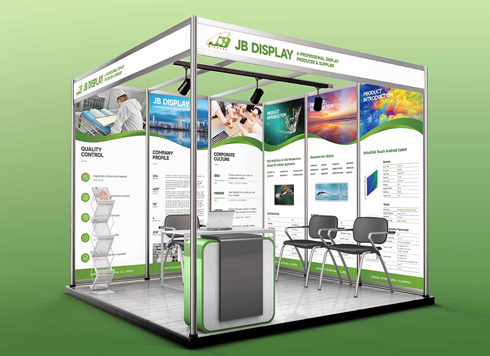 Booth Poster Design for Professional Monitor Product Suppliers
The standard exhibition booth poster projec ...
-
 Design of Standard Exhibition Booth Posters for Beauty Instruments
Carefully designed a standard exhibition bo ...
-
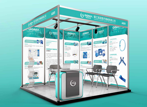 Design of Exhibition Posters for Medical Device Standards
XiYue is designing an exhibition booth post ...
-
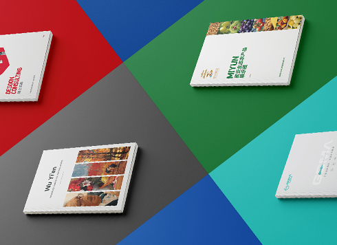 Collection of Brochure Design Cases in 2024 (Cover Series 02)
Our brochure design projects focus on diver ...
-
A drink line ships three flavors and looks like three brands on the shelf — is the flavor color really the problem?
Date: Oct 9, 2026 Read: 35
-
Same Gift Box Fine In-Store but Falls Apart in Express—Should the Insert Be Made in Two Channel-Specific Versions?
Date: Oct 7, 2026 Read: 24
-
If the ingredient list formula is tweaked and the client only sends a WeChat screenshot, can the design file go straight to print?
Date: Sep 25, 2026 Read: 30
-
If the printer provides the die, will packaging design still charge for structural drawings?
Date: Sep 13, 2026 Read: 39
-
Can Packaging Use Free Fonts and Images Downloaded Online and Be Sent Directly to the Printer?
Date: Sep 7, 2026 Read: 58