



At the same font size, English looks thinner than Chinese in mixed text—can making the Western type larger really make up for it?
When body text contains English words, model numbers, years, and columns of figures, setting them with the Western characters included in a Chinese font often makes them look thin, vertically uneven, and with ragged right edges on numbers. This is usually not because the layout has not been adjusted well, but because the Latin letters and Arabic numerals bundled with Chinese fonts are mostly padded to the Chinese character frame and were not designed together with the Chinese characters. In 2026 publication and brochure projects, a more reliable approach is to assign a separate Western font for body text; but it is not mandatory—when English appears only occasionally and numbers are mainly page numbers and years, forcing in an extra font instead raises font licensing costs and increases the chance of errors.
1. Why English set in a Chinese font looks thin at the same font size
Chinese characters are square-shaped, each occupying a fixed character body; Western characters have proportional widths, and the widths of letters i and m differ several times over. Most Western characters included in Chinese fonts are padded to the Chinese character frame, and their stroke direction and visual center also sit closer to those of Chinese characters. Placed on the same line, Chinese characters look full while Western text looks thin, and their visual sizes do not match at the same font size; this is the first source of awkwardness.
The second source is numerals. Proportional figures read naturally in narrative body text, but once they enter tables, price lists, and specification tables, the widths of figures in a column are inconsistent and the right edge looks serrated; conversely, changing all body text to tabular figures makes the running text look loose. Tabular and proportional figures each have their uses, and they stay orderly only when used separately.
- Mismatched visual size: when Chinese is 10 pt, Western text commonly needs to be adjusted to around 10.5 pt (experience range) to look close in size.
- Different baseline positions: when Chinese and Western baselines do not align, subtle up-and-down movement appears within the line.
- Inconsistent numeral widths: misaligned number columns in tables are mostly caused by this, not by the typesetter failing to adjust them.
- Missing weights and italics: the Western characters in a Chinese font often include only a regular weight, while italics and bold are synthesized by software and print with blurred strokes.
2. Which manuscripts are worth pairing with a Western font set, and which are not
Deciding whether to assign a separate Western font depends not on whether the manuscript looks fashionable, but on how much reading load English and numbers carry on the page: the greater the reading load and the more they appear in blocks, the more obvious the benefit of pairing; if they are only scattered accents, the benefit is largely consumed by licensing costs and adjustment time.
Situations suitable for pairing:
- Bilingual publications, translated or licensed books, and academic books with long English quotations and notes.
- Technical manuals and product catalogs where model numbers, specifications, and units repeatedly appear in tables.
- Financial, statistical, and annual-report brochures where figures run in columns and need decimal alignment.
Situations where pairing is unnecessary or can be simplified:
- Chinese-only essays, novels, and internal materials where English appears only in occasional abbreviations.
- Numbers serve only as page numbers, years, or dates and do not enter column comparisons.
- Materials with few pages, one-time use, and no reprint, where an extra font set only adds another process step.
It should also be made clear: font pairing solves problems at the level of alignment, rhythm, and visual impression; it does not solve bilingual standards at the content level. English spelling, capitalization, consistency of translated names, units, and orders of magnitude belong to editing and proofreading; changing fonts will not make these correct. Mixing these two matters together in delivery discussions is often the starting point of disputes.
3. Pairing framework: three checks and one lock
A practical approach is to break Chinese-Western font pairing into three decisions plus one lock. The first three steps are selection; the last step is consolidation—if you only select without locking, the pairing will be reverted the next time someone else takes over a revision.
- Check use: first determine whether Western text and numbers mainly appear in body text, tables, or notes. Body text is about reading rhythm, tables are about alignment, and notes are about whether the type is still legible when set below body-text size.
- Check visual proportion: set the candidate Western font and the Chinese body text on the same line at the same font size for three to five lines, then compare visual size and baseline. A difference of half a size step to one size step is a typical range; if the difference is too large, change the font rather than forcing the size to compensate.
- Check numeral scenarios: use tabular figures where column comparison is needed, and proportional figures in narrative body text; settle the alignment of decimal points, thousands separators, and percent signs at this step.
- Lock the combination: write the Chinese body text, Western body text, and numeral styles into a one-page specification, clearly stating font sizes, leading, letter spacing, and substitution rules, and deliver it with the files.
The “lock” is counted as a separate step because in revisions, what gets reverted is almost never the wrong font choice, but the fact that the font was only installed in the file and not written into the specification. This page does not need to be long, but it determines whether later rounds of revision are easy or troublesome.
4. What to check in acceptance, and which pitfalls recur
When accepting a mixed-typesetting manuscript, you do not need to rely on feeling to say whether it looks good; four clear checks are enough:
- Visual size: turn to three to five random pages and check whether Chinese and Western text on the same line have balanced visual weight.
- Baseline: check whether the bottoms of Chinese and Western text within a line fall on one line; small jumps are amplified in paragraphs of English.
- Numeral alignment: number columns in tables should be right-aligned or decimal-aligned, which can be verified by spot-checking any page.
- Complete glyphs: check whether italics, bold, and small-size figures are true glyphs; faux italic and faux bold are visible at a glance in print.
A common situation at delivery is: halfway through typesetting the manuscript, the client supplies an English comparison table and asks for it to be inserted at the end of each article, after the third proofround has passed and with less than a week left in the schedule. The approach is not to touch the finalized Chinese body text, but to create an independent Western text style only in the appendix area, with separately set font size and leading, so as not to disturb the body text block; the cost is a slight difference in visual density between the appendix and the body text, which must be bridged with rules and white space. Under the typical 2026 delivery pace, adjustment took an extra one or two days. If, at the time, the whole book had been switched to a different font for convenience, the rework would have covered the entire book.
The recurring pitfalls are concentrated in these areas:
- Only the regular weight is installed, and italics and bold are synthesized by software, so printed strokes look blurred.
- No spacing is left between Chinese and English, so they read as stuck together; how much to add and where to add it must be fixed in the specification.
- Numbers switch between full-width and half-width, making a table look as if it uses two fonts.
- The font license covers only the Chinese font, and the commercial-use scope of the Western font has not been checked, only to be discovered before prepress output.
5. Use only one Chinese font, or pair one Chinese and one Western font?
Both approaches can produce a finished product; the difference lies in visual impression, schedule, and the complexity of later revisions. Below are experience ranges from projects; the specifics still depend on trim size, page count, and the proportion of English.
- Use only one Chinese font (including its bundled Western characters): the style sheet is simple, replacements in revisions have limited impact, and typesetting the whole body text commonly takes a few days; the cost is that English paragraphs look looser and number columns easily become uneven. Suitable for Chinese-only publications, internal materials, and small print runs.
- Pair one Chinese and one Western font: paragraphs of English and number tables are neater, and long documents read more steadily; the cost is one to two additional font licenses, a one-page longer style specification, and commonly one to three extra days of adjustment. Suitable for bilingual books, technical manuals, annual reports, and series that will be reused over time.
- Compromise approach: leave the Chinese body text unchanged and assign a separate Western font only to table areas, note areas, and cover English. The improvement is concentrated in high-frequency locations, and the cost is considerably lower than replacing the whole document; this is a relatively common practice in 2026 projects.
Before choosing, ask three questions: how much page area English and numbers occupy in the manuscript, whether the book will be reprinted or developed into a series later, and whether the font budget can cover one more commercial license.
Frequently asked questions
If English appears only in a few places in notes, is a separate Western font still needed?
In most cases, no. When English in the note area does not form paragraphs, setting it with the Western characters bundled in the Chinese font and adjusting the size by about half a size step is enough; the benefit is out of proportion to the cost.
If numbers in a table are misaligned, is it a font problem or a layout adjustment problem?
First check whether the font has tabular figure glyphs. If it has them but they are not enabled, it is a layout setting problem; if the font does not have them, you can only change the font or switch to fixed letter spacing in the table—forcing the letter spacing will distort the numbers.
Can one Western font be used for both body text and headings?
Yes; it is sufficient for publications with few pages and simple hierarchy. For books with many hierarchy levels and a wide range of heading sizes, assigning one font each for body text and headings is more reliable, though the style sheet needs one more layer of maintenance.
When a finalized Chinese-Western mixed-typesetting file is sent to the printer, what else needs to be checked?
Check whether fonts have been outlined or embedded as required by the printer, whether the commercial license for the Western font covers this print run, and whether numeral alignment has been reverted in the final PDF; spot-check a few pages before prepress output.
In practice, start with a small sample: take two pages of body text plus one table and run through the three checks and one lock; within half a day you can see whether the pairing is worth rolling out across the whole document. The boundaries should also be clear: for one-time materials with few pages, a low proportion of English, and no reprint, there is no need to add fonts and process steps for this; for bilingual books, technical manuals, and series reused over time, this one-page style specification usually saves several later rounds of rework.
-
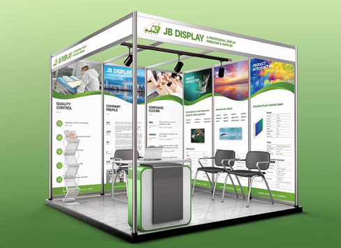 Booth Poster Design for Professional Monitor Product Suppliers
The standard exhibition booth poster projec ...
-
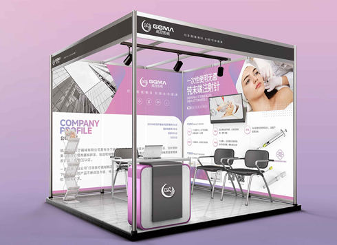 Design of Standard Exhibition Booth Posters for Beauty Instruments
Carefully designed a standard exhibition bo ...
-
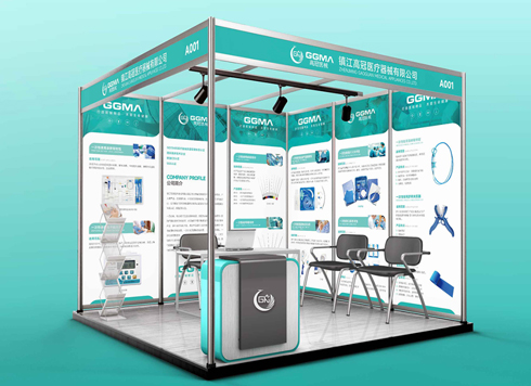 Design of Exhibition Posters for Medical Device Standards
XiYue is designing an exhibition booth post ...
-
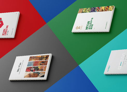 Collection of Brochure Design Cases in 2024 (Cover Series 02)
Our brochure design projects focus on diver ...
-
Art paper covers lose their feel when laminated, but unlaminated covers wear out: what is the right trade-off?
Date: Oct 20, 2026 Read: 5
-
When a pack front is packed with selling points, why does the shelf shopper pick up the less-wordy pack next to it?
Date: Oct 19, 2026 Read: 9
-
Full-bleed poster shows white edges after trimming—printer says the file has no bleed. How much should I believe that?
Date: Oct 18, 2026 Read: 7
-
The sub-brand is still internal-only—should the VI system include the master–sub relationship in advance?
Date: Oct 16, 2026 Read: 15
-
The AI-generated logo looks decent, but the printer says it needs vector art—should I ask AI to regenerate it or have a designer redraw it?
Date: Oct 15, 2026 Read: 15