



Client Is Pushing for Logo Options and Says the Black-and-White Version Is Too Plain—Is Color Really the Problem?
Conclusion first: Brand logo proposals usually start with black-and-white single-color concepts and then move to color versions. The role of the black-and-white version is to test whether the mark still holds up without color assistance; it should not be treated simply as a desaturated color draft. Color versions are more likely to attract attention in presentations, but they can also mask unstable visual weight, clogged negative space, and overly thin lines. Unless the brand already has established brand colors and is only doing a light extension, the common 2026 practice is still to define structure in black and white first, then assess character in color. Below, based on delivery experience, I explain the sequence, boundaries, and acceptance criteria.
Why black-and-white drafts are often called too plain yet are still recommended first
In graphic design, a black-and-white draft usually means single-color, positive and negative versions, not simply converting a color draft to grayscale. It pulls judgment back to outline, weight, spacing, negative space, and visual weight: if a mark cannot hold up in black and white, color is often just propped up by contrast and gradients. For brands across multiple media such as packaging, workwear, receipts, and storefronts, single-color capability is a foundational capability.
The color version is not unimportant; it carries brand character and shelf recognition. The issue is the review sequence. If color is shown first, the client is easily drawn to color first, and structural problems are often discovered only when it comes to printing, embroidery, or reduced-size use. Revisions then shift from color adjustment to redoing the structure. So a more stable sequence is black and white first, color second, and then back to single-color fallback versions for review.
- Black and white for structure: Whether the outline is clear, whether negative space is clogged, and whether wordmark proportions are stable.
- Color for character: Whether the hue fits the category and can be reproduced on packaging and screens.
- Single color for production: Whether reversed white, screen printing, embroidery, and foil stamping can retain recognition.
When the client is pushing for concepts, how should black-and-white and color versions be sequenced for delivery?
A common 2026 project rhythm is that the client first asks to see a few versions, but serving full-color mockups right away easily pulls the discussion into color preferences. A more executable approach is: internally use black and white to define 2-3 directions first; in external reviews, add a small number of color application mockups to the main black-and-white concepts, and state clearly that black and white is for judging structure and color is for assessing brand character. This is not stalling; it places revision costs earlier.
The difference between black-and-white first and direct color proposals is mainly not in design skill, but in communication and rework structure. The comparison below uses common dimensions; timelines and revision counts are experience ranges and vary with brand complexity, decision chain, and number of materials.
- Black and white first, then color: A basic logo concept commonly takes 2-4 weeks and 2-3 rounds of revision. Spending about half a day to a day earlier on single-color print checks usually reduces later rework in packaging, workwear, and single-color printing; suitable for new brands, rebranding, and multi-media rollout.
- Direct color proposal: More likely to attract attention in reviews, but commonly adds 1-2 rounds of rework where color is approved and then the structure changes again; suitable when a complete VI already exists, only a light extension is needed, or use is purely online and short-term.
- Deliverable check: Regardless of sequence, formal delivery should include black-and-white positive and negative forms, single-color version, reversed white version, minimum usage size, clear space rules, color value sheet, vector source files, and font outlining or licensing documentation; delivering only one color JPG is not a complete delivery.
Delivery in practice: when the timeline is squeezed to just over a week and the die line is not finalized, which version comes first?
A common constraint in projects is this: the client provides only the brand name, a few positioning sentences, and several phone photos of competitor references; the packaging die line is not finalized, yet the timeline is squeezed to 7-10 working days. Based on common project delivery practice, the approach is to first use a black-and-white wordmark or graphic skeleton for the recognition check and reduction check, print it at business-card size and check it as reversed white on a dark background, and make only one main-color color mockup rather than piling up multicolor renderings. The result is usually 1-2 fewer rounds of later rework in packaging printing and workwear embroidery. The tradeoff is that the first review is less lively than full-color renderings, so the judging criteria need to be explained to the client in advance.
At delivery, the first things to verify are not whether it looks good but materials and permissions: whether the brand name spelling is confirmed, whether the font has commercial licensing, whether old logo recognition needs to be retained, and whether the packaging die line and printing process are known. Doing black and white first when materials are incomplete is not lowering the standard; it exposes uncertain structural problems earlier. If reduced-size blur or broken reversed-white lines are found only after the color draft is finalized, what gets changed is no longer just color.
- Common pitfall: Converting a color draft directly to grayscale and treating it as a black-and-white draft; gradients turn gray and layers blur together.
- Common pitfall: Viewing only enlarged on screen and ignoring actual printing and minimum size.
- Common pitfall: Not making a reversed white version; temporary inversion on dark packaging causes thin lines to break and text to look dull.
- Common pitfall: Fonts are not licensed or not outlined, so printers and fabricators cannot reuse them reliably.
Where this applies and where it does not
This black and white first, color later judgment fits new brand logo design, brand upgrades, multi-media rollout such as packaging and workwear, projects with many small-size materials, and projects with many single-color processes. It also helps clients be less swayed by renderings during the proposal stage. The boundaries should be stated just as clearly: if the work is only a short-term online campaign mark with a very short lifecycle and it is certain that it will not enter printing or physical materials, the black-and-white process can be simplified. However, for a primary brand mark, it is not recommended to skip the single-color fallback version, because avatars, dark mode, receipts, and side-by-side partner use still involve single-color scenarios.
Another boundary is extension projects with established strict VI colors: color specifications can come first, but black-and-white and reversed-white versions should still be checked as required fallback versions. Otherwise, once they enter packaging, embroidery, or single-color printing, they will still need to be added later. Check font licensing, trademark searches, and printing process requirements against official platforms and delivery acceptance checklists; do not judge only by the proposal page.
What to check at acceptance, not relying on a pretty proposal page
To judge whether a logo is acceptable, do not look at how beautifully the proposal page is laid out; look at whether it remains clear under three conditions: minimum size, single color, and dark background. The pass line can be written as checkable criteria: recognizable in black-and-white print, not blurry when reduced to the typical minimum size, no broken lines in reversed white, clear space and minimum size written into the guidelines, and complete vector source files and font licensing documentation. Without these, even a complete color draft is only a proposal draft, not a deliverable brand identity.
Minimum size is inferred from the medium: logos on business cards and staff badges commonly fall within an 8-12 mm experience range; smaller scenarios such as packaging side panels and pen barrels commonly fall within a 5-8 mm experience range; final confirmation depends on proofing and the fabricator. This range is not a fixed standard; material, process, and viewing distance all change the lower readability limit.
- Pass: The single-color outline is clear; negative space does not depend on color to be distinguished.
- Pass: The minimum size has a measured paper proof, not a verbal estimate.
- Pass: The reversed-white version has adjusted line weights and does not blur on dark backgrounds.
- Counterexample: Only a color gradient version exists; details disappear when reduced.
- Counterexample: The mark relies on shadows, outlines, or background color to work.
Frequently asked questions
If the logo is shown to the client in color first, will it be easier to get approved?
It may be more likely to be selected in the short term, but color easily masks structural problems. A more stable approach is to define structure in black and white first and then add color; post-approval rework is usually lower.
What if the client does not accept the black-and-white draft because it looks too plain?
Position the black-and-white draft as a decision draft, not the final image. Include a small number of color application mockups in the review, and explain that the single-color version is needed for packaging and workwear production.
If the brand already has standard colors, is a black-and-white version still needed?
Yes. Single-color and reversed-white versions are used in packaging, embroidery, receipts, and dark backgrounds; without fallback versions, problems easily occur on small materials.
What minimum logo usage size is safe to set?
Infer it from the medium. Business cards and staff badges commonly fall within an 8-12 mm experience range; packaging side panels and pen barrels commonly fall within 5-8 mm; final confirmation depends on proofing and the fabricator.
If the logo is only used online, can the black-and-white draft be skipped?
If it is confirmed to be screen-only and the timeline is very short, the process can be simplified. However, for avatars, dark mode, and icons, a single-color check is still recommended; the cost is low and it helps avoid pitfalls.
In action terms, before the next logo proposal round, print an A4 black-and-white draft, check it once at business-card size and once on a dark background, and then decide the color direction; write minimum size, clear space, and reversed-white rules into the delivery checklist. For projects used only for short-term online campaigns, the black-and-white process can be simplified; when multi-media rollout such as packaging, workwear, and storefronts is involved, skipping single-color acceptance is not recommended.
-
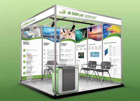 Booth Poster Design for Professional Monitor Product Suppliers
The standard exhibition booth poster projec ...
-
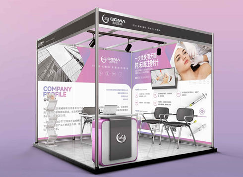 Design of Standard Exhibition Booth Posters for Beauty Instruments
Carefully designed a standard exhibition bo ...
-
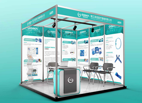 Design of Exhibition Posters for Medical Device Standards
XiYue is designing an exhibition booth post ...
-
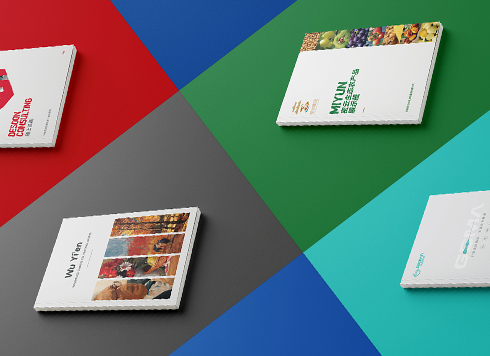 Collection of Brochure Design Cases in 2024 (Cover Series 02)
Our brochure design projects focus on diver ...
-
Brand logo has only one horizontal version—when hang tags, ID badges, and packaging frames won't fit, should you add versions or force-scale?
Date: Oct 4, 2026 Read: 43
-
When a logo includes both Chinese and English brand names and looks cramped on small items, should you adjust type height or split the lockup first?
Date: Sep 21, 2026 Read: 92
-
The logo looks sharp on your phone — why does it blur when printed on pen barrels or embroidered on uniforms?
Date: Sep 15, 2026 Read: 47
-
If the logo is finalized and I only received a PDF, and we need to switch printers for packaging next month, can I still ask for the source files now?
Date: Nov 2, 2026 Read: 1
-
Brochure laid out as A4 but finished size is large 16mo: scale the design down or ask the printer for a separate A4 sheet?
Date: Nov 1, 2026 Read: 8