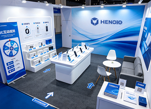


Text on Both Sides Cut Off on a Large Screen? Which Numbers Did You Forget to Ask the Build Team Before Starting?
When a large screen at an event shows distorted visuals or cuts off text on both sides, it is usually not a matter of the designer's layout skill. More often, the file was built using print millimeter dimensions or a generic 16:9 ratio, without aligning to the screen's actual pixel count, pixel pitch, tiling configuration, and safe area. According to common event delivery practices in 2026, getting the screen pixel dimensions and on-site occlusion positions before starting the artwork, designing in pixels, and leaving a typical range of 5%–10% as a safe margin around all sides can reduce on-site rework. If there is a stage opening, teleprompter, or jib camera position, even a well-specified file needs space reserved for occlusion.
Large-screen artwork vs. regular print artwork: three main differences
Regular print artwork lands on paper in millimeters; large-screen artwork is closer to pixels, lit by one or more LED modules. This difference determines: the image ratio is set by the screen's pixel count, not the canvas ratio; color is set by screen brightness and color gamut, not monitor calibration; and whether text can be read is determined by pixel pitch and viewing distance together, not font size alone.
- Ratio: Based on the screen's actual pixel count. It is often close to 16:9, but irregular screens can be noticeably wider or narrower.
- Color: LED screens are bright and have a vivid color gamut. Large areas of pure white can appear to float, and shadow details can get crushed.
- Text and motion: For distant viewing, estimate text height as a proportion of screen height; when there is video motion, confirm frame rate and format with the playback device.
Clients often take a printed key visual and simply enlarge it for a project. If the original is close to A1 print ratio and is placed on a 16:9 screen, the sides are often cropped or stretched, and the logo and date near the edges are usually the first to suffer. That is why large-screen artwork usually needs to be re-laid out, not just enlarged.
Asking the build team these items before starting is more useful than asking “how big is the screen”
Rework on large screens most often clusters around screen specs arriving too late. According to 2026 project delivery practices, a qualified build team or production team can provide a screen checklist before load-in. Getting it before layout can save most of the communication cost. It is worth turning these into a checklist before starting:
- Actual screen pixels: Not the diagonal size in inches, but how many pixels horizontally and vertically. Medium hall screens are commonly around 1920×1080; irregular tiled screens often have non-standard pixel counts.
- Pixel pitch: Typical range is P1.5–P10. Indoor close viewing uses small pitch; outdoor distant viewing uses large pitch. It determines how small text can remain readable.
- Tiling configuration: Whether it is a single screen or multiple tiles, where the seams fall, and where important information should avoid them.
- Occlusion and safe area: Stage openings, teleprompters, speakers, and jib camera positions can block the edges of the image, so a safe margin is usually needed around all sides.
- Playback environment: Which playback software is used, which formats are supported, and how much on-site debugging time is available. It is common to load in 1–3 hours ahead or the day before for debugging.
Putting these items into a kickoff confirmation sheet is more effective than repeatedly asking “how big is the screen” in a group chat. Based on delivery experience, the earlier the screen specs are confirmed, the fewer revision rounds are usually needed later—often one to two rounds fewer.
A “three-zone” layout method
Whether a layout is stable can be judged with the “three-zone” method: divide the image from outside in into safe zone, content zone, and decorative zone. Only put important information in the content zone; only decorative elements may touch the edge of the safe zone. The edges of a large screen are the least controllable, because occlusion, cropping, and tiling seams all occur around the perimeter.
- Safe zone: The outer ring of the image. A typical range is 5%–10% of screen width or height around all sides, adjusted for stage opening and equipment positions. This ring should only contain background textures and gradient color blocks.
- Content zone: Put the main title, brand logo, date and location, and QR code here. Try to avoid the center and lower area of the image, where seams often occur.
- Decorative zone: Put auxiliary graphics, light effects, and lines on the outer layer. They may be occluded; cutting off part of them does not affect information completeness.
Then check font sizes: a typical range is main title height at 1/8–1/5 of screen height, subtitle around 1/10–1/15, and body text no smaller than 1/20. The final decision should be based on an on-site test projection. Be especially careful with thin lines: line width is commonly no less than 2–3 pixels. Too thin a line can flicker or even disappear on a low-pitch screen.
At delivery there is another typical constraint: screen pixel dimensions arrive on the evening before the event, the key visual has already been finalized, and neither assets nor copy can be changed. A workable approach is to re-lay out to the new pixel count and move the lower line of information up as a whole, leaving about an 8% safe margin. The cost is that the decorative gradient has to be redrawn, and delivery slips by about two hours. This kind of cost can often be avoided by asking for screen specs one extra time early on.
Common on-site pitfalls, and an experience comparison of three media types
Most pitfalls are not at the design level, but come from assuming the other party is using the same standards as you. Common counterexamples: building a full-screen file in millimeters and only discovering at delivery that the screen has a non-standard pixel count; large pure white or pure black areas, where pure white floats and pure black merges into the dark background; text placed too close to the edge and blocked by the stage opening on site; images inserted directly at print resolution and causing playback stutter; and judging only from the computer display while ignoring differences in screen brightness and color gamut.
- Large LED screen: Supports motion and video, high brightness, less affected by ambient light; cost is based on area and rental duration and, based on experience, tends to be higher; artwork is produced in pixels, and screen specs must be obtained in advance.
- Printed backdrop board: Artwork is produced in millimeters, the image is static, and resolution is set by viewing distance. A typical range is 1:1 output at 30–100 dpi; cost is relatively controllable and it is suitable for check-in walls and group photo boards.
- Projection: Lower equipment cost and flexible setup, but sensitive to ambient light and screen flatness. It requires higher text contrast, and dark content can easily turn muddy. It is suitable for small venues with controllable lighting.
To judge whether a large-screen layout is acceptable, check three things: whether all perimeter information is inside the safe zone, whether the main title can be read at a glance from a distance, and whether seams press onto text or faces. If the event also has a livestream or recording camera, check the image ratio together with the camera framing; experience suggests that the livestream safe frame and the on-site large-screen safe area do not overlap, so it is advisable to produce a separate framing version for the camera.
Applicable scenarios and boundaries
Designing in pixels, leaving a safe zone, and confirming screen specs in advance are suitable for event key visuals, launch event backdrops, annual meeting large-screen interactions, and other scenarios mainly viewed from a distance. For any project where the image will be used on a large screen, livestream, and recording at the same time, it is worth spending an extra half day checking parameters during the layout stage.
However, this is not a universal method for all screen materials. When content needs to be read up close by the audience—for example, an information screen next to a check-in desk or a detailed introduction screen in an exhibition hall—simply enlarging the font is not appropriate. You need to re-layout according to viewing distance, possibly changing to vertical orientation or splitting the screen. If the event only has one fixed-size printed board, producing artwork directly in millimeters is simpler. In addition, adding screens, swapping screens, or cancelling tiling on site is not uncommon. Keeping important information in the content zone and only decoration at the edges is a fallback for yourself.
FAQ
Must large-screen artwork be built at 1920×1080?
Not necessarily. 1920×1080 is just a common pixel count for medium screens. Irregular screens and tiled screens often have non-standard ratios. It is safer to get the screen's actual width and height in pixels before creating the canvas.
How small can text be on a large screen?
There is no fixed font size; estimate by pixel pitch and viewing distance. A typical range is main title at 1/8–1/5 of screen height, body text no smaller than 1/20, and line width no less than 2–3 pixels. Final judgment should be based on an on-site test projection.
Can an already printed key visual be used directly as a large-screen background?
It can be used as an asset, but it is not advisable to use it directly as final artwork. Print artwork is usually in millimeter proportions and CMYK. Placing it directly onto a pixel canvas can easily cause distortion and color shift. Re-laying it out once is safer.
How much safe area should be left on a large screen?
There is no universal number. A common practice is to leave 5%–10% of screen width or height around all sides. If there is a stage opening, teleprompter, or jib camera position, it needs to be larger; check against on-site occlusion positions.
The colors are badly off on site—is that a file problem?
Not necessarily. LED screens are bright and have a vivid color gamut, so deviation is more noticeable when they have not been calibrated. You can fine-tune the file according to the actual calibrated result, or give key color values to the on-site calibration staff for reference.
If you have a large-screen project on hand right now, start with one thing: write the screen's actual pixel count, pixel pitch, tiling configuration, and occlusion positions into a confirmation sheet, send it to the build team or production team for item-by-item replies, and only then start the first version. Leaving a 5%–10% safe margin and putting important information only in the content zone is a low-cost insurance policy. This approach assumes distant viewing and on-site playback. For close-viewing screens or static printed boards, laying out according to their respective viewing distances is more appropriate.
-
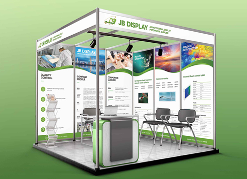 Booth Poster Design for Professional Monitor Product Suppliers
The standard exhibition booth poster projec ...
-
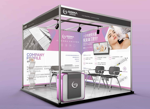 Design of Standard Exhibition Booth Posters for Beauty Instruments
Carefully designed a standard exhibition bo ...
-
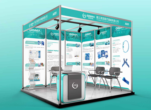 Design of Exhibition Posters for Medical Device Standards
XiYue is designing an exhibition booth post ...
-
 Collection of Brochure Design Cases in 2024 (Cover Series 02)
Our brochure design projects focus on diver ...
-
The logo is centered in the circular button, so why does it still look off to one side? Should I nudge it manually, or is something wrong with the file?
Date: Oct 15, 2026 Read: 1
-
Same logo looks clear in a brochure—why does it blur on a shipping box? Can switching the file to a box version save it?
Date: Oct 14, 2026 Read: 3
-
Brochure body text justified with uneven letter spacing and white gaps at line ends—is the software stretching the spacing? Will left alignment fix it?
Date: Oct 13, 2026 Read: 7
-
White Logo on Black Card Packaging Looks Gray—Was White Ink Printed Only Once? Will One More Pass Fix It?
Date: Oct 12, 2026 Read: 9
-
Why does a folded crease always crack with a white line first—is the paper too thick or the crease not scored deep enough?
Date: Oct 11, 2026 Read: 12