



The fluorescent green on the cover is small, the printer says CMYK can do it, but the client insists on a spot color—how should this disagreement be judged?
When fluorescent green from a screen looks dull on a brochure cover, in most cases a highly saturated color like this falls outside the range that CMYK printing can reproduce—not because the printer was careless in matching ink; the part outside the gamut cannot be brought back by adjusting ink. Whether to add a separate spot color plate for it usually depends on three things: whether the color is part of brand identity, how large the area is, and whether later materials in this batch need to align with other materials. In the experience range, when it is only a fingertip-sized accent and the brand does not require strict color matching, CMYK approximation plus one physical proof is usually enough; only a large main visual or a brand standard color is worth considering an extra spot color plate.
1. Why does eye-catching fluorescent green from the screen lose a level of brightness first on paper?
A display is additive: red, green, and blue light combine to create highly saturated colors close to pure. Paper is subtractive: ink absorbs part of the spectrum and reflects the rest.The range CMYK inks can reproduce is an irregular polygon, and vivid greens, oranges, purples, and fluorescent colors often sit just outside that polygon. Once outside, software performs nearest-color mapping and pushes the color back to the boundary; visually, this means one level less saturation and a duller, grayer look.
This is still very common in 2026 projects, because most artwork is finalized on screen, and the person approving it also nods while looking at a screen. What really determines how the finished piece looks is the value on paper under a specified light source, not the RGB numbers in the file. It is common for the same artwork to look like three different colors in an office, under store spotlights, and in outdoor daylight.
- Additive vs subtractive: screens add light and get brighter; inks subtract and get darker, so bright colors are inherently at a disadvantage.
- Gamut boundary: the closer a color is to pure, the more likely it sits outside the boundary.
- Nearest-color mapping: software converts automatically and does not warn that the color cannot be printed.
- Paper and ink coverage: paper whiteness, ink absorbency, and total ink coverage each push saturation down another level.
2. First determine whether the color is outside the gamut, then discuss changing the process
A color that looks very bright does not necessarily mean it cannot be printed. Saturated true reds and orange-reds that still fall inside the gamut are generally within CMYK's capability; the trouble is high-saturation greens (especially cyan-leaning fluorescent greens), high-saturation purples, fluorescent oranges, and some brand blues.The key is to break 'accurate or not' into several items that can be confirmed by signature, rather than only asking the printer whether it can print an exact match.
Suggested sequence: start with the least effortful checks and add cost step by step:
- Check the color values: after conversion to CMYK, if one channel is near 0 while the others are near maximum, the color is already at the boundary, and actual printing will inevitably pull it inward.
- Find a physical reference: compare a color swatch or a previously printed similar item under the same light source; this is more reliable than staring at a screen.
- Print side-by-side samples: print a small patch of the same color using CMYK approximation and one spot color plate, compare the physical samples side by side, then decide.
- Clarify area and use: a full-page large area and a few-square-centimeter accent have completely different tolerances.
- Set acceptance criteria: write down the viewing light source and allowed deviation, so no one argues after delivery.
The value of these steps is turning 'is the color accurate' into items that can be confirmed. Skipping physical comparison and proofing and going straight to revising the artwork often ends with three rounds of changes and no progress.
3. CMYK approximation, an extra spot color plate, or a different printing process: the cost of each path
Real projects basically choose among these paths: adjust the color into a range CMYK can handle reliably, add a separate spot color plate for that color, or change to another printing or output method. They are not simply substitutes for one another; they are combined according to area, quantity, brand requirements, and budget.A spot color addresses the part of the color that exceeds CMYK; it does not solve every color difference.
- CMYK approximation: usually the lower-investment path; changes are concentrated on the design side, the process stays the same, and lead time is basically unaffected. It suits accents and colors that are not brand standard colors. The cost is that the color is pushed back inside the boundary, and each batch needs to be matched again.
- An extra spot color plate: the color is stable and can be aligned across materials; it suits brand standard colors and large main visuals. The cost is an extra plate, ink mixing or ink stocking, and a typical lead time 2–5 working days longer than pure CMYK (depending on ink availability); when quantity is very small, per-unit allocation is noticeably higher.
- Digital or large-format output: easier for short runs and small batches, with a slightly wider gamut; it suits display stands, proof sheets, and materials within a few dozen copies, but not large batches that require long-term batch consistency.
- Screen-printing spot inks and fluorescent inks: closer to the brightness seen on screen, but the range of overprintable colors is limited, lightfastness must be checked separately, and long-term outdoor use requires caution.
The costs and lead times above are experience ranges; actual results depend on the printer's quote and proofing results. Whether to run an extra plate for one color is essentially a trade-off between brand consistency, budget, and lead time.
4. At the delivery stage: with a one-week schedule across three materials, how can the color be fixed once?
A common set of constraints looks like this: the brand manual gives only one set of RGB values, only one week remains, and the materials span three substrates—brochure cover, display stand, and paper bag. In our project delivery practice, the approach is to first turn the color into a written fixed specification: give the printer the CMYK approximation, an available spot color reference number, the allowed deviation range, and the viewing light source together; for short-run items such as display stands, first print a small physical sample digitally; for brochures, schedule the print date backward from the spot color ink preparation time.
The cost of skipping this step is very concrete: the first proof passes, but when the batch arrives the stores say the brand color is wrong, and the whole batch must be redone or the color difference must be accepted; when the paper batch changes once, the color drifts again, and the difference between batches, when viewed side by side, is typically distinguishable by the naked eye.With color, the earlier you fix it with a physical sample, the easier it is; the later you leave it, the more you can only rely on explanations.
5. When is an extra plate worth it, and when is it unnecessary?
The cases where an extra plate is worth it are relatively clear: the color is part of corporate identity, occupies the cover's main visual area, must stay consistent across multiple materials, and the batch is relatively large. Only when these conditions hold at the same time does the stability of a spot color show its value.
Conversely, for internal documents, one-off event materials, colors used only as decoration, or projects with tight budget and schedule, adding a plate specifically for one color is usually not cost-effective; CMYK approximation plus one physical proof is generally enough.
- Consider adding a spot color: brand standard colors, large solid areas, cross-material alignment, and batches of several thousand copies or more.
- Generally unnecessary: internal printed materials, short-term materials, colors that do not carry identification, and areas only fingertip-sized.
- A boundary statement that can be quoted on its own: whether a color can be printed accurately first depends on whether it is inside the CMYK gamut; the part outside the gamut cannot be brought back by revising the design file—only a spot color or a different printing process can address it.
Frequently asked questions
Can fluorescent green printed in CMYK get close to the brightness on screen?
Generally it cannot get completely close. Fluorescent green usually falls outside the CMYK gamut; CMYK can only produce a similar green, with one level less saturation. To get closer, spot ink or fluorescent ink is needed, and a physical sample should be produced first for confirmation.
If the client only provides RGB values, what must be added at minimum before sending to print?
At minimum, add a CMYK approximation, a clear color reference number (if using a spot color), the allowed deviation range, and the viewing light source. If only RGB is given, the printer can only convert on its own, and the result is hard to trace responsibility for and hard to accept.
Why does the same brand color match on the brochure but shift on the paper bag?
The substrate and process are different. Offset printing on paper, film printing, and screen printing differ noticeably in ink layer thickness and absorption; each needs its own proof and fixed specification. The same color value cannot simply be applied to all materials.
Is spot color always more expensive than CMYK?
Usually not. With large areas and large batches, the difference in per-unit allocation for spot color is limited; when quantity is very small and ink must be mixed and stocked separately, the increase in cost and lead time becomes more noticeable—this is a matter of experience range.
The proof looks right but the production run shifts—where does the difference usually come from?
Common causes are a different process between proof and production run, a change in paper batch, or temporary use of an approximate ink instead of the spot color ink. When checking, write the process, paper, and viewing light source into the acceptance sheet together; this is more useful than arguing afterward.
In action: first single out the critical color, convert it to CMYK once to see whether it is at the boundary, then use one physical proof to settle the conclusion, and finally write the color values and acceptance criteria into the delivery documents. The boundary should be stated just as clearly: if the color does not carry identification and the material is printed only once, there is no need to add an extra plate for it; spending the budget on paper and finishing processes is more practical.
-
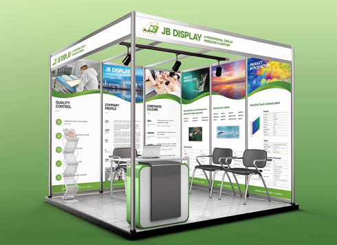 Booth Poster Design for Professional Monitor Product Suppliers
The standard exhibition booth poster projec ...
-
 Design of Standard Exhibition Booth Posters for Beauty Instruments
Carefully designed a standard exhibition bo ...
-
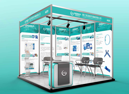 Design of Exhibition Posters for Medical Device Standards
XiYue is designing an exhibition booth post ...
-
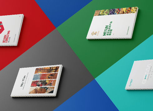 Collection of Brochure Design Cases in 2024 (Cover Series 02)
Our brochure design projects focus on diver ...
-
When a sample is shipped to another city and the client only signs back “OK,” who is to blame if mass production shifts color? Were the reference and tolerance missing from the approval form from the start?
Date: Nov 22, 2026 Read: 3
-
When text at both ends of a banner is pinched by rope, is moving the text inward enough—and should hole positions and hanging method be marked together?
Date: Nov 21, 2026 Read: 5
-
When the company name on a booth fascia can’t be read across the aisle, can checking letter height and stroke weight against the far viewing distance before artwork start save a reprint?
Date: Nov 20, 2026 Read: 11
-
The address along the bottom of a roll-up banner keeps getting covered by the base—can leaving a keep-out zone from the supplier die line before artwork save a site rework?
Date: Nov 19, 2026 Read: 13
-
The booth spotlight hits the center of the display panel, and customers at the meeting table say it is a washed-out white blur—is it material glare or a light mounted too low?
Date: Nov 18, 2026 Read: 18